I think Anthony’s paper was very conservative.
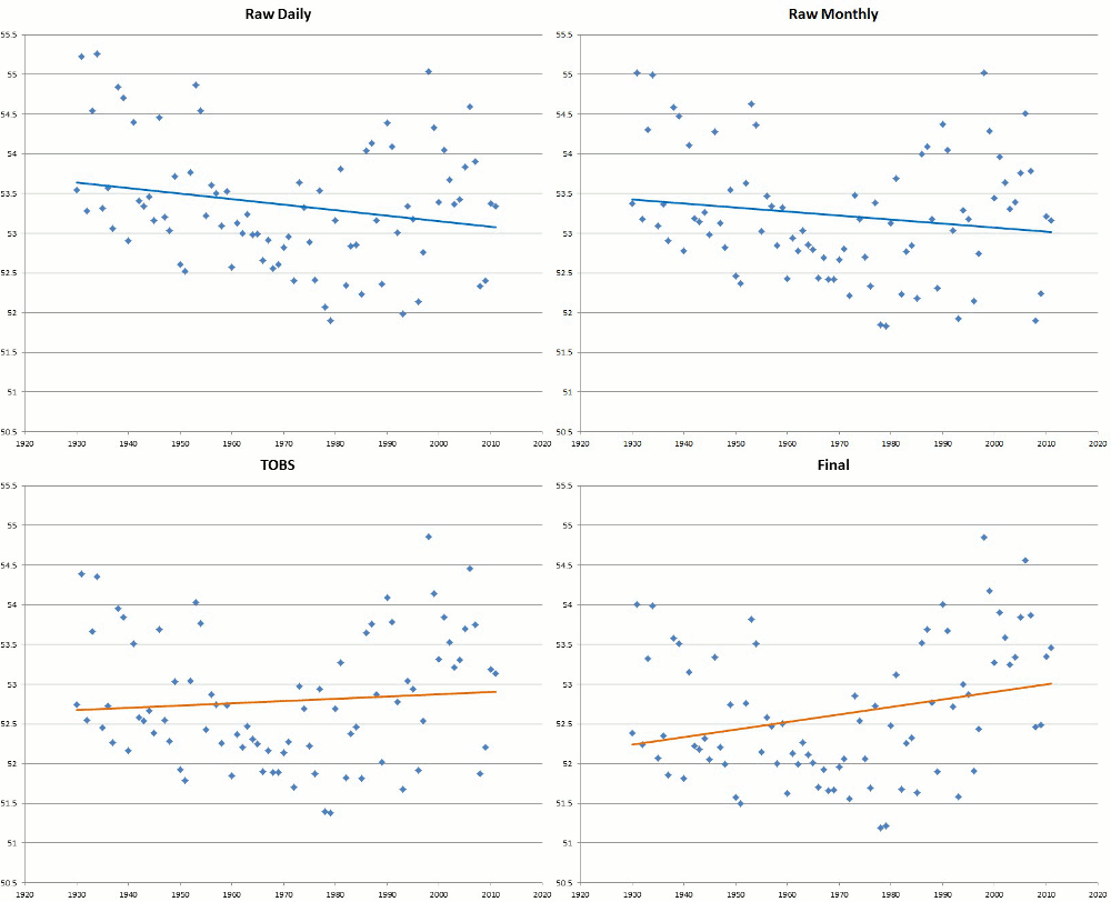
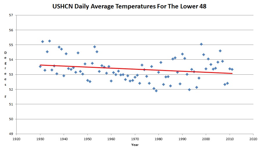
USHCN data tampering is much worse than he indicated. By messing with the data, the USHCN trend since 1930 is actually reversed from a measured cooling trend – to a warming trend.
I think Anthony’s paper was very conservative.
USHCN data tampering is much worse than he indicated. By messing with the data, the USHCN trend since 1930 is actually reversed from a measured cooling trend – to a warming trend.
The climate history deniers at NCDC are about to defile US history and announce that July was the hottest ever in the US – despite the fact that July, 1936 was much hotter.
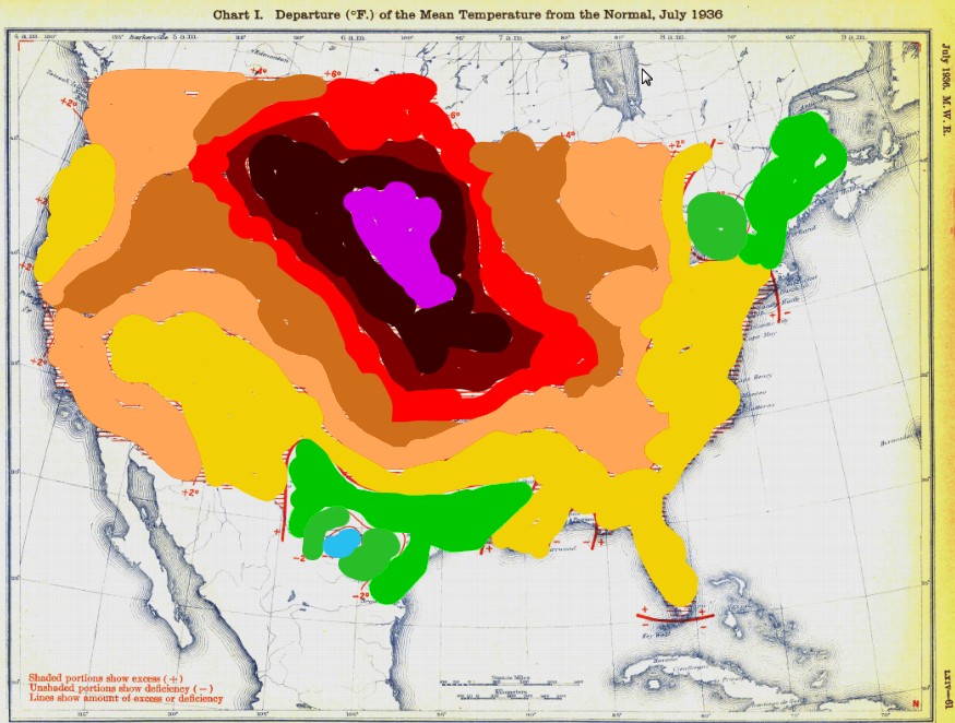
docs.lib.noaa.gov/rescue/mwr/064/mwr-064-07-c1.pdf
Compare the area of above normal temperatures
Deviation    1936    2012
+12            5%      0%
+10           10%     ~0%
+8            15%     <1%
+6            25%     15%
+4            65%     60%
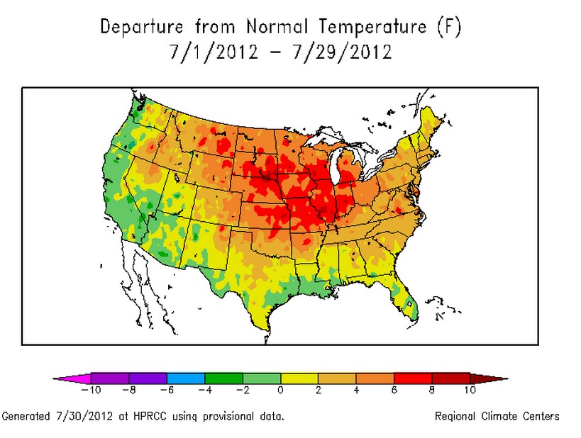
This is pretty solid evidence that their data tampering has severely corrupted the temperature record.
During the last two weeks they went hysterical over a cyclical event which happens every 153 years in Greenland, and a claim by a “former skeptic” who told Huffington Post last year that he never was a skeptic.
Bottom line – these people are irrational and neurotic.
SUMMERTIME, AND THE TWISTERS ARE MISSIN’
JULY HEADS FOR A RECORD-LOW TORNADO COUNT
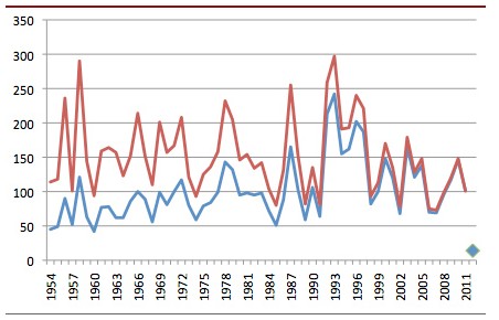
Bob Henson | July 24, 2012 • Heat and drought are punishing much of the United States right now, but there’s actually some good weather news to report. This month is on track to produce fewer tornadoes than any July on record, and by a long shot.
There were also no hurricanes or tropical storms in the Atlantic during July.
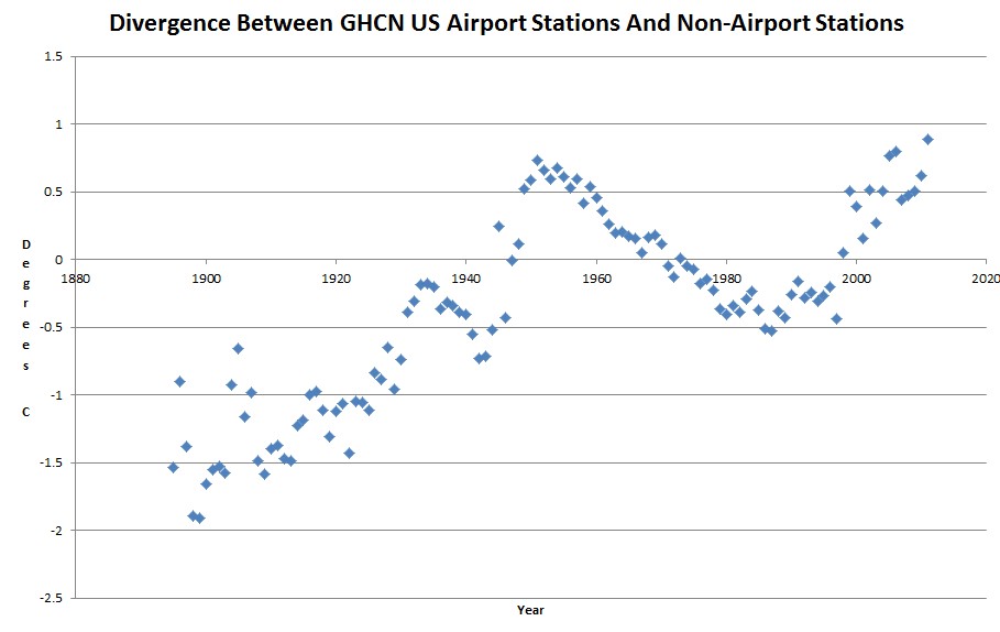
The GHCN US temperature record shows a large divergence between temperatures taken at airports, and those taken at the rest of the stations. This is most likely due to the introduction of pavement.
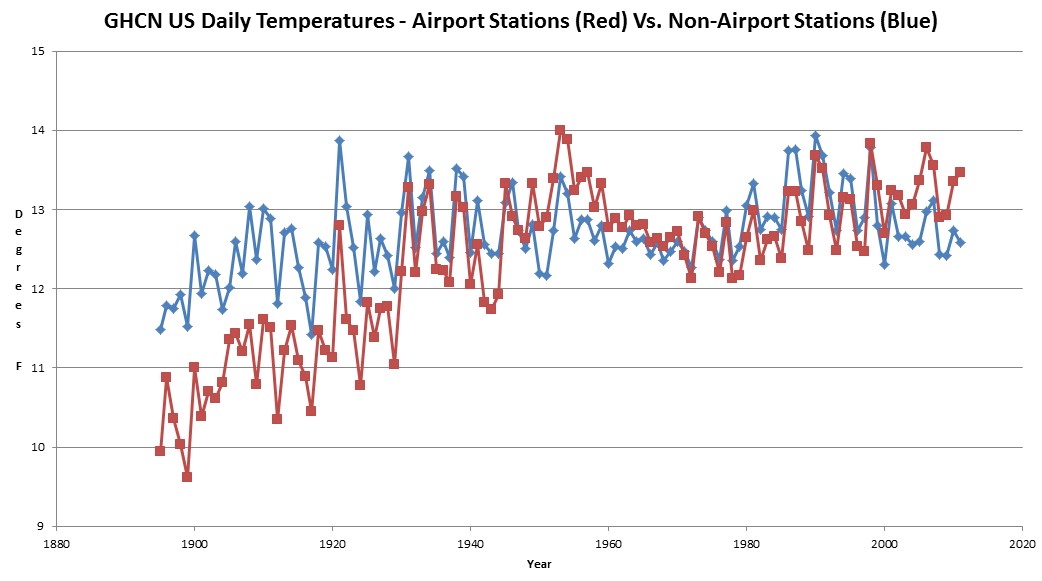
The first airplane flight was in 1903, so we can probably assume that most of the airport stations were very rural at the time – thus the much lower temperatures. As asphalt and pavement was added, the temperatures rose.
Next, look at the systematic divergence between the two data sets. What happened after 1990???
h/t to Michael D Smith for the suggestion.
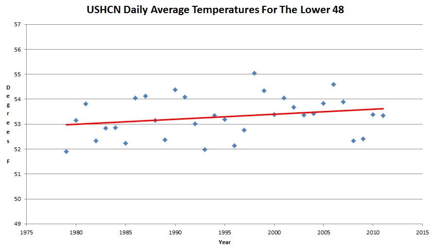
Starting in 1979 make no sense though, because it was the coldest year since 1924. If we start in 1930, the US is cooling.
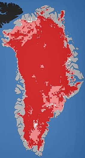
The Times Atlas got in trouble last year for publishing this bogus map of Greenland.
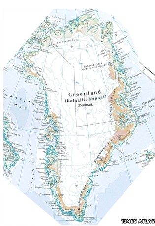
It turns out that they showed far too much ice. Recent maps from NASA indicate that all of the ice has melted.
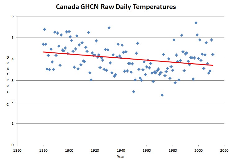
GHCN raw daily data shows a cooling trend in Canada since 1880. Unlike the US, only a small percentage of the GHCN stations are located at airports.
I have found hundreds of news stories describing the melting of the Arctic between 1900 and 1940, as well as abundant evidence that Arctic ice expanded during the 1970s.
Unless the freezing point of water has changed, the earlier period must have been warmer. Yet when we look on Hansen’s graphs, it appears that the period from 1900 to 1940 was much colder than the 1970s.
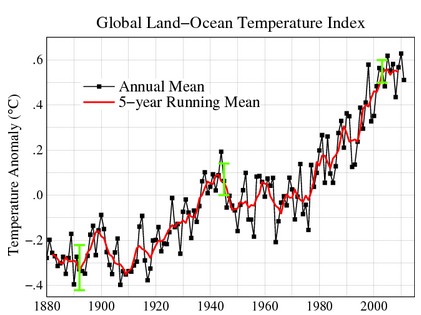
Data.GISS: GISS Surface Temperature Analysis: Analysis Graphs and Plots
It doesn’t matter how beautiful your theory is, it doesn’t matter how smart you are. If it doesn’t agree with experiment, it’s wrong. Richard P. Feynman
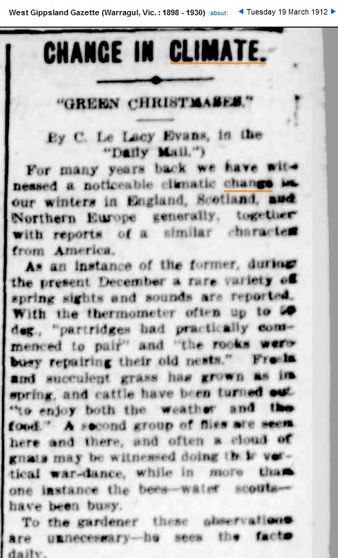
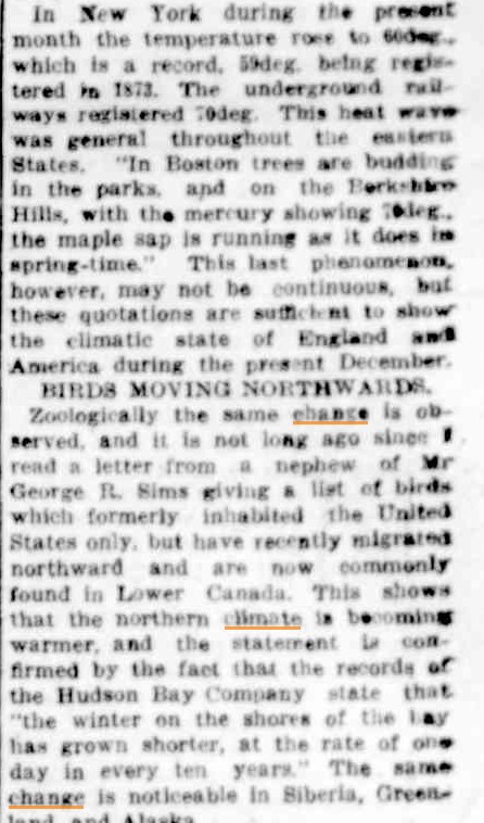
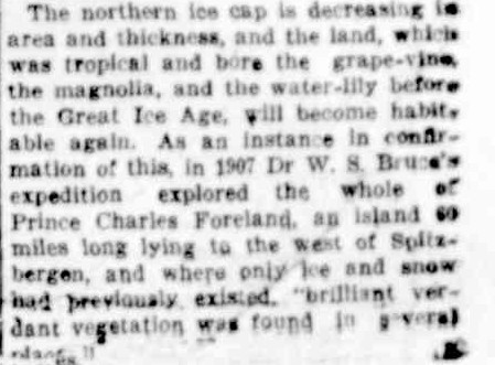
Hansen shows 1912 as being one of the coldest years on record, but people who were living at the time saw a world which was completely different from Hansen’s fantasy graphs.