
The climate mafia has enlisted these two handsome gentlemen to discredit satellite temperatures. Neither of them knows anything about the topic, but their specialties are talking climate trash for cash – so they were perfect for the job.
Satellites are a problem for the climate mafia, because they show just how bad recent surface temperature fraud is.
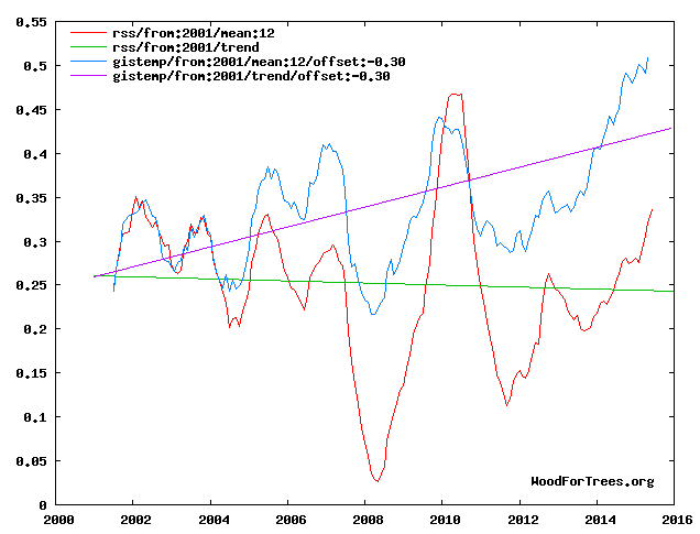
Wood for Trees: Interactive Graphs
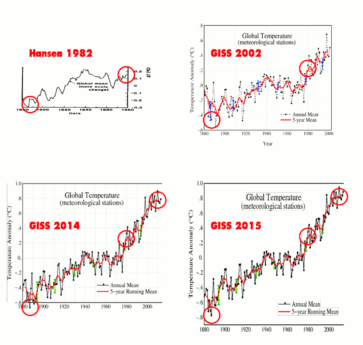
The claim from the climate clowns is that satellite temperatures have to be adjusted for error, unlike surface temperatures which they say “hardly need to be adjusted.“
Wow! All this data tampering for nothing?
They do have just one minor problem however. The 1995 IPCC report, authored by none other than NOAA’s own Tom Karl, showed that satellite temperatures matched NOAA balloon data, and that neither showed any warming since 1979.


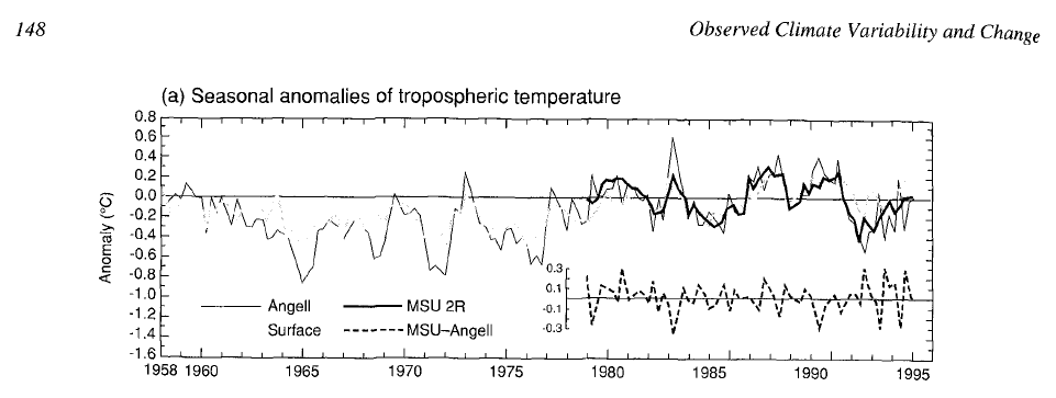

There is no legitimate basis for disputing the satellite temperatures. This is just one more layer of fraud piled on by the usual clowns.


but you don’t understand..
…it’s the balloon data that needs major adjusting
Hey Latitude! Yes, the surface record is perfect. Climate science only has two very tiny errors that need to be corrected — all of the satellite data, and all of the balloon data.
🙂
The surface record is perfect, until it is discovered that it isn’t. The only perfection is in the adjustments, until they aren’t. Just as Mohammad changed his mind in the Koran, truth changes in alarmist peer review in a very convenient manner that ever supports the agenda.
Instead of “An Inconvenient Truth” Gore should have titled his movie “A Convenient Untruth”.
Don’t worry Steve, when Schmidt, Venema, Hausfather and Mosher have finished Mannipulating the balloon and satellite data, it will match the models perfectly.
Remember,
“The data doesn’t matter. We’re not basing our recommendations on the data. We’re basing them on the climate models.”
~ Prof. Chris Folland ~ (Hadley Centre for Climate Prediction and Research)
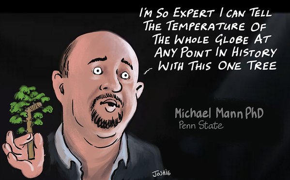
Mann thinks his bristlecone pines, after statistical fraud, know more about global temperatures than the satellites. That makes him a blubbering fool.
He’s a great job with great pay… He’s not the fool… We are.
IIRC, the bristlecone pines used were not even normal bristlecones. Many of them were strip-bark bristlecones with highly asymmetrical growth rings. Such trees are totally unsuitable for climatic research.
Unfortunately, progstains don’t do truth. Nor do they ever concede a lie. They begin with witless anti-reason. When that doesn’t work, they turn to coercion. When that doesn’t work, they’ll switch to all out force.
I fear it may not matter who runs for President. The candidate which serves the Oligarchs is virtually certain to magically win, and all that has been misdirected by Obungo will be pushed to new extremes. This statement by the shitforbrains twins is just the beginning of an assault on that data. Ultimately, the progs conspire to replace Christy and Spencer with klimate faithful.
They disregard satellite temperature data as inaccurate, but yet believe satellites can accurately measure sea level rise to a hundredth of a millimeter. *rolls eyes*
Speaking of serial deniers, Mark Steyn has bits of news not seen in the MSM.
Mark is doing a tour of Down Under so those in Oz might want to grab tickets if he will be near you.
For the rest of us who want to aid in sticking it to the Mann, there is his new cat album, Feline Groovy: Songs for Swingin’ Cats.
Mark Steyn’s Night of Terror from the album:
https://www.youtube.com/watch?v=eNbmLIW8PmA
That is truly awful. I like Steyn’s editorials and humor, but for God’s sake who convinced him that he could sing, and that this was a good idea? Was it the same person who told Cook he would look great in a Nazi uniform?
Someone who was tone deaf?
Actually given the caterwauling that passes for modern music in many cases, why not?
Not any more awful than William Shatner’s recordings. That is the genre to which this belongs. I like the humor in it, and Steyn can probably use the money for paying his lawyers. We know he didn’t get paid for this: [youtube https://www.youtube.com/watch?v=8cqGH-97LQA&w=640&h=360%5D
Not any more awful than William Shatner’s recordings.
That’s like saying, “Tastes as good as a crap sandwich”.
Maybe Steyn’s plan is to force us into paying him to stop singing. 😉
Of course “singing” should be in quotes, and Mark should be introduced to an auto-tuner.
Some of us enjoy listening to humorously purposefully bad music, it provides a release, of sorts, and a bit of schadenfreude: [youtube https://www.youtube.com/watch?v=rmPOWJtsEGc?list=PLg5_wcdn25VweI2BHxqLEbIpa-njEqCTt&w=640&h=360%5D
I am not one of those people, I have an associates degree in vocal performance. I enjoy a good parody and even comical performances, but that video above is truly awful, and on so many levels.
Some are “badder” than others 😉
[youtube https://www.youtube.com/watch?v=TAPoNXrWNMc&w=640&h=360%5D
Shatner does Bohemian Rhapsody, but I didn’t post it. Look it up if you dare. 😉
Here is a popular singer who filled auditoriums…
https://www.youtube.com/watch?v=qtf2Q4yyuJ0
Fantastic! Surely the audience knew what it was in for. Thanks Gail for proving my point.
lectrikdog, I have to be taught rhythm and am pretty close to tone deaf and I run screaming when my hubby who is musical plays that.
I like Shatner because he showed that the Saddlebred did not have to be a saddleseat gaited horse. He sponsored a western class for Saddlebreds.
Shatner on a Saddlebred
https://s-media-cache-ak0.pinimg.com/736x/9d/86/2a/9d862a1ad574d4c8dc8b5a4b23fec5ff.jpg
Kentucky Fall Classic Horse Show 2015
Class 39 Saddle & Bridle William Shatner Western Pleasure
http://2.bp.blogspot.com/-wP37FuHv2O0/Vhc9PpAcnmI/AAAAAAAAE8s/qSeMYuiODMs/s640/39%2BGiovannis%2BGreat%2BDay.jpg
A three gaited horse for comparison
http://4.bp.blogspot.com/-1hL9t-Jj5K0/Vhc9QsK9BqI/AAAAAAAAE88/uzrCJeen–I/s640/46%2BBourbon%2BSky.jpg
I never gaited my horses. That is why I was happy to see a class for a ‘natural’ saddlebred FINALLY. They are a really great breed; smart, smooth riding, calm and like people. Because of how they are shown they are very under rated by the general buying public.
The satellites and surface thermometers may both be right. The reason this can be true is that increased atmospheric CO2 does not increase net “forcing” in the saturated bands which amount to at least half of the radiative potential. It just moves the same amount of forcing from maybe 10 meters to 1.5 meters where the surface thermometers hang out.
Surface thermometers show increase. Satellite radiometers say, “wat chu talkin’ bout?” The same energy just moved from higher into the surface thermometer strike zone.
On the other hand, this theory could be utter nonsense.
Could be, but it explains a lot of weird stuff.
Or is could be hot asphalt and air conditioner exhaust they are measuring and then adjusting up to account for the UHI.
Or it could be the use of electronic thermometers, which have been shown to measure high, but data before their use is adjusted down.
WRONG WAY… BOZOS !!!
“What is the difference between theory and practice?
In theory there is no difference”
Stolen from a blog I tripped over and haven’t found back to attribute – any help appreciated.
Theory and practice are parallel universes. Theory attempts to explain the unknown. Practice attempts to apply best theory as it is understood to putting dinner on the table tonight.
Is frost is also a few meters above the surface?
http://oi66.tinypic.com/35hpkde.jpg
Can be.
According to the PHD atmospheric specialist, the overall troposphere should warm 20% more then the surface, not 100 percent less.
They are totally wrong. The troposphere warms a teeny weeny bit, the surface somewhat more, neither is dangerous. What’s the problem? Just floating an idea based on sound physics that can explain all of the above.
Are you the real and original gymnosperm?
Hmmm…
“the surface somewhat more”
There is absolutely no proof that that is the case.
Yes, the fabricated, manipulated, smeared, and highly error prone surface data from noaa/giss et al shows an increase, but there is absolutely no guarantee that this is actually REAL.
All REAL data points to it being a LIE.
Well, Berkeley Earth did a zillion land only measurements showing land surface warming and Judy Curry was co on a paper showing that siting close to urban areas did not explain the trend…
Off hand, does anyone know what change in the average global lapse rate (which could only be due to H2O), would account for the divergence of the surface temperatures from the satellite temperatures?
NASA
OMG! So your saying that it is normal for temps to vary so much in just a few meters of altitude? And you saying that somehow the radiosondes don’t pick that up?
Normal? No. Radiosondes are not designed to deal with the first few meters. They may not even turn them on. We could measure the first few meters with thermometers on sticks. We just don’t with rare exceptions.
Oh so your saying the divergence ONLY occurs within the first few meters above ground level and that this difference is constant enough that it accounts for the significant divergence of global surface data from satellite data? And that if I have take a surface temp from the top of the a sheer 1,000 ft. cliff and release a radiosonde from below that ascends 50 meters lateral distance from the face of the cliff and which takes a measurement at the same altitude ASL as the surface station that the surface temp will be higher? And that this will account for more of the difference between surface temp data and satellite data than UHI and other poor siting factors of ground stations?
Pretty much, we are all talking in these vague averages as if there were no differences in surface altitude. There may even be a lateral gradient off the face of your cliff. The vertical gradient begins again at the top of the cliff.
Completely agree with y’all on the bs of the adjustments, siting and UHI. But still there seems a discrepancy between surface and satellite. That is what I’m trying to explain.
But still there seems a discrepancy between surface and satellite. That is what I’m trying to explain.
It’s all about the artistry, and the artists…
https://upload.wikimedia.org/wikipedia/commons/6/6e/EdwardMoran-UnveilingTheStatueofLiberty1886Large.jpg
http://www.ericspitler.com/images/2d/liberator_color.jpg
If it is only few meters, there is no problem, because at night the temperature drops quickly. A few meters over the Antarctic is different than a few meters above the Sahara.
Plus, we got this thing called wind, and another thing called convection.
Wind, convection, and conduction, which dominates at the surface.
Personally I am not ready to debate those areas where atmospheric PHDs both skeptics and CAGW proponents agree.
I believe the whole point of the satellites is meaningful coverage of the entire Earth, or most of it anyway poles excluded most likely. Surface temperatures are land temperatures for the most part and not gridded on a regular grid. Of course, land surface temperatures were the only thing considered for global warming; flood, drought, heat and cold are meaningful on land where humans and food lives.
Satellites can measure surface temperatures by using the atmospheric window, the band of wavelengths for which CO2 and water vapor neither absorb or emit. An inexpensive remote reading infrared thermometer is tuned to that wavelength. If my hand-held remote reading thermometer is good to about 1/10th of a degree then so ought the satellite be. Of course, the handheld reader doesn’t know the emissivity of the surface; I can set the emissivity but from space there’s going to be an average emissivity on land less than 1, and that’s where some uncertainty is going to kick in. Water is pretty close to just “1” for emissivity and can be accurately measured even from space.
Given annual variation in plant life, that’s going to change average emissivity over land over the course of a year. Instead of tinkering with the data, it ought to just be “raw” and look for trends if any. What it measures it measures with accuracy and repeatability; the problem is going to be varying emissivities of what it is measuring and that will produce variations in reported temperature.
Completely agree, but you have to bear in mind that the surface thermometers record a nano layer at the approximate height of the human nose. The satellites do a weighted average of microwave pings of O2 that extends from the surface to a tiny bit of the lower stratosphere.
https://geosciencebigpicture.files.wordpress.com/2015/09/tlt-tmt-tls-weighting.png
All I’m suggesting is you take the same amount of energy and move it closer to our noses, a gnarly problem is solved.
Let me guess, Marty sent you to fill in for him?
This seems to be a novel strategy…agree with the comment, but then contradict it.
Nice!
Tell me.. do you know ANYONE that does NOT live in the Lower Troposphere??
Nope, but neither do I know anyone who lives in the abyssal ocean, nor the stratosphere; both of which are cooling. Tell me, is it any one of these layers or the sum of all of them that represents “global” warming.
What principal of science would cause sun light to warm the column of air at nose-level but not the column of air directly above it?
We are talking about IR leaving, not solar UV, visible and near IR coming in. CO2 is virtually transparent in the solar bands.
*principle
The whole idea of looking at temperature is unscientific to begin with because it is an extrinsic property and confounded by the latent heat of vaporization of water.
It is mind boggling that the American Chemical Society and the American Physical Society were not screaming bloody murder about looking at the wrong data from the beginning.
Thank Goodness Marty/Winston/Dr. Zachary is no longer with us, can you imagine what he would have done with latent heat!
It goes to show that in the entire world there are just a handful of “scientists” who are controlling the earth’s “official” temperature readings. The rest of the “97% consensus” is made up of other scientists who do not challenge the pronouncements of “the powers that be” lest they jeopardize their own pet government grants that keep them in good wine. It’s not about reality or truth, only about control and job security.
“….increased atmospheric CO2 does not increase net “forcing” in the saturated bands which amount to at least half of the radiative potential. It just moves the same amount of forcing from maybe 10 meters to 1.5 meters where the surface thermometers hang out.”
>>>>>>>>>>>>>>>>>
Sorry that just does not fly. CO2 passes off the absorbed IR to other molecules/atoms in the troposphere within nano-seconds. All it does is aid conduction a tiny bit. The variability in water vapor is going to have a heck of a lot more effect.
CO2 starts radiates IR above the tropopause not below it.
http://www2.sunysuffolk.edu/mandias/global_warming/images/stratospheric_cooling.jpg
The black dotted line is the tropopause.
In fact, the temperature depends on the circulation and pressure over the area (wind and humidity).
CO2 begins absorbing and radiating immediately above the surface. In the saturated bands ~15um/667cm-1 the combined efforts of CO2 and water vapor have exhausted all the light and dissipated it through thermalization. An hypothetical radiometer flying below the tropopause looking down sees this:
https://geosciencebigpicture.files.wordpress.com/2015/10/280-560-transmittance-annotated.png
The flat spot at the bottom is ZERO transmittance. All the photons being done gone. This flat spot exists at both preindustrial and “doubling” levels and it corresponds to the radiative power spectrum of CO2 like this:
https://geosciencebigpicture.files.wordpress.com/2015/12/co2-electron-population-vs-transmission-to-troposphere.png
You are right again about radiation resuming in these bands from the lower stratosphere.The shark bite to the left is the relevant bands and satellites over the Sahara, the Pacific, Pacific cloud tops, and an hypothetical U-2 flying at 20 km over the US all see the same ~217K emission temperature corresponding to the ozone layer.
https://geosciencebigpicture.files.wordpress.com/2016/01/280-ppm-transmitance-and-ozone-added.png
The point here is that there is a huge gap between some few meters and the lower stratosphere where no radiation happens in these bands.
My argument is that these bands were saturated at pre industrial levels. All we have done is move the altitude of extinction down. We aren’t warming the planet, just our noses.
gymnosperm says: “…CO2 begins absorbing and radiating immediately above the surface….”
Three Physicists say you are wrong.
We will start with GallopingCamel:
Then go onto Dr Robert Brown, a physicist at Duke University.
And finally you have Dr.Happer who, using actual real world data chops down the calculated: ” pressure broadening, molecules close to the ground emit photons “in the wings” at frequencies that less broadened molecules at higher altitudes/lower pressures are nearly transparent to.”
“Note: at noon the same day, Prof. Happer delivered a less-technical lecture at the John Locke Foundation, in Raleigh, NC: Watch this video »”
[video src="http://jlf.streamhammer.com/speakers/williamhapper090814.mp4" /]
The take away from his UNC lecture (9/2014) was the CO2 ‘modeling’ is a mish-mash of theoretical equations and experimentally derived data. Where the Climate alarmists missed the boat is in using equations for ‘line broadening’ aka the ‘wings’ where the current CO2 absorption ( at 400 ppm) is supposedly taking place. These equations produce results that do not match up to the experimental data. The lines are not as broad as theory would have it.
Slide 22: Lorentzian line shape nor Voigt line shapes are correct in the far wings!
This was the point of the lecture. Why was the theory wrong?
Since the experimental data shows less broadening this flattens the exponential curve and essentially lowers the ‘Climate Sensitivity’ of CO2 for a doubling to 800 ppm to less than 1C===> 0C
At the lecture Dr. Will Happer did agree with what Dr Brown and GallopingCamel said about the time to radiate being about ten times slower than the time to the next collision in the troposphere. Dr Happer in his lecture also answered my question about where CO2 energy is radiated instead of being handed off via collision. Experimental data shows barely any radiation at 11 KM and that radiating is in the stratosphere ~ 47 KM above the surface. Seems the ‘Sky Dragon Slayers’ are not as wrong as everyone tries to say they are. CO2 IS radiating far above the surface and not at the surface.
David Burton put up an audio video and slides of Dr Happer’s presentation at this. link
SLIDES: link
Slides 16, 22, 42, 43 and 44 are the critical slides.
Whatever happened to Galloping Camel? We were both expelled from SKS in the class of …2010? Actually think he got pissed when a comment was deleted and left. I hug out a bit longer until formally expelled. Anyway, totally agree with him as usual.
Robert Brown treats the process as a continuum to space which is relevant to the “wings”, but not the saturated central channel, including the first transition from ground state, which contains most of the radiative/absorptive “power” of CO2. Robert claimed to be working on quantum aspects of saturation and pressure broadening a while back but this effort seems to have flagged. Maybe the table of transitions and their position in the spectrum provided will prod him.
Unfortunately, I must completely disagree with Will Happer’s assertion that CO2 is radiating at 47 km. All the measurements from all the different places and altitudes show CO2 radiating at the same temperature~217K. If you look at the lapse rate you can see that at 47 km the temperature is much WARMER than that.
“All it does is aid conduction a tiny bit. ”
And convection.
That is some pretty sneaky physics. Apply for a grant immediately!
Does Gail have her own blog somewhere?
You’re looking at it! 😉
Gymnosperm I doubt it moves it from 10 meters to 1.5. I’m thinking maybe 10 to 9.9 is a better guess, for “a same amount of forcing” as you say. Actually the altitude of extinction is around 200 meters depending on one’s definition of extinction.
Yeah, you hear everything from 3 meters to 200. Probably varies from place to place depending on temperature, turbidity, pH, etc. Just another nebulous average, like surface temperature.
By diminishing the extinction profile from whatever to something less you move the thermalization closer to surface thermometers. My only point. We should EXPECT some difference in trend between the surface and TLT.
” I doubt it moves it from 10 meters to 1.5. I’m thinking maybe 10 to 9.9 is a better guess,”
>>>>>>>>>>>>>>>>>
Actually Morgan, Dr Evans gets into that. He found some major flaws in the basic Climate model that also translate into all the rest of the models.
Again the problem is you are not talking SURFACE. That is the big mistake of the ClimAstrologists.
Dr. Evans is an electrical engineer and mathematician, who earned six degrees related to modeling and applied mathematics over ten years, including a PhD from Stanford University. He was instrumental in building the carbon accounting system Australia uses to estimate carbon changes in its biosphere, for the Australian Greenhouse Office.
So CO2 is NOT changing the temperature at the surface it is changing it high in the troposphere/stratospher ~27 kilometers up just like the graph I showed indicates.
http://www2.sunysuffolk.edu/mandias/global_warming/images/stratospheric_cooling.jpg
The action is taking place on either side of the tropopause (black dotted line) with Water, Ozone and Carbon Dioxide all radiating energy.
Do not forget the temperature profile. (From NOAA)
http://oceanservice.noaa.gov/education/yos/resource/JetStream/atmos/images/atmprofile.jpg
According to Dr Happer, CO2 barely starts radiating at 11 kilometers and is mainly at 27 kilometers. (Kilometer scale on left.)
This makes sense to me. Any surface LWIR is treated as conduction, accelerating convection and establishing a local TDE.
If the surface radiated less, (if radiation physics was different) then it would conduct more regardless, with radiation / conduction both functioning as a plus / minus balance to each other and conduction dominating in the lower atmosphere. But the oceans, ah, there things are different with DW LWIR having a much poorer watt per sq. meter vs. watt per sq meter SW ability to warm the oceans.
Last time I read what was written by a skeptic that went to hear Mann speak they claimed there were no questions allowed at the event. I don’t think that kind of lecturing is a very effective propaganda tool. Unlike some large 100 level University class they are doing a sales pitch.
those that attend have every right to expect to be able to ask questions and when they aren’t, have every right to be suspicious about the voracity of the speaker.
I don’t there is any doubt about Michael Mann’s voracity
Voracity — how much can you eat? https://en.wiktionary.org/wiki/voracity
Veracity — how truthful are you? https://en.wiktionary.org/wiki/veracity
I pick both when talking about Mikey Mann but the ‘Voracity’ is in regards to money.
I once went to a Steven Hawking lecture. Even he took several questions. It was a slow process, but we were all happy to wait. By that point, Dr. Hawking hadn’t had functioning vocal cords for well over a decade, but he still managed to take questions. What’s Mikey dying of?
https://www.youtube.com/watch?v=gM1ZBiwoYLQ
(I know the sport very well, and I still race mountain bikes Cat 1. There’s no one at Lance’s level who isn’t doping. NO ONE.)
“The climate mafia has enlisted these two handsome gentlemen to discredit satellite temperatures. ”
They look shockingly similar.
They exhibit the same level of voracity and veracity.
Those are some sexy manbeasts, alright.
Real lookers.
I suspect they may have bought their PhD’s with sexual favors to the department chairs at their respective Universities, heh?
Neither of them seems to be old enough to grow a beard .. or to learn how to shave.
I know they want the world to live like Neanderthals, but why do they adopt the look ?????
I see “kick me” signs on their backs and wedgies in their pasts.
You would think Dessler would at least shave is ugly mug before appearing in a video.
It shouws his contempt for the Unwashed Masses.
SG, can you add a pic of Gavin Schmidt to those two.., please
http://a4.res.cloudinary.com/talent/image/fetch/t_face_s270/http://speakerdata.s3.amazonaws.com/photo/image/823519/schmidt.jpg
Smug looking SOB isn’t he?
Why do I feel a sudden urge to gouge out my own eyeballs with a rusty grapefruit spoon?
I recommend the use of an eye wash station or a boric acid/saline solution rinse.
http://2.bp.blogspot.com/-YuYqR3PvrJQ/UXx-4XPQMII/AAAAAAAABJg/YT0F5tXT_NU/s400/office-5a.jpg
I would recommend from black tea compresses on the eyes.
Earthers.
Don’t ask me why, but this little guy reminds me of Dessler…
https://www.youtube.com/watch?v=jHjFxJVeCQs
https://m.youtube.com/watch?v=iXHTmEUGR7c
FOUR balloons datasets match THREE satellites data sets. The satellite per se argument is a non sequitor LOL
The ClimAstrologists Motto: “If the facts don’t fit the theory, change the facts.”
The surface temperature data set is full of holes – LITERALLY. It is NOT FIT FOR PURPOSE!
The US has the most reliable surface station coverage and yet over 40% is fabricated and the amount fabicated IS INCREASING!
https://stevengoddard.files.wordpress.com/2014/06/unnamed.gif
The adjustments get bigger and bigger over time.
http://www.climate4you.com/images/NCDC%20Jan1915%20and%20Jan2000.gif
There was the great thermometer drop out too.
This what they SAY they have for stations.
https://upload.wikimedia.org/wikipedia/commons/thumb/a/ab/GHCN_Temperature_Stations.png/800px-GHCN_Temperature_Stations.png
This is what they actually had in Africa:
https://stevengoddard.files.wordpress.com/2015/01/ncdcafricafaking2.gif
(black diamond is stations used.)
In 1975 the far north ground stations in Canada had over 600 individual temperature series and more than 540 combined series with records of more than 20 years.
https://diggingintheclay.files.wordpress.com/2010/04/canadastations1975.png
The ClimAstrologists dropped this to less than 30 locations reporting stations by 2009. And dropped most of the stations in the far north.
https://diggingintheclay.files.wordpress.com/2010/04/canada-bypopulation.png
Getting rid of stations, especially rural northern stations allows wholesale data tempering.
https://diggingintheclay.files.wordpress.com/2010/04/canadadt.png
This is a graph comparing the number of weather stations around the world with the simple mean of the temperature data.
http://www.uoguelph.ca/~rmckitri/research/nvst.jpg
EXPLANATION
>>>>>>>>>>>>>>>>>>>>>>>
THESE are the real reason the Satellite temperature records are being attacked:
https://i1.wp.com/www.globalwarming.org/wp-content/uploads/2013/06/CMIP5-73-models-vs-obs-20N-20S-MT-5-yr-means1.png
http://www.climatechangedispatch.com/images/pics7/rss_glob_temp_anom_long-term.png
The ClimAstrologists Motto “If the facts don’t fit the theory, change the facts.”
The surface temperature data set is full of holes – LITERALLY. It is NOT FIT FOR PURPOSE!
The US has the most reliable surface station coverage and yet over 40% is fabricated and the amount fabicated IS INCREASING!
https://stevengoddard.files.wordpress.com/2014/06/unnamed.gif
The adjustments get bigger and bigger over time.
http://www.climate4you.com/images/NCDC%20Jan1915%20and%20Jan2000.gif
There was the great thermometer drop out too.
This what they SAY they have for stations.
https://upload.wikimedia.org/wikipedia/commons/thumb/a/ab/GHCN_Temperature_Stations.png/800px-GHCN_Temperature_Stations.png
This is what they actually had in Africa:
https://stevengoddard.files.wordpress.com/2015/01/ncdcafricafaking2.gif
(black diamond is stations used.)
1975 far north ground stations with over 600 individual temperature series and more than 540 combined series with records of more than 20 years.
https://diggingintheclay.files.wordpress.com/2010/04/canadastations1975.png
Dropped to less than 30 locations reporting stations by 2009
https://diggingintheclay.files.wordpress.com/2010/04/canada-bypopulation.png
Getting rid of stations, especially rural northern stations allows wholesale data tempering.
https://diggingintheclay.files.wordpress.com/2010/04/canadadt.png
This is a graph comparing the number of weather stations around the world with the simple mean of the temperature data.
http://www.uoguelph.ca/~rmckitri/research/nvst.jpg
EXPLANATION
What stands out to me in the station count vs. dT graph is the shift from chaos to monotonous rise, starting at the exact moment of the Great Dying. When you get a massive, unprecedented step change, starting at the exact point of a method change, it’s not a coincidence.
It is simple math. by simultaneously lowering the number of stations, and homogenizing those left, the geographic expansion of each area covered is greatly expanded, and the area affected by homogenization, is likewise expanded, presto, smeared and exaggerated warming.
Don’t forget that they tossed rural stations and added Airports.
Also Dr Spencer found the UHI is actually worse as you go from wilderness to small town.
http://www.drroyspencer.com/wp-content/uploads/pop-density-vs-rate-of-ISH-station-warming.jpg
http://wattsupwiththat.com/2010/03/03/spencer-using-hourly-surface-dat-to-gauge-uhi-by-population-density/
THESE are the real reasons the Satellite temperature records are being attacked.
https://i1.wp.com/www.globalwarming.org/wp-content/uploads/2013/06/CMIP5-73-models-vs-obs-20N-20S-MT-5-yr-means1.png
http://www.climatechangedispatch.com/images/pics7/rss_glob_temp_anom_long-term.png
Thank you for two excellent and informative Posts!
It is our host who does the heavy lifting. I am more of a librarian with a large curiosity streak.
But Gail, those are the OLD models. The current models, which have been updated with current temperatures, all show the current temperatures to be within the margin of error. You won’t be able to claim today’s models are wrong until they, too, are obsolete, by which point there will be new unfalsifiable models.
On a more serious note, that brings up an interesting question. Presumably those models were in line with the then current temperatures, when each was released. It would be interesting to plot those models against the current Karlized temperature history. It seems to me that the 1990’s models would fail the hind casting validations, when compared to the current version of historical temperatures.
Michael Mann seems to be clutching a YAD 061 that has been adjusted a bit, like the terrestrial temperature record. Michael Mann’s nose seems to be longer than it used to be a few years ago too,
I thought he had a hockey stick for a nose.
https://wattsupwiththat.files.wordpress.com/2012/03/game_of_thrones_scr1.jpg
The real shape of the hockey stick
http://c3headlines.typepad.com/.a/6a010536b58035970c01a3fcfdfdf2970b-450wi
NOAA, NASA-GISS etc….love satellites until they don’t!
From 2003
[Satellites were used to develop an 18-year record (1981-1998) of global land surface temperatures. The data showed that the Earth’s snow-free land surfaces, on average, warmed during the period. The findings are in a NASA study published in a recent issue of the Bulletin of the American Meteorological Society.
Unlike scattered ground-based weather observing stations that measure the temperature two to three meters above land, satellites measure ground surface temperature, or skin temperature, that is essential in assessing regional and global climate change. Other supplementary satellite measurements, such as land cover, cloud, precipitation and sea surface temperatures can then be used to give scientists many of the tools they need to determine the causes of land surface warming.
The study used data from the National Oceanic and Atmospheric Administration (NOAA)/NASA Pathfinder Advanced Very High Resolution Radiometer (AVHRR) land dataset; NASA’s Moderate Resolution Imaging Spectroradiometer (MODIS) skin temperature measurements; and NOAA’s TIROS Operational Vertical Sounder (TOVS) data, for validation.]
Satellites for lack of a better phrase “the sharp end of the spear” of our best science! But now ONE of the many satellites in orbit doing yeoman work on sea level, ice thickness, incoming outgoing IR etc……..You can’t make this s h i zzz le up
One question this video reminds me of is, why is Carl Mears still employed? He routinely insists that his work is fraudulent, and should be ignored. Yet he keeps getting paid to do it. How? Why?
For anyone who hasn’t seen the cartoon Tony pulled those picture from:
http://www.youtube.com/watch?v=UVMsYXzmUYk
Reblogged this on Climate Collections.