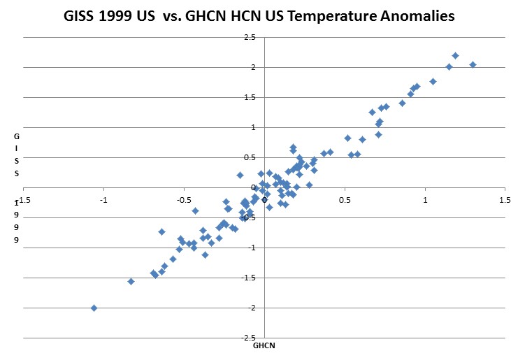
In 1999, GISS US temperatures showed no warming.
The graph below compares 2012 GHCN HCN daily temperature anomalies from 1895-1999 to the GISS US temperatures 1999 version. The correlation was pretty good.
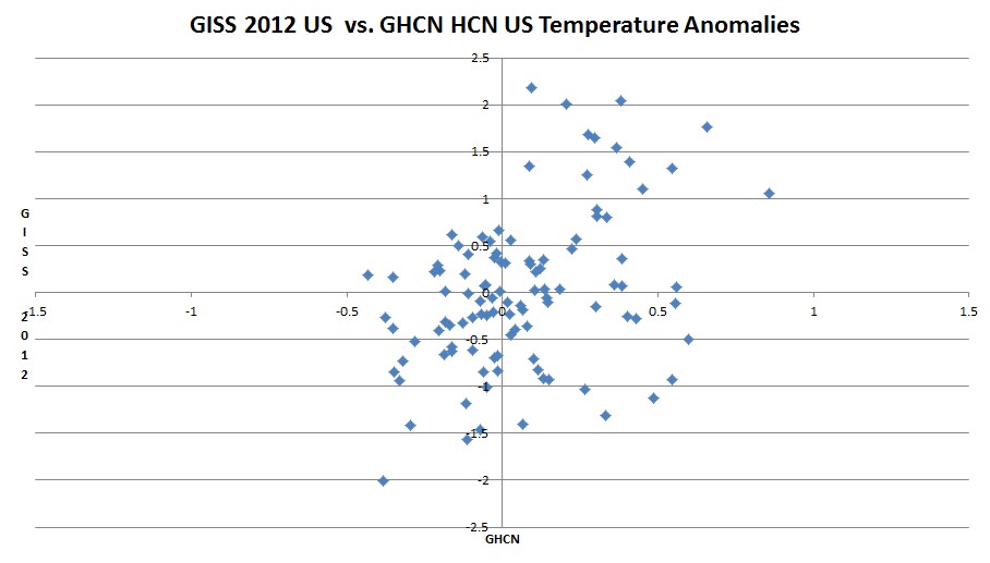
The next graph shows the same 1895-1999 data, except that it uses 2012 GISS US temperatures, instead of the 1999 version. Note that after adjustments, recent GISS US temperatures have almost no correlation with thermometers. The pattern is now a random shotgun blast, indicating that current GISS is a complete fraud.


It’s the Appellization, due to surface thermometers being so unreliable these days; even more so than in the past.
In order for warming to match hockey stick levels, the data needs to first be subected to peer reviewed Appellization and then be rigorously Hansenized.
Reblogged this on Climate Ponderings.
More like smoking black powder cannon. A 20″ ball could graze little Davey’s head, and he still wouldn’t see it.
Man I used to revere NASA…. anyway they said.
“it is unlikely that 2011 will reach a new global record temperature.
In contrast, it is likely that 2012 will reach a record high global temperature”
These predictions were made at around the time that their models were saying “we are going to have El nino after El nino” oh vey…According to the MET we will likely come in at about 9th (global). Good bad or just indifferent?
There is no difference between prediction and ultimatum
Freaky deaky stuff!
(Head to 2:45 for the beginning of the bread act in general. Of particular note, 4:20 marks the beginning of the signature trick in which Yif materializes a massive baguette from his hand.)
http://www.youtube.com/watch?feature=player_embedded&v=N–a2OuPLok
And the same in map format.
http://notalotofpeopleknowthat.wordpress.com/2012/11/30/giss-make-usa-change-colour/