
John Daly captured this version of GISS US temperatures in 1999 or 2000, which I have used as a basis to show that Hansen has massively altered temperature data.
http://www.john-daly.com/usatemps.006

NASA has of course deleted the old data from their site, so how do we know that John Daly’s data is correct? Simple, I overlaid John Daly’s data from 2000 (blue below) on a graph Hansen published in 1999.
http://www.giss.nasa.gov/research/briefs/hansen_07/fig1x.gif
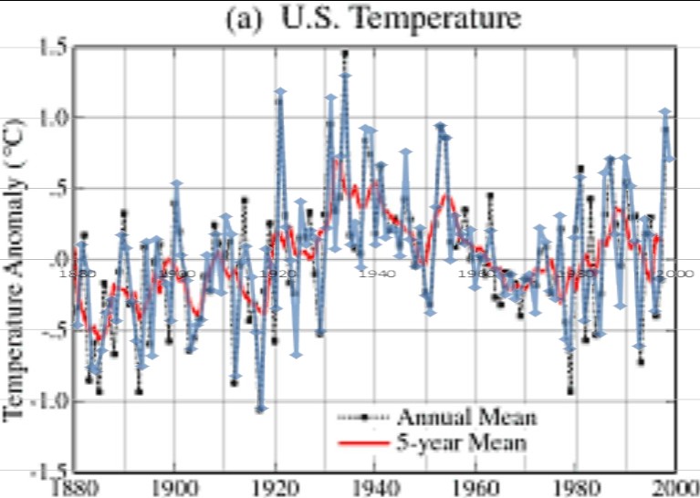
Hansen alters the data constantly, but it is a pretty close match. He has turned an 80 year cooling trend into a warming trend. The gun is smoking.


The diffderence between the two sets of data can also been seen on these maps.
http://notalotofpeopleknowthat.wordpress.com/2012/11/30/giss-make-usa-change-colour/
“The gun is smoking.”
The handcuffs should be clicking…
Hansen is the proctologist of data adjustment.
I think he sees a proctologist to get his data verified.
Wow. It amazes me they are allowed to get away with this.