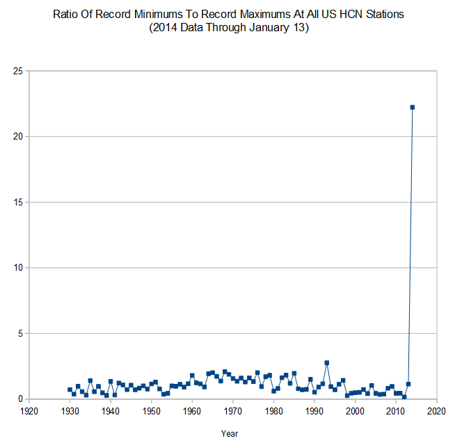
289 record minimums so far, and 13 record maximums.
Disrupting the Borg is expensive and time consuming!
Google Search
-
Recent Posts
- The Real Hockey Stick Graph
- Analyzing The Western Water Crisis
- Gaslighting 1924
- “Why Do You Resist?”
- Climate Attribution Model
- Fact Checking NASA
- Fact Checking Grok
- Fact Checking The New York Times
- New Visitech Features
- Ice-Free Arctic By 2014
- Debt-Free US Treasury Forecast
- Analyzing Big City Crime (Part 2)
- Analyzing Big City Crime
- UK Migration Caused By Global Warming
- Climate Attribution In Greece
- “Brown: ’50 days to save world'”
- The Catastrophic Influence of Bovine Methane Emissions on Extraterrestrial Climate Patterns
- Posting On X
- Seventeen Years Of Fun
- The Importance Of Good Tools
- Temperature Shifts At Blue Hill, MA
- CO2²
- Time Of Observation Bias
- Climate Scamming For Profit
- Climate Scamming For Profit
Recent Comments
- arn on The Real Hockey Stick Graph
- arn on The Real Hockey Stick Graph
- Gordon Vigurs on The Real Hockey Stick Graph
- Peter Carroll on The Real Hockey Stick Graph
- Robertvd on The Real Hockey Stick Graph
- Robertvd on The Real Hockey Stick Graph
- Gordon Vigurs on The Real Hockey Stick Graph
- Jack the Insider on The Real Hockey Stick Graph
- Bob G on The Real Hockey Stick Graph
- conrad ziefle on The Real Hockey Stick Graph


Wow! Gaia is pissed.
Excuse my ignoramus but has it always been above 1 to 1 since 1930?
No. Most recent years have been below 1.
Probably a red horizontal line at 1 would make sense, since this is a ratio. Also, I’d be tempted to say that a logscale is more appropriate because if you reverse the ratio (i.e. take 1/x and plot that) then it will give quite a different impression.
Lastly, I’m surprised that previous years are quite as stable, I would expect such events to come in clusters. There’s something odd about the change. One of this things I noted elsewhere is that the electronic temperature stations (or AWS if you like — Automatic Weather Stations) have a higher input bandwidth than the old heavy mercury thermometers. That is to say, they react faster to fluctuations in local temperature, the maximum temperature recorded generally only exists for a fleeting moment of time. With the old mercury thermometers, the measurement was slower and effectively averaged out a longer period of time.
In a nutshell, they don’t measure the same thing at all.
With the BOM in Australia, I checked the continuous readings when they had some record-breaker hot days, for example here:
http://www.bom.gov.au/products/IDN60901/IDN60901.94768.shtml
You see there’s a reading every 30 minutes. These are somewhat averaged, but the day maximum could well be significantly higher than ANY of the 30 minute samples (because the maximum only exists momentarily).
For example: the official BOM daily maximum for Observatory Hill (Sydney) on Tuesday 14 January 2014 was 27.5 but looking down the list of samples every 30 minutes the maximum is only 26.8 at 2:30 PM (which is really 1:30 PM when you throw away the DST adjustment, so just after midday as expected).
You can see this effect on any AWS, and I’m pretty sure the max/min was never fully calibrated against the old mercury thermometers, so yet another discontinuity in the historical data. *SIGH*
Hey, that’s a fine Hockey Stick!
Is this data for Jan 1 through Jan 13 each year, or are 2013 and earlier full years?