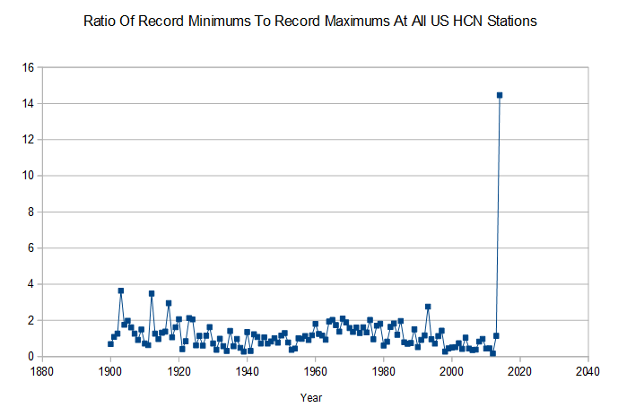
Looks like alarmists have a little bit of catching up to do. 188 record minimums and 13 record maximums so far in 2014.
Disrupting the Borg is expensive and time consuming!
Google Search
-
Recent Posts
- Is Antarctica Melting?
- High Speed Analysis And Visualization
- El Nino To The Rescue?
- Fake News Update
- Growth Of Antarctic Sea Ice
- 65 Years Of Progress!
- El Nino To The Rescue?
- Worst March Drought On Record
- ChartGL Process Control Demo
- The Biggest Money Laundering Scam
- Drought In The Headwaters Of Lake Powell
- Unrealistic Expectations Of Water Availability
- Did Bill Gates Do This?
- Worst March Drought On Record In The US
- The Real Hockey Stick Graph
- Analyzing The Western Water Crisis
- Gaslighting 1924
- “Why Do You Resist?”
- Climate Attribution Model
- Fact Checking NASA
- Fact Checking Grok
- Fact Checking The New York Times
- New Visitech Features
- Ice-Free Arctic By 2014
- Debt-Free US Treasury Forecast
Recent Comments
- conrad ziefle on Is Antarctica Melting?
- Gordon Vigurs on Is Antarctica Melting?
- Bob G on Is Antarctica Melting?
- conrad ziefle on High Speed Analysis And Visualization
- Bob G on 65 Years Of Progress!
- Bob G on 65 Years Of Progress!
- Gordon Vigurs on 65 Years Of Progress!
- arn on 65 Years Of Progress!
- arn on 65 Years Of Progress!
- Bob G on 65 Years Of Progress!


Looks like a hockey stick to me….
Beat me to it. 😀
Whadda ya know, another hockey stick.
What was the ratio last year?
Last year was 1.15
First time since 1993.
2004 1997 1996
Looks like a sine wave. Colder in the 1900’s, warmer in the 30’s, cold through to the 70’s and warmer up to 2000. Likely to be cooler over next two to three decades, if we followed the wave, and don’t follow Warmist prophets of doom.
If you inverted the ratio how high would 2012 have been? Was it over 15:1?
Obviously needs adjusting.
If that data was in the BEST dataset it would be identified as a ‘breakpoint’ and thrown out due to ‘regional differences’.
2004 1997 1996
http://www.climatecentral.org/news/for-first-time-in-20-years-cold-records-may-beat-warm-in-u.s-16790
I guess it depends on what data set you’re looking at.
Climate Central uses a database heavily loaded with stations which were not in existence during the hot 1930’s and 1950’s. That allows them to slime their readers with misinformation.
Interesting how you can see the ~60 year cycle in Steve’s graph.