
Disrupting the Borg is expensive and time consuming!

Google Search
-
Recent Posts
- Analyzing The Western Water Crisis
- Gaslighting 1924
- “Why Do You Resist?”
- Climate Attribution Model
- Fact Checking NASA
- Fact Checking Grok
- Fact Checking The New York Times
- New Visitech Features
- Ice-Free Arctic By 2014
- Debt-Free US Treasury Forecast
- Analyzing Big City Crime (Part 2)
- Analyzing Big City Crime
- UK Migration Caused By Global Warming
- Climate Attribution In Greece
- “Brown: ’50 days to save world'”
- The Catastrophic Influence of Bovine Methane Emissions on Extraterrestrial Climate Patterns
- Posting On X
- Seventeen Years Of Fun
- The Importance Of Good Tools
- Temperature Shifts At Blue Hill, MA
- CO2²
- Time Of Observation Bias
- Climate Scamming For Profit
- Climate Scamming For Profit
- Back To The Future
Recent Comments
- Bob G on Analyzing The Western Water Crisis
- arn on Analyzing The Western Water Crisis
- Bob G on Analyzing The Western Water Crisis
- Bob G on Analyzing The Western Water Crisis
- Bob G on Analyzing The Western Water Crisis
- Hank Phillips on Analyzing The Western Water Crisis
- Hank Phillips on Analyzing The Western Water Crisis
- Hank Phillips on Analyzing The Western Water Crisis
- Hank Phillips on Analyzing The Western Water Crisis
- Bob G on Analyzing The Western Water Crisis
C’mon, Steve! How ’bout some links to source data, even though I don’t doubt it one whit!!!
Dude the links are given above……gov’t would never lie to the peasantry would it ?
I added them
Why do you consider a radiance measure from a satellite better than a measurement of temperature from the air 1.5 meters above the surface? Both of those are a complete FRAUD. They both measure “somthing” and should never be “corrected” until some folk can decide what they are measuring! They are both important but like hieroglyphics are not understandable without much more consideration. The PR claims of these measurements are pure FRAUD. This fraud needs to be examined first, with criminal penialties. Later,others can decypher what was measured.
CBC at it again. Comments.
http://www.cbc.ca/news/technology/climate-change-2013-ranked-4th-warmest-year-1.2505077
Steve did you see this ;>)
http://www.principia-scientific.org/breaking-new-climate-data-rigging-scandal-rocks-us-government.html
Saw that too. PSI made claims Steve never did. Those guys seem to have a real hard time with SB equations, not sure why.
LIE LIE LIE OOO now I believe you /sarc/
Too many thermometers mounted on the side of AC units with stickem
SHOCK NEWS:
The historical record of NASA’s data manipulation:
1969: Apollo Mission to the Moon brought lunar soil samples to Earth for precise analysis.
1983: Analysis of solar-wind-implanted elements in lunar soils revealed severe mass fractionation in the Sun and an interior of Fe, O, Ni, Si, S, Mg and Ca [O. Manuel & Golden Hwaung, “Solar abundances of the elements,” Meteoritics (1983)].
1983: The conclusion section of the above paper predicted that the Galileo Mission to Jupiter would find excess Xe-136 from the supernova birth of the solar system.
1995: The Galileo probe entered Jupiter and observed excess Xe-136 there, as predicted twelve years earlier.
1998: CSPAN news recorded this admission from the NASA Administrator of hiding Jupiter isotope data:
http://www.youtube.com/watch?v=m3VIFmZpFco
With deep regrets,
Oliver K. Manuel
This 1998 report on the findings in Jupiter also contains a complete reference to the original 1983 paper on “Solar abundances of the elements.”
O. Manuel, “Isotopic ratios in Jupiter confirm intra-solar diffusion”,
Meteoritics and Planetary Science 33, A97, a
Paper 5011 (1998)
http://www.lpi.usra.edu/meetings/metsoc98/pdf/5011.pdf
Hey, One-Note, give it a rest. Your carpet-bombing highjacking is tiresome and offensive.
WHy would you compare GLOBAL data with USA data? of course they wont line up. ass-hat.
Moron alert
Definitely “illiterate” alert. I wonder which part of “GISS Global” ‘nothing’ didn’t understand; “global”, or “global”?
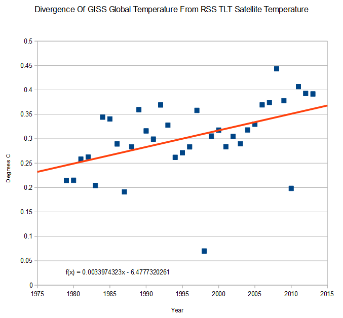
Interesting how the divergence gets larger the closer the data gets to the present. If you want ot show warming, cool the past and heat the present.
Kiwi:
All part of the Al-Gore-Rhythm used in the computer models that produce the so called temperature records.
Ladies and gentlemen, what we have here truly is “Man-Made Global Warming”. Just change the data by cooling the past, and warm the present. Here we see Mankind’s Fingerprint, so to speak.
Global warming in it’s heyday never amounted to much – worldwide average temperatures measured to within a hundredth of a degree, displayed in tenths of a degree – if you believe any of that… well let’s just pretend and play along. Since the satellite era, say late seventies, GATA is up what; a fraction of a degree? Yawn. Crisis. Really?
Just astounding how a small group of frauds and charlatans have gotten away with this. I is difficult not to conclude that there are a lot of suckers in the world.
A systemic error trend. How could that be? Oh, wait …
This three (3) minute video of the Sun (Earth’s heat source) over a three year period is instructive.
Compare the featureless, tranquil images of low energy radiation coming from the photosphere with the violent images of high energy radiation coming from the interior of the Sun:
http://mobile.news.com.au/technology/science/scientists-baffled-as-sun-activity-falls-to-century-low/story-fnjwlcze-1226805090679
There’s no information here. Are the time periods the same? What is the value of the divergence? Where is the commentary on the difference of what is being measured (2 different strata of the atmosphere)?
Here are linear trends for GISS and RSS from 1979 – 2013 inclusive.
Plot
Not very different. GISS and RSS diverge by 0.03C/decade over the period. Interannuaol data is very similar, but RSS has more variance (larger troughs and peaks).
But why compare these two data sets in isolation from others? Here are the trends for both satellite data sets, GISS and HadCrut4.
Not only are the trends very similar for all 4 data sets, the year to year variation is almost identical, with a notable exception for 1997/98. Satellite measurements appear to be more sensitive to ENSO.
Trend ranked from highest:
GISS – 0.158c/dec
Had4 – 0.154c/dec
UAH – 0.136c/dec
RSS – 0.125c/dec
I think I see why GISS and RSS were chosen for comparison.
Calculating statistical significance for the two trends…
RSS – 0.125c/dec [+/- 0.069]
GISS – 0.158c/dec [+/- 0.044
The uncertainties overlap – between 0.114c/decade and 0.194c/decade, 55% of the spread. the trends are not statistically distinguishable.
Another statistics moron arrives and accidentally demonstrates that global warming is complete bullshit.
All data sets show statistically significant warming from 1979, including the “more accurate” data set. How do you figure the contrary?