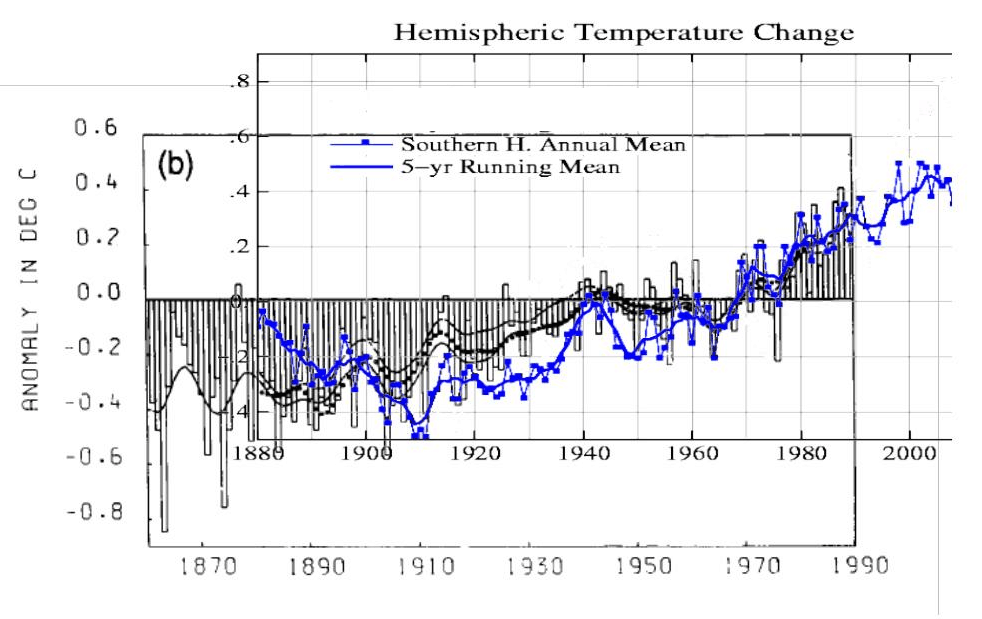
Blue line is current GISS southern hemisphere. Solid black line is Hansen 1990 from FAR. Note the settled science before 1900.
Data.GISS: GISS Surface Temperature Analysis: Analysis Graphs and Plots
www.ipcc.ch/ipccreports/far/wg_I/ipcc_far_wg_I_full_report.pdf


And now, for this highly important climate announcement from IOTW:
Raquel at 73 y/o:
http://nyppagesix.files.wordpress.com/2014/02/rw01.jpg?w=380
It’s people like her that have been responsible for raising temperatures for decades
I was just looking at the adjustments done to the Reykjavik Iceland records by the NCDC. The Iceland Meteorological Office disputes these changes and notes that any further adjustments are not required for their already-quality-controlled records.
NCDC shows their adjustments to Reykjavik here.
ftp://ftp.ncdc.noaa.gov/pub/data/ghcn/v3/products/stnplots/6/62004030000.gif
I was struck by how much the linear trend over the whole period changes between the raw quality controlled records in the first panel to the NCDC adjusted ones in the second panel. It is over +1.0C difference over the period. The adjustments are really not that large. Whenever you look at individual stations, they are similar, not huge adjustments. It shouldn’t make that much difference.
But it does. The adjustments are done in a systematic way to maximize the change in trend. There is the 1965 tipping point where the adjustments go from negative to positive which has been mused about. Lowering the older records, raising the more current ones, removing the burdensome 1940 warm period.
So for fun, I just mocked up the numbers in a separate chart (not the exact ones since the actual numbers are not available, but representative).
Sure enough, small systematic adjustments can translate into a huge change in the linear trend over time. Over +1.0C from small -0.25C to +0.35C adjustments.
http://s28.postimg.org/vkwxykm2l/Reykjavik_Temp_Adjustments.png
Now the pattern in NCDC/GISS adjustments makes more sense. They figured out how to do this with small changes long ago.
Bill, I think you are exactly correct. I remember that a couple of years back, some of the “climate scientists” were asked about the effect of the various adjustments. They responded that the adjustments had no overall effect because the number of positive adjustments was balanced out by the number of negative adjustments. DOH! Of course, their reasoning is, well, how can I say this? Their reasoning was stupid. Yes, perhaps they are correct that the positives and negatives are roughly equal, but unless the positives and negatives are equally distributed throughout the time series, they will strongly affect the trend. As you show, the adjustments are most definitely NOT randomly distributed.
One could argue that the trend change is due to “climate scientists” simply being not-very-good at science. Sadly, if simple incompetence were the case we would see more examples where they improperly adjust temperatures to make the trend cooler. The fact that trend adjustments are so overwhelmingly monotonic toward warming shows that they are not incompetent, but are, in fact, dishonest.
Reblogged this on The Firewall.
it would be great if someone could collate all the temp graphs that have been changed, put up on one website and given a strong title, at the moment it is all fragmented. But I do my bit and would like a one stop shop to email and throw around this data when necessary.
shared widely, thanks again:-)
I really find this shocking. I have in the past worked for groups that had to provide data quality statements for every data release. Based on what I have been made aware of from the skeptics I gather these adjustments are not released with such documents. Is that really the case?
Not only are there no meaningful documents, but they overwrite the data in place, and block web archivers.
It just seems so shoddy/high school to me. Each time the data is adjusted, it needs to be supported with documents outlining the reasons, the method and the change. If the documents do not exist then the change should be considered invalid and thrown out.
If this is indeed the case, how is it that nobody has taken them to task on it. Haven’t these folks been taught best practices?
This alone should be proof of the duplicity at the root of the cause. (which is kinda why I have not really considered it a big deal, as I have assumed that this was a skeptic talking point and that adjustments were done above board most of the time)
—
I have noticed a deviation in trend lines from RSS and GISS. Could the adjustments be the sole reason for this?
http://www.woodfortrees.org/plot/gistemp/from:1979/to:2015/plot/gistemp/from:1979/to:2015/trend/plot/rss/from:1979/to:2015/plot/rss/from:1979/to:2015/trend
I assume that RSS processing is more well known and less open to change given that it is derived from satellites.
Finding NASA and NOAA data corruption seems like shooting fish in a barrel. You can hardly miss, wherever you aim.