
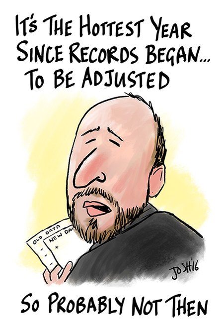
NOAA tampers with US temperatures by actually altering the monthly data. This is because the US data set is robust and does not show any warming over the last century.
But with global temperatures they play a different game. Instead of relying on altering the data, they alter the station selection over time. By eliminating rural stations in the data set, NOAA and NASA increase the amount of warming.
You can get any shaped function you want out of the nearly useless “global” temperature data set. NOAA/NASA/CRU use a carefully cherry-picked common set of NOAA stations as their base, and then declare their data sets to be independent. But they keep changing the set of stations being used, which causes the changes over time seen in the animation above.
Transitioning to more heavily UHI infected data, gives them to freedom to create a hockey stick – while actually adjusting current global warming downwards.
Dana Nuccitelli | Environment | The Guardian
It is clever ploy for several reasons:
- People like Steven Mosher look at the current data and convince themselves the adjustments are legitimate
- During Congressional hearings, Tom Karl simply shows graphs of how he is reducing warming
It is important for skeptics to be aware of the different games being played.

Reblogged this on WeatherAction News.
The BEST web page says:
“The Berkeley Earth Surface Temperature Study has created a preliminary merged data set by combining 1.6 billion temperature reports from 16 preexisting data archives. Whenever possible, we have used raw data rather than previously homogenized or edited data. After eliminating duplicate records, the current archive contains over 39,000 unique stations. This is roughly five times the 7,280 stations found in the Global Historical Climatology Network Monthly data set (GHCN-M) that has served as the focus of many climate studies. The GHCN-M is limited by strict requirements for record length, completeness, and the need for nearly complete reference intervals used to define baselines. We have developed new algorithms that reduce the need to impose these requirements (see methodology), and as such we have intentionally created a more expansive data set.”
http://berkeleyearth.org/about-data-set/
And yet they somehow come up with a very similar temperature trend to the GHCN derived trends. Looks like they are using HADsst for their ocean data and maybe that dominates the trend? They don’t provide any graphs of the land only data that I could find on their web site. They do provide a land only data set for download, but I haven’t looked at it yet.
http://berkeleyearth.org/data/
They also provide their source data for the adventurous:
http://berkeleyearth.org/source-files/
Frank Lanser looked at the BEST temperature set and found they did the same type of cherry picking and adjustments as the other data sets. Also they do not actually use RAW data much of the time. The goal of BEST was to have ‘independent scientists’ confirm the government data sets to squash the rumblings from the Climategate mess and nothing more.
……………….
First the politics.
Muller went out with the BEST data set before publishing and proclaimed he was a skeptic who looked at the data and became convinced of Global Warming. He was LYING!
The Truth about Richard Muller
Zeke shows he is a dye in the wool Alarmist here: http://www.yaleclimateconnections.org/2008/02/common-climate-misconceptions-the-water-vapor-feedback-2/
and Judith Curry is a Trojan Horse. Her business partner Peter Webster is linked with Climate Communication as a member of the Aspen Global Change Institute.
Climate Communication is a non-profit science and outreach project supported by grants…
WHAT WE DO
And guess who is on the staff of Climate Communication?
Peter Gleick
Katharine Hayhoe
Michael Mann
Jeff Masters
Michael Oppenheimer
Naomi Oreskes
Jonathan Overpeck
Benjamin Santer
Kevin Trenbreth
Don Wuebbles
To name just a few. So that puts BEST in the propaganda category in my book especially after Zeke’s defense of the adjustments over at Judith Curry’s website and hatchet job on Tony.. link
…………………………..
Now back to BEST and Frank Lanser
He has a guest essay at WUWT The Original Temperatures Project
The following from Frank Lanser’s site HideTheDecline Original Temperatures: Summary
http://hidethedecline.eu/media/AORIT/SUM/4.gif
http://hidethedecline.eu/media/AORIT/SUM/12.gif
http://hidethedecline.eu/media/AORIT/SUM/13.gif
I don’t trust anything Muller and his clowns do.
I don’t trust them either, but they have quite a bit of data available, including the raw data. I was just looking at what they did to Elgin, Texas.
http://berkeleyearth.lbl.gov/stations/26751
The raw data for Elgin had little trend, but it was adjusted to match the “Regional Expectation”, wherein lies the problem I suspect. The result is a big upward trend just like the region. The regional expectation could easily be UHI biased and adjusting relatively rural sites to match this bias is a glaring mistake.
The “Regional Expectation” is THE BIG LIE!
http://hidethedecline.eu/media/AORIT/SUM/15.gif
Do not forget the Station Drop out Problem
Ben says over at Jo Nova’s on January 20, 2014 at 8:53 am
He is referring to Frank Lanser’s The Original Temperatures Project (WUWT guest essay)
http://hidethedecline.eu/media/AORIT/SUM/4.gif
Back at Frank Lanser’s website.
http://hidethedecline.eu/pages/posts/original-temperatures-introduction-267.php
http://hidethedecline.eu/media/ARUTI/Coast/fig1.jpg
http://hidethedecline.eu/media/ARUTI/Coast/fig2.jpg
Frank’s best illustration that “Regional Expectation” is THE BIG LIE, is BEST / HUNGARY.
http://hidethedecline.eu/media/AORIT/SUM/12.gif
http://hidethedecline.eu/media/AORIT/SUM/13.gif
So BEST took an airport and ADDED ” 0.7 K of warming to the Pecs [airport] data. because they EXPECTED WARMING and when the data did not give warming they made it up out of whole cloth.
How do they ‘justify’ their ‘Regional Expectation’ and adjustments?
Zeke Hausefeather did a hatchet job on Steve in his article @ Judith Curry’s Understanding Adjustments to Temperature Data. The Mosh pup is there defending BEST. Zeke and Mosher are defending the TOBS adjustments that Steve (and I) say are bogus.
Zeke Hausfeather states:
I will take those three points separately.
SCALPEL and KRIGING
Elsewhere Zeke explains they use a computer program to ‘detect’ station moves. They are too darn LAZY to actually go to the first hand accounts and SEE if there are changes even when looking at current data. It is all automated.
An excellent example is my nearby station.
Original readings:
July 30 2014 Min 59°F — Max 68°F
The Max Temperature was 68 °F because a cold front with rainy weather came through.
That now is a Max Temperature 81 °F
The temperature was increased by 13 °F for no good reason.
And for August 2014 the records showed:
Aug 1. –Min 65°F — Max 75 °F
Aug 2. –Min 65°F — Max 70 °F
Aug 3. –Min 66°F — Max 78 °F
Aug 4. –Min 66°F — Max 83 °F
Aug 5. –Min 69°F — Max 86°F
In other words there was NO REASON to adjust that 68 °F ===> 81 °F
(This is Jeff Masters Wunderground Data from NOAA)
And as to the question of whether or not BEST was actually using raw data to begin with. Zeke says, “In the Berkeley approach every attempt is made to use first reports. We avoid the term “raw” data because one can never know that data that purports to be “raw” is in fact “raw.” ~ http://judithcurry.com/2012/07/29/a-new-release-from-berkeley-earth-surface-temperature/
>>>>>>>>>>>>>>>>>>>>>>>
TOBS
Someone did the tests on TOBS way back in the 1800s. Instructions were written and given out to the observers in 1882. There were two thermometers, one max (mercury) and one min (alcohol.)
For the maximum thermometer they state:
“…When a maximum thermometer is not read for several hours after the highest temperature has occurred and the air in the meantime has cooled down 15° or 20°, the highest temperature indicated by the top of the detached thread of mercury may be too low by half a degree from the contraction of the thread….”
That would indicate the max thermometer should be read just after the heat of the day and any adjustment for reading at the wrong time of day should RAISE the maximum temperature not lower it!
Meteorology: A Text-book on the Weather, the Causes of Its Changes, and Weather Forecasting By Willis Isbister Milham 1918 mentions the Six thermometer and says the accuracy was not good so the US weather service used the two thermometers mentioned above.
He also states there are 180 to 200 ‘regular weather stations ordinarily in the larger cities, 3600 to 4000 coop stations and 300 to 500 special stations.
I thought it quite interesting that Willis Isbister Milham was talking about 20 years of hourly data in 1918. Also remembernone of the ClimAstrologists go and actually look at the raw data. Instead they interperted a ‘jump in the data’ as a station move. Yet Milham says these ‘jumps of even two or three degrees occur’ naturally.
On page 68 Milham says a thermometer in a Stevenson screen is correct to within a half degree. It is most in error on still days, hot or cold. “In both cases the indications of the sheltered thermometers are two conservative.”
>>>>>>>>>>>>>>>>>>>>>
TRANSITION from traditional glass thermometer measurement stations to the new electronic measurement system
In addition to the TOBS ‘adjustment’ BEST does another 0.5 C colder adjustment to the older liquid in glass thermometers. However that adjustment is just as bogus, actually more so than the TOBS adjustment.
So that ‘adjustment’ just like the TOBS adjustment is also in the WRONG direction. This mean up to a 1.5°C cooling adjustment to the older data in the WRONG DIRECTION!
>>>>>>>>>>
Now add in the station drop out leaving just ocean affected or airport stations and you turn a cooling trend very neatly into a warming trend.
In other words, the minute people start messing with the data, when a huge vested interest is involved, all best are off!
BEST has problems they do not acknowledge. Starting with data ingestion. Example Rutherglen Australia. A famous, pristine long record agricultural research station most of which data is simply missing in BEST. Menn stitching (splicing), example Zhang et al. theor. appl. climatol. 115: 365-373 (2014). Regional expectations QC, example Best station 166900 (Amundsen Scott). Best excludes 26 months of record cold based on disagreement with McMurdo, which is 1300 km away on the coast 2700 meters lower. Ridiculous
Reblogged this on Climate Collections and commented:
Well done, Tony.
After some looking, I did find land only graphs for BEST. Here is a graph of the NH land only:
http://berkeleyearth.lbl.gov/auto/Regional/TAVG/Figures/northern-hemisphere-TAVG-Trend.pdf
It looks just like the highly adjusted NOAA/NASA/HADCrut results. So maybe the similarity has more to do with the “homogenization” of the data, although from what I recall BEST uses a much different approach than the others.
Here’s a graph of the associated number of sites used each month:
http://berkeleyearth.lbl.gov/auto/Regional/TAVG/Figures/northern-hemisphere-TAVG-Counts.pdf
They don’t show much more than 10,000 sites being used in any month for NH and it looks like there is a sharp drop in number of sites for the last year or two, down to less than 1,000.
Or maybe the similarity of NH trends for BEST to NOAA/NASA/HadCRUT has more to do with the choice of sites to represent grid areas. By favoring sites with strong UHI influence the trend over time is artificially inflated.
Hey oz4caster! Site choice makes a huge difference, just as you point out. If you have not read E.M. Smith’s look into NASA’s software and site selection, I suggest you take a look. It is years old now, but still very much relevant. https://chiefio.wordpress.com/gistemp/
oz4caster,
I wrote a comment to you earlier today.
Frank Lanser looked at BEST and figured out how they were scamming us.
http://hidethedecline.eu/pages/posts/original-temperatures-summary-279.php?searchresult=1&sstring=best
http://wattsupwiththat.com/2014/01/06/the-original-temperatures-project/
Oz4 – which data series did you use, raw or EXPECTED?
Or just call it something else.
Steven Mosher | June 28, 2014 at 12:16 pm | [ Reply to the ” ” prior post & spelling in the original]
“One example of one of the problems can be seen on the BEST site at station 166900–not somempoorly sited USCHN starion, rather the Amundsen research base at the south pole, where 26 lows were ‘corrected up to regional climatology’ ( which could only mean the coastal Antarctic research stations or a model) creating a slight warming trend at the south pole when the actual data shows none-as computed by BEST and posted as part of the station record.” The lows are not Corrected UP to the regional climatology.
There are two data sets. your are free to use either.
You can use the raw data
You can use the EXPECTED data.
http://judithcurry.com/2014/06/28/skeptical-of-skeptics-is-steve-goddard-right/
See how easy it is. If a fully automated, staffed by research scientists has already been adjusted. Anything for the cause.
DD, today I was trying to take a deeper look into the BEST data because they seem to be more open and transparent about what they are doing with the data than NOAA/NASA/HadCRUT. I was trying to figure why their results match so closely with NOAA/NASA/HadCRUT even though they are using a much larger data set and supposedly use different methods. At first I thought that their use of HadSST might be the main reason for the similarity since oceans dominate the earth. However, after finding their Land Only graphs, that obviously is not the case. So, I started looking into their station data and intend to spend more time in the near future looking at this data. They provide “raw” data through a “data table” link below the “raw” data anomaly graph. Below is link for data from Elgin, Texas which is an example I posted in an earlier comment:
http://berkeleyearth.lbl.gov/stations/26751
It shows the raw temperature anomalies and how that raw data was adjusted to match the “Regional Expectation”. I have yet to learn more about how they derive the “Regional Expectation” but suspect that may be the main problem with their approach. To their credit, they appear to be very transparent in what they do, as in the example of Elgin, but also appear to be very wrong in the adjustment they made to raw data from this relatively rural site that had little trend but after adjustment matches the upward regional trend that I suspect is UHI dominated.
Because of problems that others here have mentioned with the BEST “raw” data, I am hoping I can spot check some of the “raw” data, at least as compared to some Austin area temperature data I have collected over the years. Their tool for displaying the station data and downloading the raw data looks very helpful, provided the raw data are truly “raw”. I suspect verifying older raw data may not be easy since it was all on paper originally and at some point had to be digitized. To thoroughly verify it would involve tracking down digital images of the paper originals if they exist or tracking down the actual paper originals if they still exist. I’m not sure that I will go to that much trouble.
For older data, I favor the approach of using a few good sites with longer records than trying to “correct” lots of data from lots of poor sites. So I will be looking through the BEST data to find some of the better sites to see what they show.
For more recent years, I prefer the shotgun approach of using all the available data that go into the global weather models four times per day as in the CFSR and ERAI data sets. If it’s good enough for weather forecast models, it should be good enough for climate studies and should provide much better spatial coverage than GHCN data sets. However, I do have reservations that even the CFSR and ERAI data sets could end up being corrupted if they don’t fit the party line, since they involve a “reanalysis” of the original weather model input data. So far, I’m not seeing any obvious evidence of corruption in the CFSR data, although the ERAI data seems to very suspiciously match the HadCRUT data as if the reanalysis was designed to provide a better match.
Reblogged this on Canadian Climate Guy and commented:
Data hocus pocus is the name of the game. Some say it’s a game of chance, but not the way NASA and NOAA play it!
Can you say “stacked in their favour”?
What they have also done, by pushing up the 1930’s numbers, is to make the steep rise from 1910 to the 1940’s less steep.
This takes care of another criticism made by sceptics, that the early 20thC warming (natural) was similar to the post 1979 warming.
That is a good point, Paul
The Internet Archives WayBack Machine
https://archive.org/web/
Has GISSTEMP Global Land-Ocean Index back to 1997
Here’s what a straight up comparison between the two looks like.
http://oi63.tinypic.com/bdoaix.jpg
With a 12 Month running average and an added factor added so Excel’s
linear trend function crosses the “Y” axis at the same place.
Do not even have to use the WayBack, just NDDC/NOAA’s own current sites.
Been updating since 2/13/15
(1) The Climate of 1997 – Annual Global Temperature Index “The global average temperature of 62.45 degrees Fahrenheit for 1997″ = 16.92°C.
http://www.ncdc.noaa.gov/sotc/global/1997/13
(2) http://www.ncdc.noaa.gov/sotc/global/199813
Global Analysis – Annual 1998 – Does not give any “Annual Temperature” but the 2015 report does state – The annual temperature anomalies for 1997 and 1998 were 0.51°C (0.92°F) and 0.63°C (1.13°F), respectively, above the 20th century average, So 1998 was 0.63°C – 0.51°C = 0.12°C warmer than 1997
62.45 degrees Fahrenheit for 1997″ = 16.92°C + 0.12°C = for 1998 = 17.04°C
(3) For 2010, the combined global land and ocean surface temperature tied with 2005 as the warmest such period on record, at 0.62°C (1.12°F) above the 20th century average of 13.9°C (57.0°F).
0.62°C + 13.9°C = 14.52°C
http://www.ncdc.noaa.gov/sotc/global/201013
(4) 2013 ties with 2003 as the fourth warmest year globally since records began in 1880. The annual global combined land and ocean surface temperature was 0.62°C (1.12°F) above the 20th century average of 13.9°C (57.0°F). Only one year during the 20th century—1998—was warmer than 2013.
0.62°C + 13.9°C = 14.52°C
http://www.ncdc.noaa.gov/sotc/global/201313
(5) 2014 annual global land and ocean surfaces temperature “The annually-averaged temperature was 0.69°C (1.24°F) above the 20th century average of 13.9°C (57.0°F)= 0.69°C above 13.9°C => 0.69°C + 13.9°C = 14.59°C
http://www.ncdc.noaa.gov/sotc/global/2014/13
(6) average global temperature across land and ocean surface areas for 2015 was 0.90°C (1.62°F) above the 20th century average of 13.9°C (57.0°F) = 0.90°C + 13.9°C = 14.80 °C
The annual temperature anomalies for 1997 and 1998 were 0.51°C (0.92°F) and 0.63°C (1.13°F) [16.92 + (0.63-0.51)= 0.12 >> 17.04 ] for 1998
So the results are 16.92 or 17.04 >> 14.52 or 14.52 or 14.59 or 14.80
And per the written sections –
2010, the combined global land and ocean surface temperature tied with 2005 as the warmest such period on record – @ 14.52°C
2013 ties with 2003 as the fourth warmest year @ 14.52°C but was at the same temp as 2010 & 2005 which were records.
Thanks to Nick at WUWT for the find. http://wattsupwiththat.com/2015/02/09/warming-stays-on-the-great-shelf/#comment-1856325
Since 1997 was not even the peak year (per 2015 write-up 1998 was 0.12°C warmer), which number do you think NCDC/NOAA thinks is the record high. Failure at 3rd grade math or failure to scrub all the past. (See the ‘Ministry of Truth’ 1984).
WOW so that boils down to:
1997 = 16.92°C.
1998 = 17.04°C
2003 = 14.52°C
2005 = 14.52°C
2010 = 14.52°C tied with 2005
2013 = 14.52°C tied with 2003
2014 = 14.59°C
2015 = 14.80 °C
Taking the statement “The annual temperature anomalies for 1997 and 1998 were 0.51°C (0.92°F) and 0.63°C (1.13°F), respectively, above the 20th century average”
Then, using 1997, their calculated ’20th century average’ was 16.92°C minus 0.51°C = 16.41 °C.
Then they switched to “the 20th century average of 13.9°C (57.0°F)”
WTF?!? do I have that correct?
Time for a screen shots Tony!
(This is not the first time I have seen that the baseline average has changed but I can’t find the link.)
Gail,coombs
You seem to have nailed the BEST fraud (made it easily understood) with the above graph coastal v land data
I just strung together the information others have dug up. When it is put in one place the fraud becomes quite obvious.
The BEST crew are all ClimAstrologists to boot.
Zeke Horsefeathers
Richard Muller
Judith Curry
Here business partner Peter Webster is connected to the Aspen Global Change Institute’s Climate Communications team with Peter Gleick, Katharine Hayhoe, Michael Mann, Jeff Masters, Michael Oppenheimer, Naomi Oreskes, Jonathan Overpeck, Benjamin Santer, Kevin Trenbreth, Don Wuebbles among others
“The best way to control the opposition is to lead it ourselves.” – Vladimir Lenin
Clinton’s mentor Georgetown University Professor Carroll Quigley in his book Tragedy and Hope, (1966) said the same.
It would not surprise me in the least if these guys have algorithms remove or add stations depending on trend of the data at those stations, especially for data from places like Russia where they “lost” a whole heap of stations, and now by adding some back in, show a large positive anomaly.
Thing is , that while it was a bit warmer in Russia, it was no warmer than 33 years ago. And of course, this is winter, so I’m guessing people up there really don’t think its a bad thing !!
https://www.rt.com/news/326679-moscow-winter-warm-temperatures/
“…It would not surprise me in the least if these guys have algorithms remove or add stations depending on trend of the data at those stations….”
I think I read something about that earlier today but I am not sure what the source was
Frank Lansner ?
http://hidethedecline.eu/pages/posts/original-temperatures-introduction-267.php
http://hidethedecline.eu/pages/ruti/coastal-temperature-stations.php
Verity?
https://diggingintheclay.wordpress.com/2010/01/04/climate-data-effects-of-station-choice-location/
E.M. Smith?
https://chiefio.wordpress.com/2010/02/15/thermometer-zombie-walk/
AHHHhhh, It was Verity @ Digging in the Clay. I found the link. And yes Andy G, you are correct dropping months also lets the ClimAstrologists lie.
Of Missing Temperatures and Filled-in Data (Part 2)
https://3.bp.blogspot.com/_vYBt7hixAMU/S4mYG1RMJfI/AAAAAAAAAS0/dmCFnD3wXJM/s400/Andrew's+Missing+Months.bmp
Figure 1. Quantification of missing months in annual station data (analysis and graph: Andrew Chantrill).
https://diggingintheclay.files.wordpress.com/2010/03/pix2.jpg
Figure 2. Distribution of missing months by month and year (analysis and graph: Andrew Chantrill).