
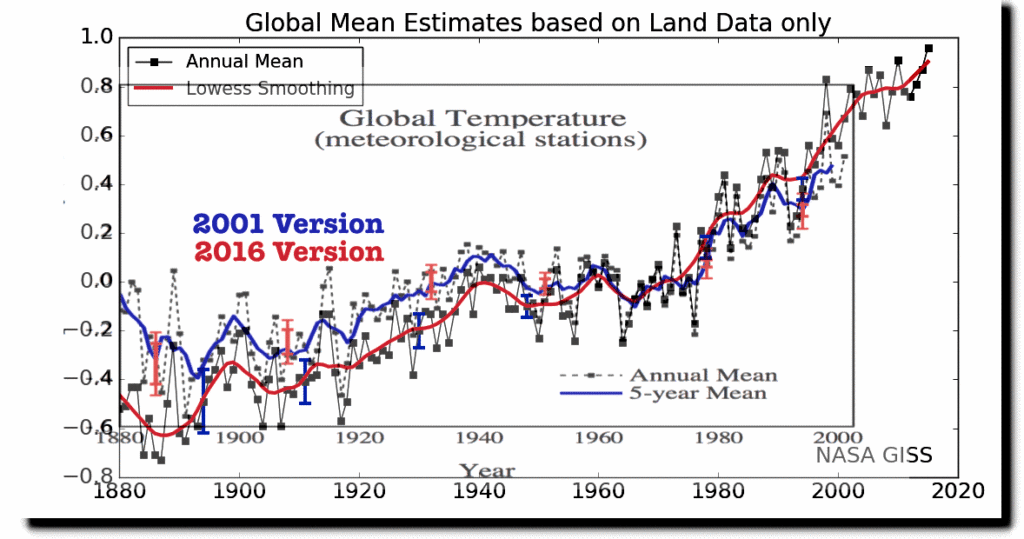
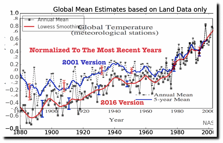
In 2001, NASA graphs showed 0.5C warming from 1880 to 1998. Now they show 1.1C warming during that same period. The image below overlays the two NASA graphs, with the colors shifted in the 2001 version for clarity.
Gavin Schmidt has more than doubled warming by altering the data. Even worse, Gavin has altered the data far outside his own 95% confidence bounds. The 2001 confidence bounds are shown as the red vertical bars, and the 2016 confidence bounds are shown as the blue vertical bars. This is a smoking gun that Gavin’s data is fake, and his confidence intervals are meaningless.
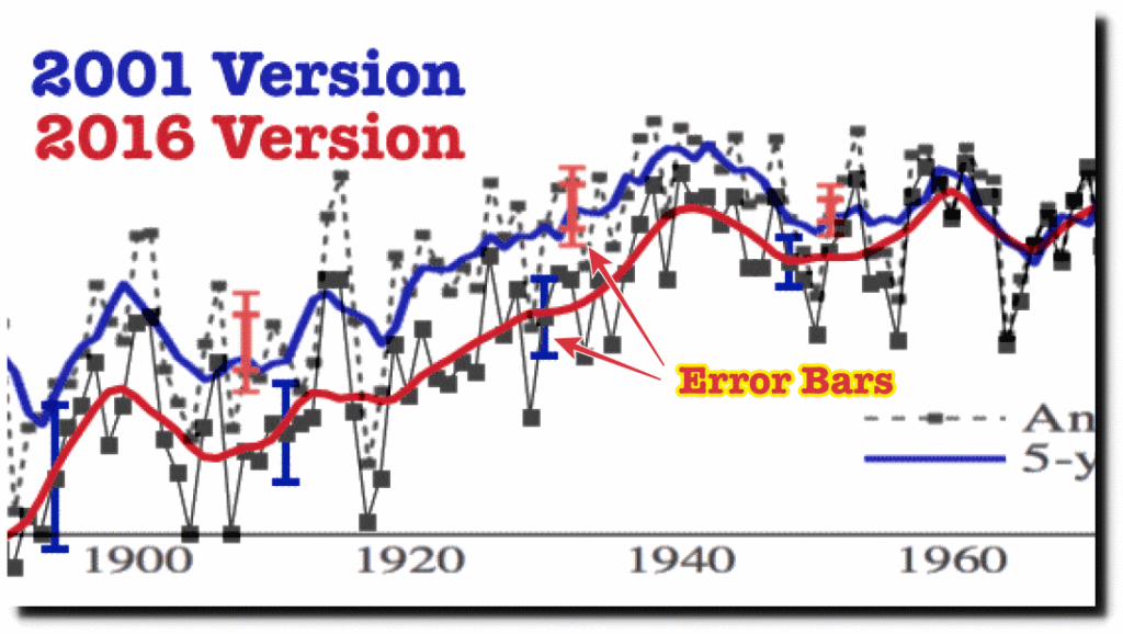
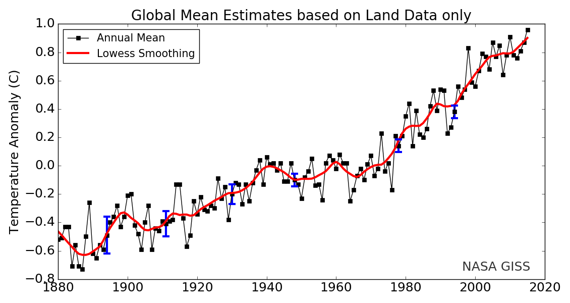
2016 version
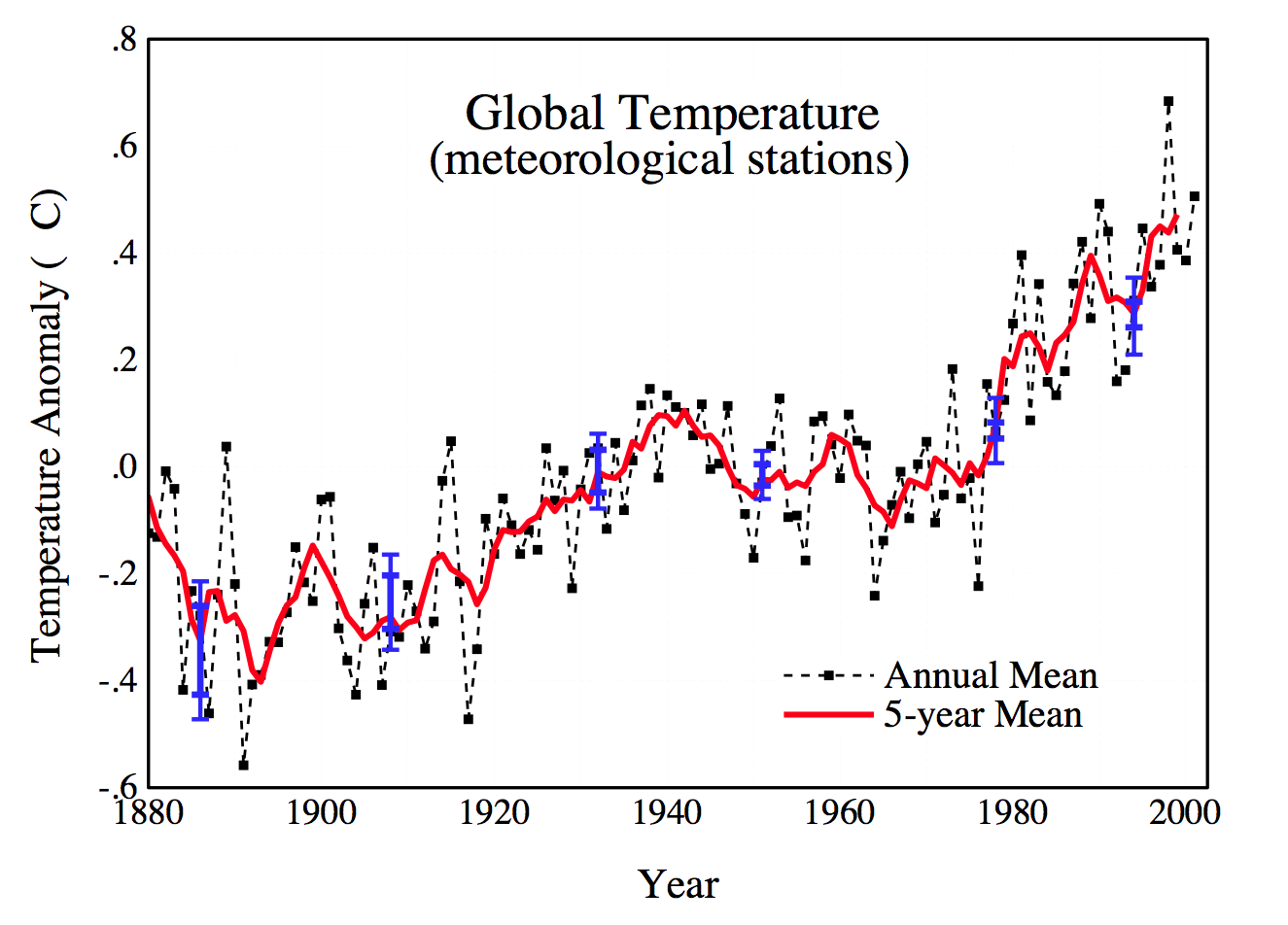
2001 version
But Gavin’s fraud is worse than it seems. He uses an optical illusion to minimize the appearance of tampering. By adjusting pre-197o temperatures down, and post-1970 temperatures up, the magnitude of the tampering is harder to see. In order to better visualize the fraud, I normalized the graphs to the five year mean of the most recent common years.
Global warming is the biggest scam in science history.
