
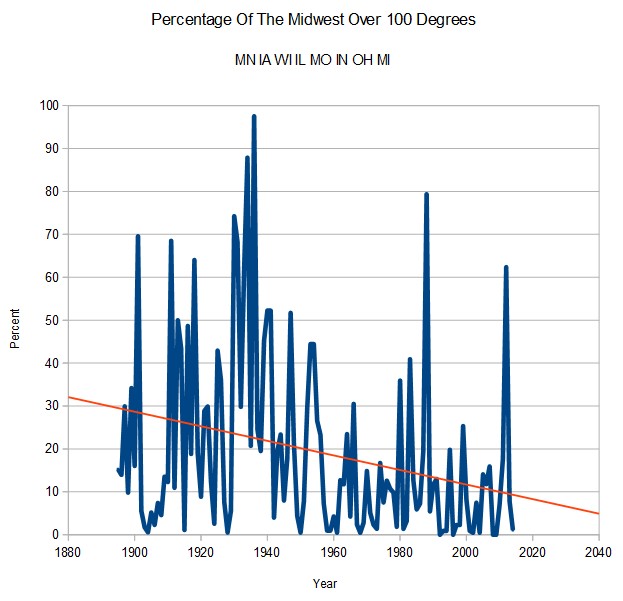
In the 19th century, about 30% of stations in the Midwest would reach 100 degrees every year. Now that figure is less than 10%. In 1936, almost every station in the Midwest reached 100 degrees.
Disrupting the Borg is expensive and time consuming!
Google Search
-
Recent Posts
- On The Road Again
- Vandalism At The Reflecting Pool
- Fifty Years Ago Today
- Truth Or Consequences
- US Climate Trend Maps
- Declining Spring Snow Cover In Northern New Mexico
- You Can’t Fool Mother Nature
- Cattle And The Climate
- One Atomic Bomb Per Hour
- New Video : Analyzing Oil And Gas
- Is Antarctica Melting?
- High Speed Analysis And Visualization
- El Nino To The Rescue?
- Fake News Update
- Growth Of Antarctic Sea Ice
- 65 Years Of Progress!
- El Nino To The Rescue?
- Worst March Drought On Record
- ChartGL Process Control Demo
- The Biggest Money Laundering Scam
- Drought In The Headwaters Of Lake Powell
- Unrealistic Expectations Of Water Availability
- Did Bill Gates Do This?
- Worst March Drought On Record In The US
- The Real Hockey Stick Graph
Recent Comments
- Bob G on On The Road Again
- Gordon Vigurs on On The Road Again
- Bob G on On The Road Again
- Gordon Vigurs on On The Road Again
- Bob G on On The Road Again
- Bob G on Vandalism At The Reflecting Pool


Thank you, Steven, for exposing climate change fraud.
Steven- what is the math behind the trend line?
Open office “Insert trend line”
OpenOffice Forum https://forum.openoffice.org/en/forum/viewtopic.php?f=9&p=145220
all about open office trend lines.
Those charts correlate very with the US corn crops. The years that spike are the years where there is a considerable reduction of the crop. Obviously there has been a down trend in that regard. More good news that alarmists don’t want to talk about.