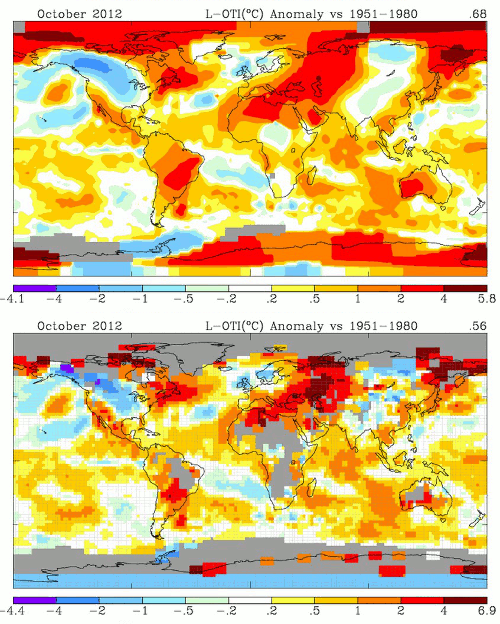
Note: Gray areas signify missing data.
Data.GISS: GISS Surface Temperature Analysis
Data.GISS: GISS Surface Temperature Analysis
Beyond all the usual upwards adjustments, Hansen upwards adjusted October an additional 0.12 C by coloring in missing data with his hot red and brown crayons. He also cleverly warmed the south pole by a few degrees.


“Little Red Writing Hood”
Brilliant!
🙂
Recent computer models demonstrate that if billions of taxdollars had NOT been wasted on green energy in the US in the last 4 years, enough generators could have been leased to heat every home without electricity in the NY/NJ area for a month in the aftermath of Sandy.
Or do something crazy like bury electrical cables underground.
It would be interesting to caculate that percentage area of above normal adjustment in areas with no data compared to the percentage of below normal adjustments in the same areas. Then compare percentage of above normal to below normal temps in areas where there is data. I think that result would be very revealing, probably a smoking gun.
More like a smoking cannon or shrapnel bomb.