
Disrupting the Borg is expensive and time consuming!

Google Search
-
Recent Posts
- Cattle And The Climate
- One Atomic Bomb Per Hour
- New Video : Analyzing Oil And Gas
- Is Antarctica Melting?
- High Speed Analysis And Visualization
- El Nino To The Rescue?
- Fake News Update
- Growth Of Antarctic Sea Ice
- 65 Years Of Progress!
- El Nino To The Rescue?
- Worst March Drought On Record
- ChartGL Process Control Demo
- The Biggest Money Laundering Scam
- Drought In The Headwaters Of Lake Powell
- Unrealistic Expectations Of Water Availability
- Did Bill Gates Do This?
- Worst March Drought On Record In The US
- The Real Hockey Stick Graph
- Analyzing The Western Water Crisis
- Gaslighting 1924
- “Why Do You Resist?”
- Climate Attribution Model
- Fact Checking NASA
- Fact Checking Grok
- Fact Checking The New York Times
Recent Comments
- Bob G on Cattle And The Climate
- Robertvd on Cattle And The Climate
- Bob G on Cattle And The Climate
- Robertvd on Cattle And The Climate
- Billyjack on Cattle And The Climate
- Bob G on Cattle And The Climate
- Robertvd on Cattle And The Climate
- Robertvd on Cattle And The Climate
- Robertvd on Cattle And The Climate
- conrad ziefle on Cattle And The Climate
Death spiral in the making! (sarc)
Hey! That;s great news. Vineyards spreadin out far and wide.
When Asian soot finally melts all the multi-year ice, that curve will bottom out. The limit is probably 10,000 km^3.
I want it this year. The hysteria from the CAGW d!ck-heads would be the funniest thing, especially when NOTHING really catastrophic follows.
Like watching a particularly ugly balloon deflate.
Where’s the nobhead Ellis these days?
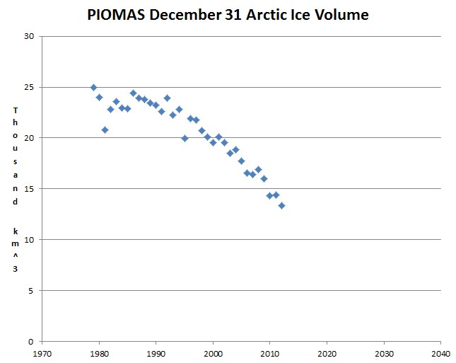
Maybe I’m the only one, who does not get it, but to me the trend shows there IS something going on with the Arctic ice. I mean, having the ice extent somewhere around median is nice, but according to the chart, ice is obviously getting thinner. Why is that?
PIOMAS is a model. They have corrected several times to avoid the embarrassing
earlier-than-expected-zero-model-volume-yet-real-cold-touchable-cubic-kilometers-of-ice scenario.
http://wattsupwiththat.com/2011/06/28/piomas-arctic-sea-ice-volume-model-corrected-still-appears-suspect/
That explains it. I thought it was real (well, as real as you can get) data. Thanks a lot.