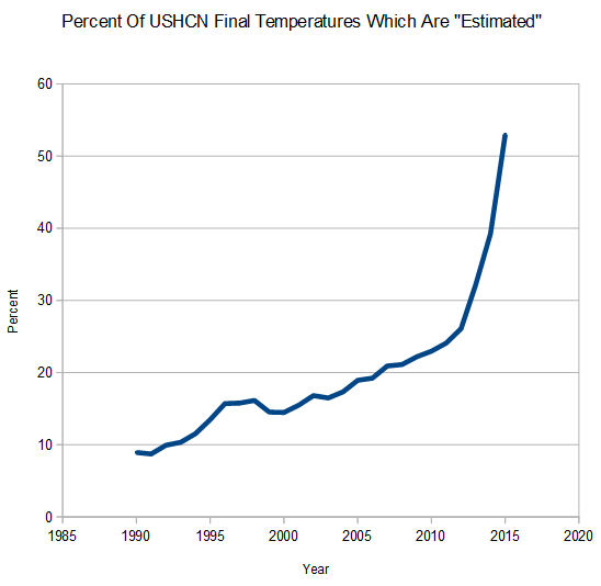
100% Of Reported US Warming Since 1990 Is Fake

The animation below flashes between the average of measured adjusted USHCN temperatures, and the estimated (infilled) ones – which are marked with an “E”

As you can see, all US warming since 1990 is due to infilling fake data. And even the measured zero warming temperatures have been tampered with using various other adjustments.
USHCNFakeVsAdjusted

USHCN is losing data at a spectacular rate over the last three years, with more than 50% of the 2015 data marked as estimated, and nearly 40% of the 2014 data marked as estimated.

ScreenHunter_6754 Feb. 04 07.19

Temperature analysis  reported by NCDC to 0.01 degrees are scientific malfeasance. They probably aren’t accurate within 1.0 degrees.
Posted in Uncategorized | 20 Comments

NCDC Data Fabrication Is Skewed Towards Warming

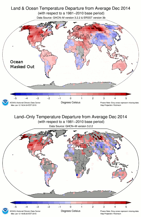
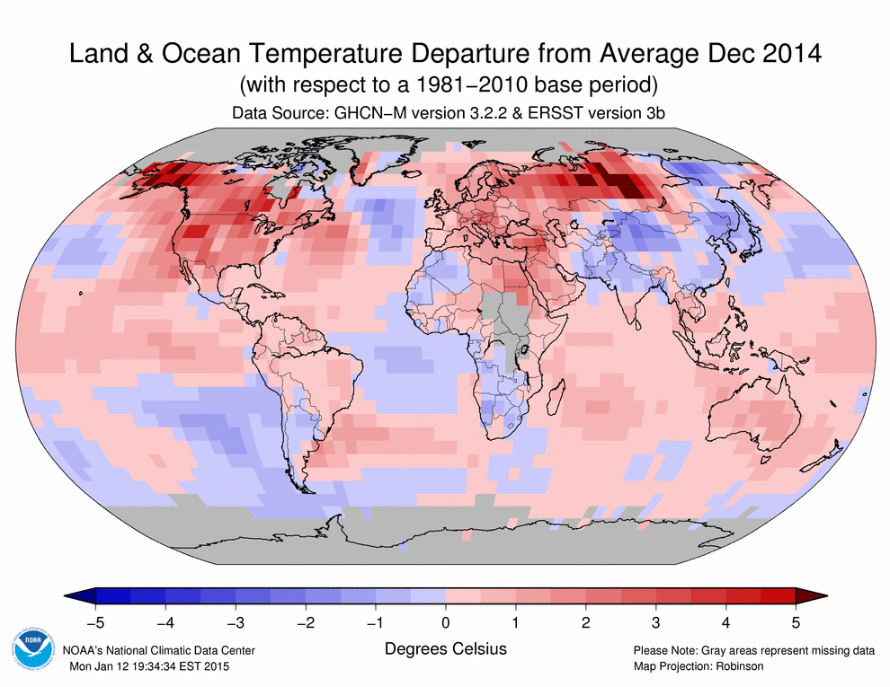
NCDC publishes lots of bright red maps like this one, where most of the surface temperatures are fake.

201412 (4)

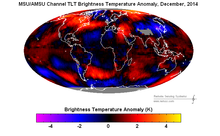
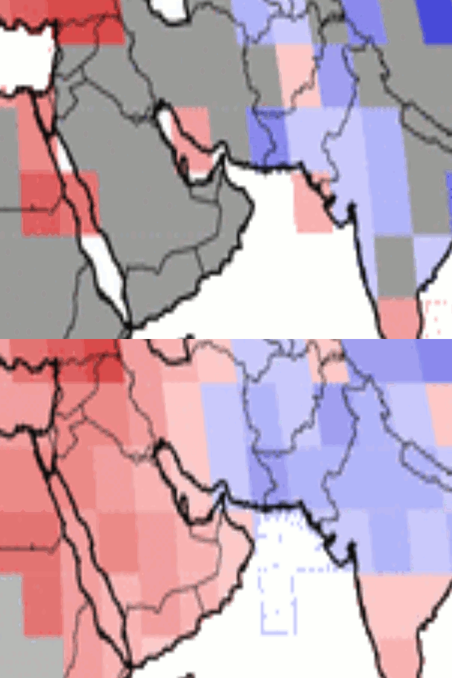
The animation below flashes between the measured and reported data. In December, 2014 they turned Saudi Arabia red hot without a single thermometer reading in the country, despite the fact that most of the measured data in the region was below normal.

NCDCSaudiArabiaDecember2014

Satellite data showed that most of Saudi Arabia was cooler than normal in December

ch_tlt_2014_12_anom_v03_3 (1)


ScreenHunter_6755 Feb. 04 07.33

NCDC creates fake temperatures for the majority of the land surface using an algorithm which skews temperatures upwards, then reports a record temperature by 0.02 degrees.

NCDCLandRealVsPublished

Scientific malfeasance doesn’t get much worse than this.

Posted in Uncategorized | 7 Comments

Odds Of Gavin And Tom’s Data Tampering Being Correct Are Close To Zero

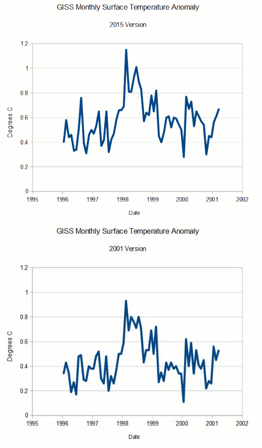
In my previous post, I showed the spectacular data tampering at GISS during the 1990’s. But it is much worse than it seems. GISS publishes a data set called Fig C which keeps the monthly temperature anomalies over a certain time window.

The animation below shows all of the overlapping months reported in the 2001 and 2015 data sets. As you can see, every single month except one has been adjusted upwards. The odds of that happening randomly are very close to zero.

GISSFigC2001-2015.txt

2001 version : FigC.txt
Current version : Fig.C.txt

I am reminded every day by alarmists that Anthony Watts and Judith Curry have criticized my work exposing this tampering, and I would appreciate these highly respected skeptics clearly setting the record straight about what they believe is incorrect about this analysis.

Posted in Uncategorized | 46 Comments

One Of My Favorite Videos

[youtube=https://www.youtube.com/watch?v=Uuzmub5PXNQ]

Posted in Uncategorized | 22 Comments

Gavin’s Spectacular Data Tampering In The 1990’s

Earlier today I showed Gavin’s spectacular data tampering before 1980, to create the lower half of the hockey stick.

NASANorthernLatititudes1981-1999-2015

1981 version : 1981_Hansen_etal_1.pdf
1999 version : 1999_Hansen_etal_1.pdf
Current version : Fig.B.gif (407×678)

But that is only half of the hockey stick. Some of Gavin’s finest tampering is done in the 1990’s data.

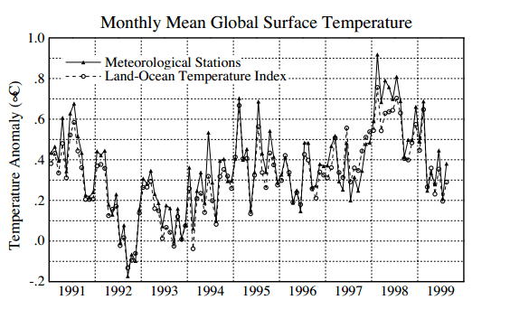
Hansen 1999 showed no net warming during the 1990’s

ScreenHunter_6734 Feb. 03 21.33

pubs.giss.nasa.gov/docs/1999/1999_Hansen_etal_1.pdf

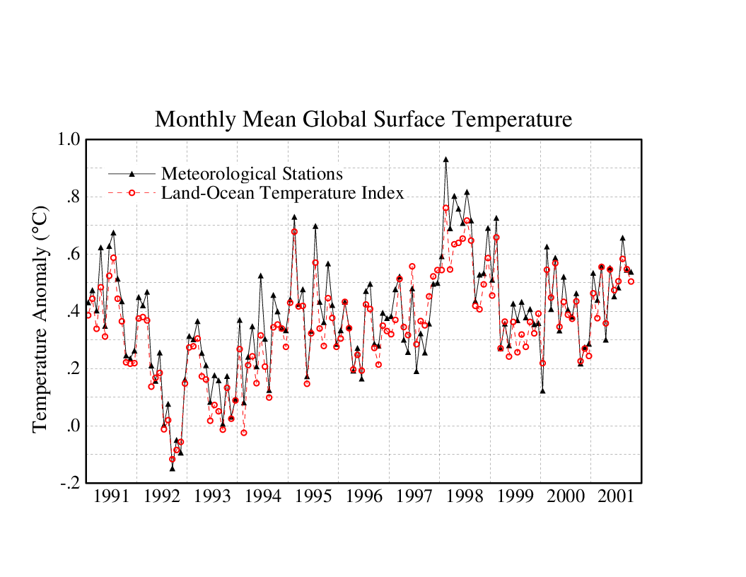
In 2001, the GISS website also showed no net warming during the 1990’s

FiG.C.2001

NASA Goddard Institute: Surface Temperature: Graphs

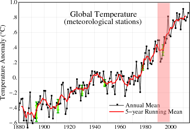
But GISS now shows the 1990’s as the fastest warming decade.

PaintImage66

They built the rest of the hockey stick by simply making up data.

This image shows how the 1990’s station data has been altered since Hansen 1999.

ScreenHunter_6746 Feb. 04 05.46

The animation below shows the spectacular alterations to GISS 1990’s surface between 2001 and 2015, tripling the warming during the decade.

GISSFigA2001-2015.gif

2001 : FigA.txt
Current : Fig.A.txt

We also know that the post 2000 warming is fake, because none of the other data sets show any warming post 2000.

In summary, the entire blade of the hockey stick is a fraud, from one end to the other.

Posted in Uncategorized | 33 Comments

All Hawaiian Children Get Named Hussein

ScreenHunter_930 Feb. 03 18.53

Posted in Uncategorized | 17 Comments

Learning To Support Terror Like A Progressive

ScreenHunter_929 Feb. 03 18.51

Posted in Uncategorized | 24 Comments

More Workplace Violence From The Religion Of Peace

President Obama says these people are not terrorists

ScreenHunter_6733 Feb. 03 11.49

Posted in Uncategorized | 49 Comments

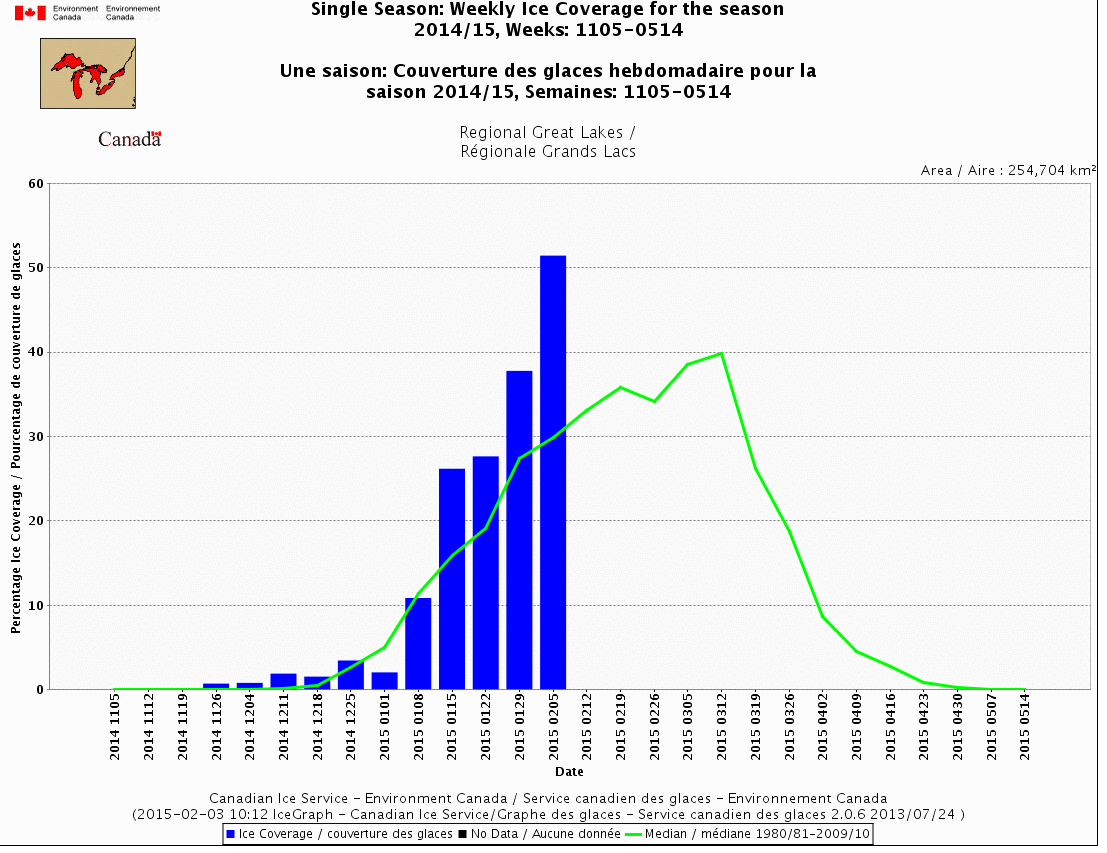
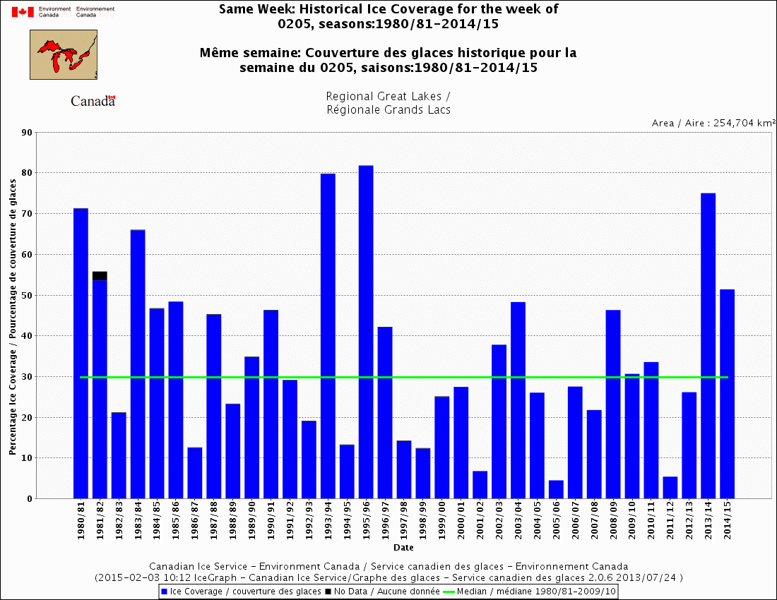
Great Lakes Ice Cover Far Above Normal Again

Great Lakes ice cover has been above normal five of the last seven years, and seven of the last thirteen years. It is already far above the normal annual maximum, with another month of growth left.

ScreenHunter_6732 Feb. 03 11.3520150202180000_CVCSWCTGL_0008100042.gif (1100×850)

20150202180000_CVCHDCTGL_0008100047

20150202180000_CVCHDCTGL_0008100047.gif (1100×850)

Many experts claim the exact opposite, because their career depends on lying about the climate.

Posted in Uncategorized | 44 Comments

Hansen and Schmidt Removing The 1940’s Blip

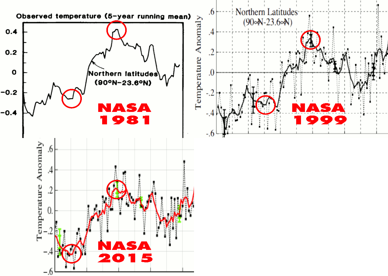
In 1981, Hansen reported high temperatures at the Northern Latitudes (23.6N – 90N) around 1940, followed by a strong cooling. But that didn’t support the theory, so NASA’s finest simply made the 1940’s blip disappear through repeated data tampering.

NASANorthernLatititudes1981-1999-2015

1981 version : 1981_Hansen_etal_1.pdf

1999 version : 1999_Hansen_etal_1.pdf

Current version : Fig.B.gif (407×678)

They climategate team didn’t like the 1940’s blip, so they disappeared it.

From: Tom Wigley <[email protected]>
To: Phil Jones <[email protected]>
Subject: 1940s
Date: Sun, 27 Sep 2009 23:25:38 -0600
Cc: Ben Santer <[email protected]>

It would be good to remove at least part of the 1940s blip, but we are still left with “why the blip”.

di2.nu/foia/1254108338.txt

Posted in Uncategorized | 21 Comments