NCDC shows 2012 as the most extreme year in US history, when in fact it was one of the least extreme years in US history.
The graph below is the NCDC graph, showing 2012 as the most extreme year, and 1936 as one of the least extreme years.

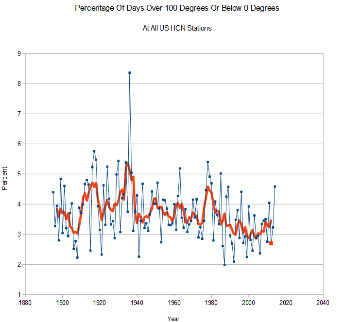
The next graph shows the actual percentage of days over 100 degrees or below 0 degrees F. The real graph is basically inverted from the NCDC graph, with 1936 as by far the most extreme year, and 2012 as one of the least extreme years. Extreme temperatures have been on a steady decline for 80 years.
 The level of fraud at NCDC seems to know no limits, with the climate extremes index as the crown jewel of their fake climate data.