The EPA has this graph on their website, based on the NCDC Climate Extremes Index
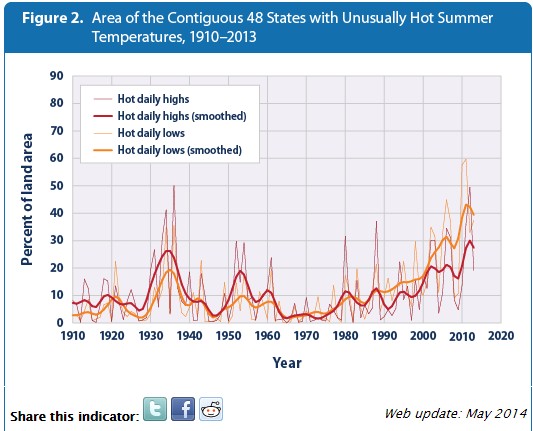
High and Low Temperatures | Climate Change | US EPA
It shows that the area of the US with hot daily summer temperatures is at record levels.
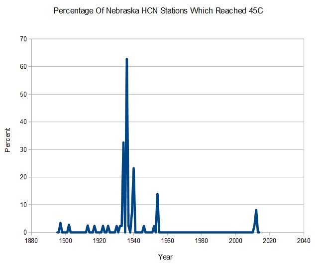
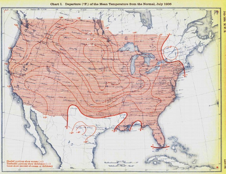
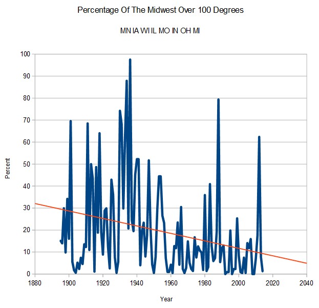
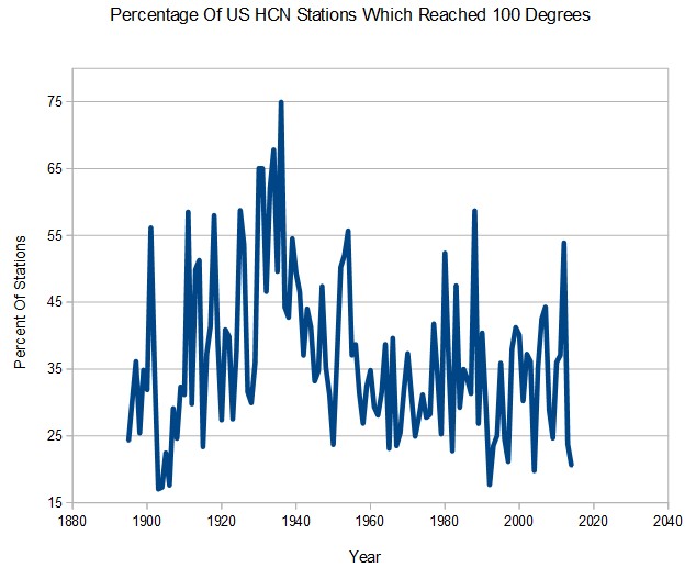
The graph is completely fraudulent. In fact it is inverted. Prior to 1960, the area of the US which reached 100 degrees during summer was quite a bit higher, and in 1936 seventy-five percent of stations reached 100 degrees. The percentage of the US reaching 100 degrees every year is much lower now, with 2014 close to a record low.
The EPA graph shows 2012 as the hottest, when in fact it wasn’t even in the top ten. They show 1936 at 50%, when in fact it was 75%.
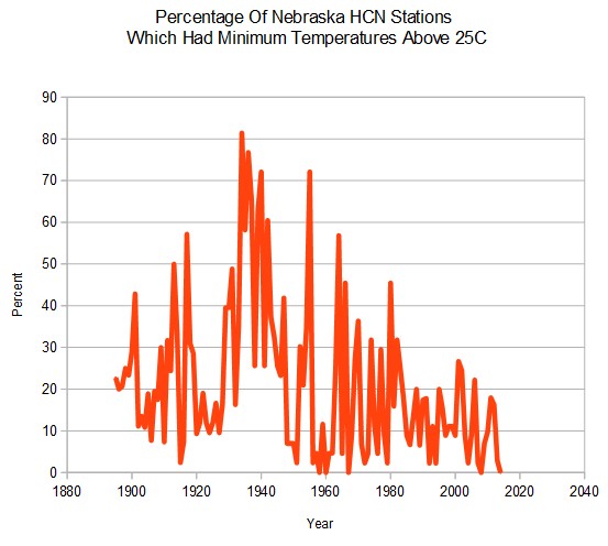
Next is the minimum temperature graph – again in sharp disagreement with the EPA graph.
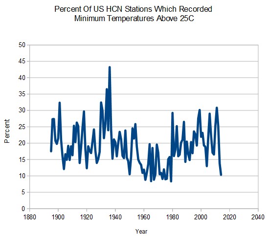
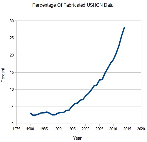
This metric is not affected by TOBS or homogenization. Apparently the good people at NCDC are simply fabricating numbers, because I used their thermometer data in this analysis.