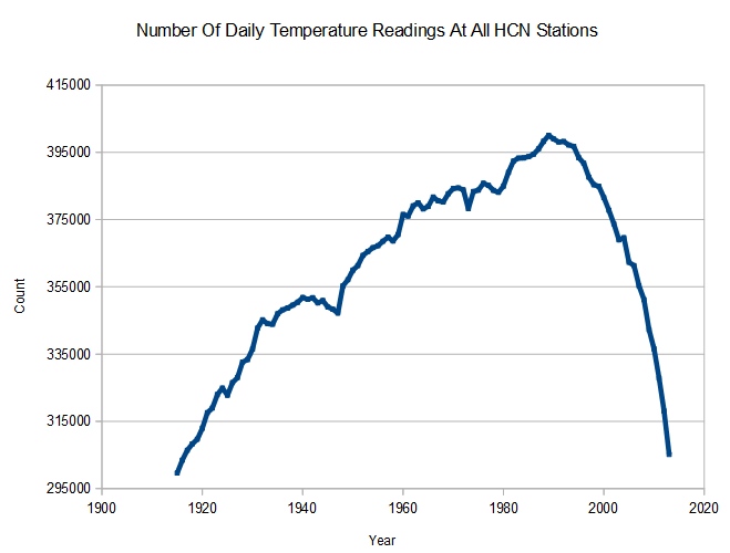
Zeke just can’t grasp what he is doing wrong. Around 1990, USHCN started losing a lot of mainly rural stations. Using their clever infilling and gridding, they turned those disappearing stations into urban stations – which created a huge spurious warming trend.
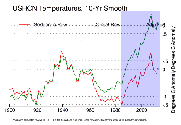
Zeke likes the meaningless green line.
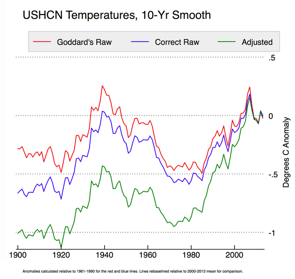
The Blackboard » How not to calculate temperatures, part 3
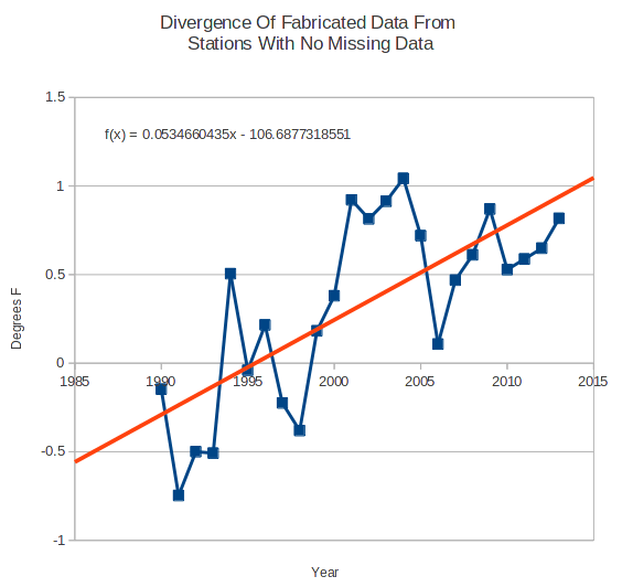
See the graph below. Essentially all of the warming since 1990 is due to fabricated (no underlying temperature records) data shown below in green – which strongly hints at cooler rural stations being lost, and their missing data being replaced by infilled urban data.
This is so blatantly obvious, that only a temperature expert couldn’t grasp it.
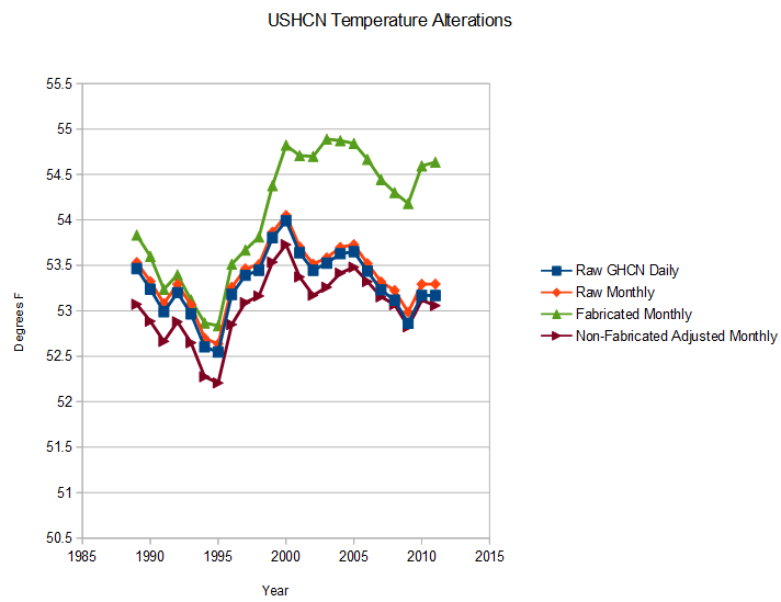
It is like dealing with anomaly/infilling/gridding zombies. Do they actually think that their large spike in temperatures after 1990, coinciding with their large spike in lost (mainly rural) stations – was coincidence?
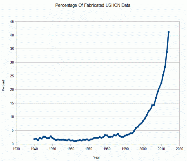
If you lose a cool rural station and replace the data with that from a warm urban station, it raises your average temperature. Now repeat over and over again several hundred times since 1990.
In the next graph, I normalized Zekes data properly, and highlighted the period of rapid station loss in blue. The huge spike in temperatures in the green line is due to garbage data handling practices, not warming.
Just say no to data tampering. This nonsense has to come to an end.