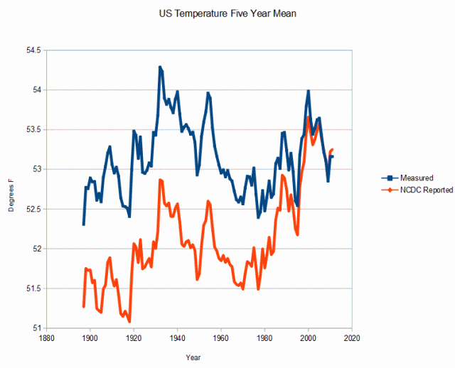
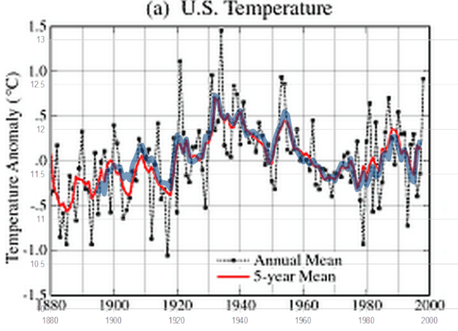
A few weeks ago, some stalker (named Brandon) claiming to be a skeptic was attacking me, saying that my data alteration graphs were incorrect because of how I chose to normalize the data. Had he passed high school algebra, he would have known that the slope of a line is independent of the offset, but here is a quick primer.
The graph below shows Hansen 1999 in blue, and current GISS in red. The graphs are normalized to the five year mean of the most recent common years, and show how they have cooled the past by almost 0.4C, just since 1999.
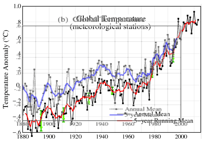
fig1x.gif (500×182)
Fig.A.gif (656×446)
In order to fool simple minded people like Brandon, NOAA/NASA do a nature trick. The graph below shows the two graphs normalized to an anomaly of zero. Note how they cleverly split the tampering between almost -0.2C in the 1880’s, and almost +0.2C in the late 1990’s. This creates the illusion that their tampering isn’t so bad. But it still adds up to almost 0.4C, and is just a way to hide the magnitude of their data crimes.
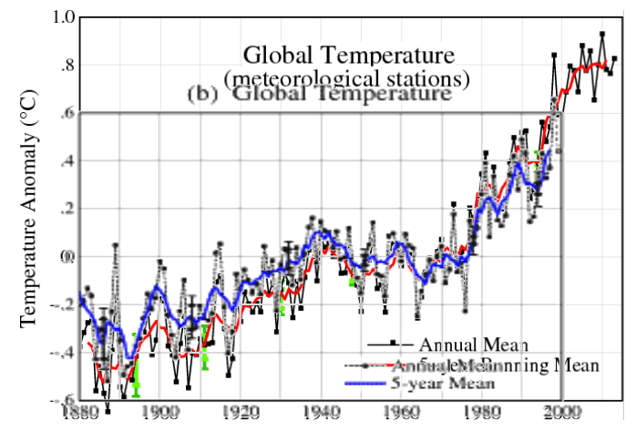
Using a common baseline of zero is meaningless mathematically, because they have cooled past temperatures during the baseline period. In order to see the magnitude of the tampering, the best methodology is to normalize the most recent five year mean temperatures, as in the top graph.