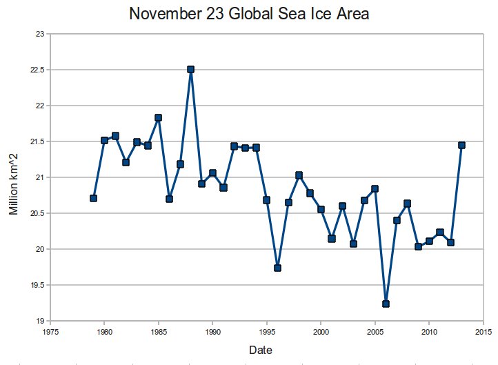
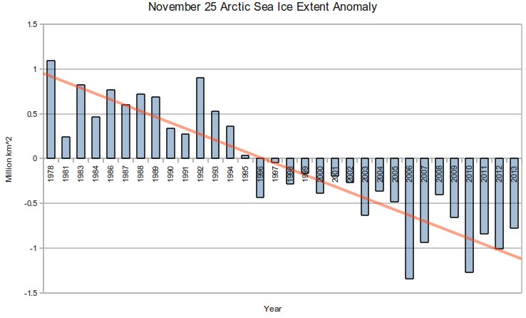
NSIDC cleverly starts their graphs in 1978, the year of peak Arctic ice. This creates the impression that there is a linear downwards trend.
Index of /DATASETS/NOAA/G02135/north/daily/data/
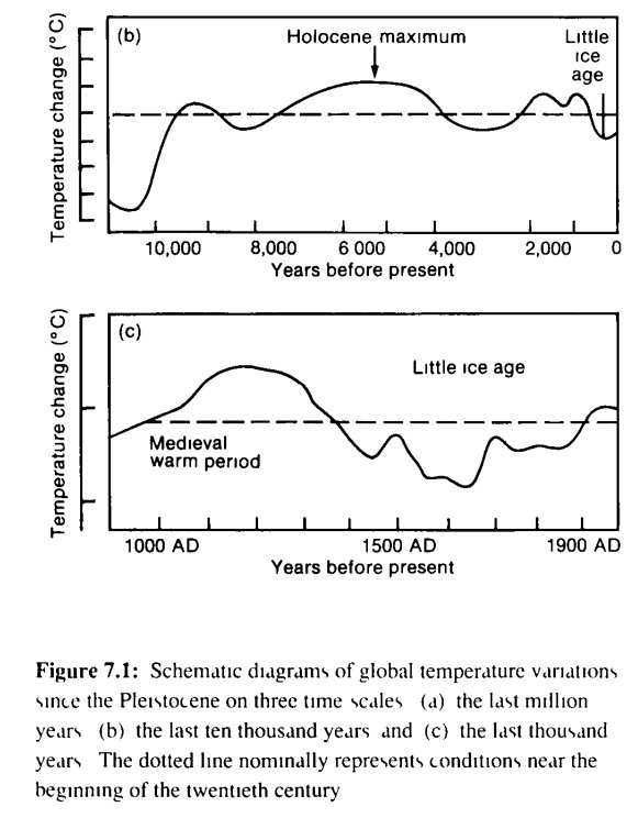
What NSIDC is hiding is that there were satellite measurements much earlier than 1978, which showed that 1978 was the peak ice extent. The graph below is from the 1995 IPCC report. I added the red circle to show NSIDC’s misleading start date.
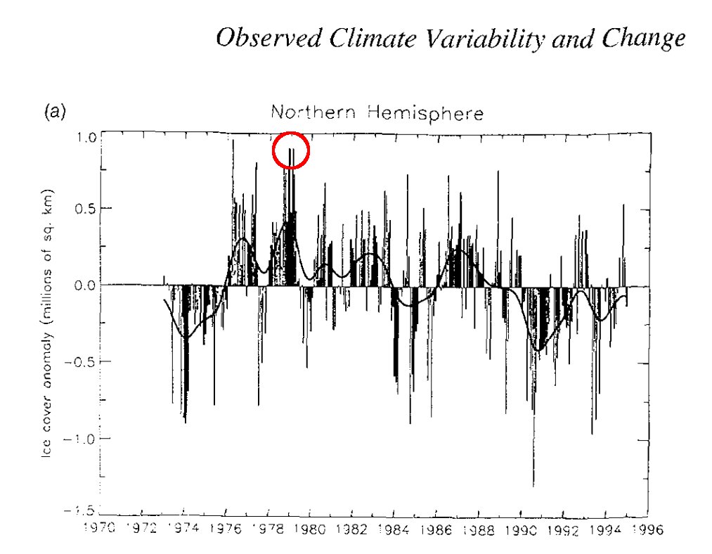
Note that 1974 had about the same anomaly as the current value (top graph) indicating that there has been no long term change in Arctic sea ice extent through the entire satellite record.
Most people who made it past high school would understand that you can’t claim a linear trend based on a plot of one leg of a cyclical function.