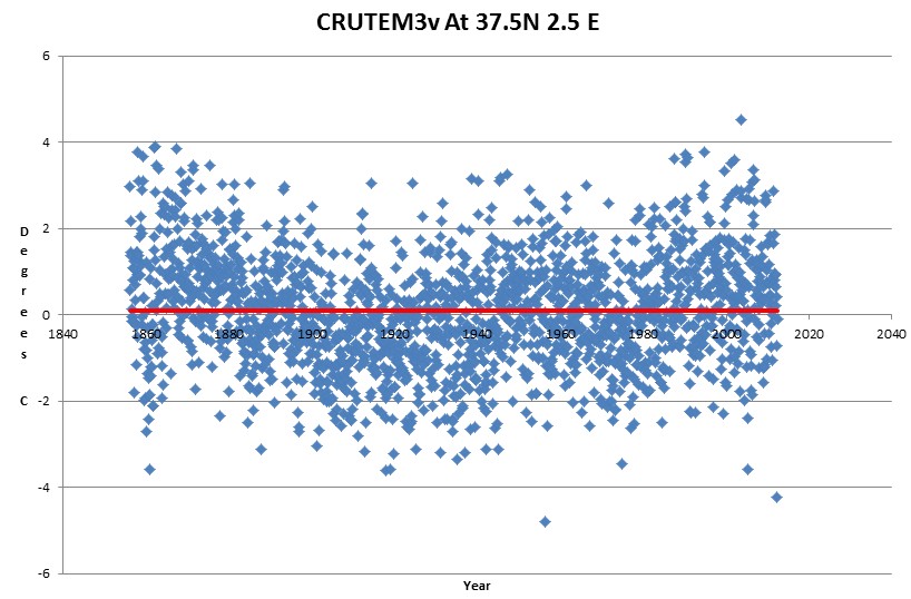
We have comments insinuating that my graphs are wrong. Prove it.
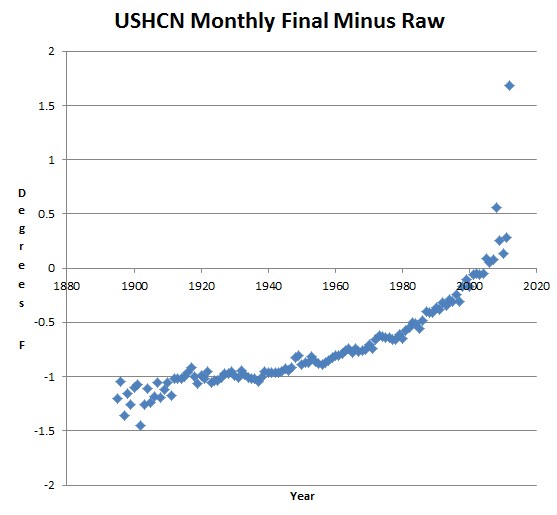
Data is here.
ftp://ftp.ncdc.noaa.gov/pub/data/ushcn/v2/monthly/9641C_201208_F52.avg.gz
ftp://ftp.ncdc.noaa.gov/pub/data/ushcn/v2/monthly/9641C_201208_raw.avg.gz
***"fully adjusted temperature series"***

  - "9641C_YYYYMM_F52.avg.gz" if you want the average of fully-adjusted monthly mean maximum and minimum temperatures (with estimates for missing values).

***"raw (unadjusted) temperature series"***

    - "9641C_YYYYMM_raw.avg.gz" if you want the average of monthly mean maximum and minimum temperatures that are not bias adjusted.

ftp://ftp.ncdc.noaa.gov/pub/data/ushcn/v2/monthly/readme.txt
The correction is much larger than they admit.
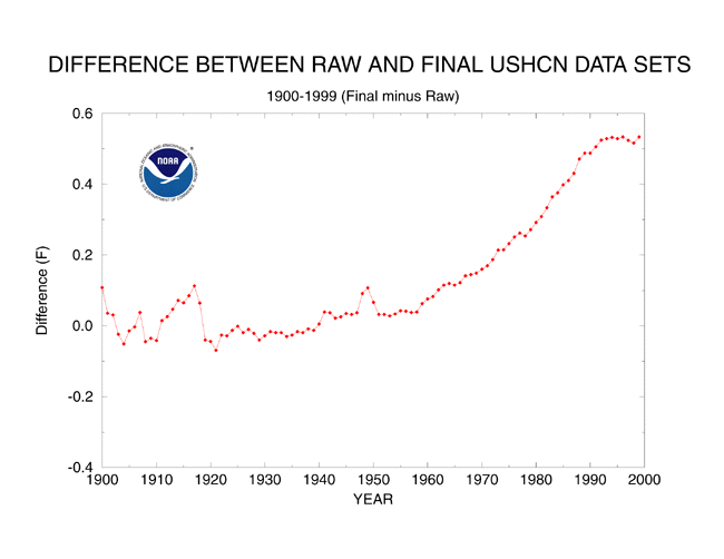
ts.ushcn_anom25_diffs_urb-raw_pg.gif (650×502)
It is interesting reading the comments below. Typical alarmist strategy. They come here and boldly lie about every aspect the discussion.