My YouTube account was skyrocketing in a hockey stick, with nearly six million views in the past four weeks. So YouTube has quite predictably shut me down.
My YouTube account was skyrocketing in a hockey stick, with nearly six million views in the past four weeks. So YouTube has quite predictably shut me down.
Hi, everyone.
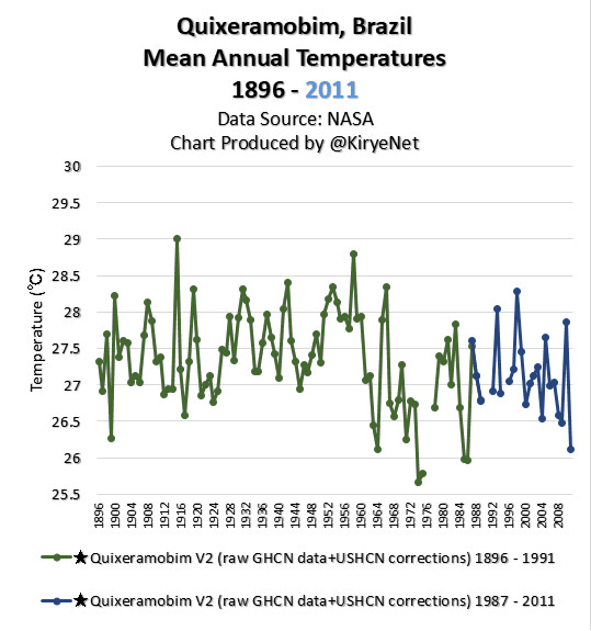
Here is an animation chart for mean annual temperatures in Quixeramobim, Brazil.

As you can see, GHCN V3 Unadjusted data show Quixeramobim had a cooling trend since 1896, while V4 Unadjusted data show a warming trend.
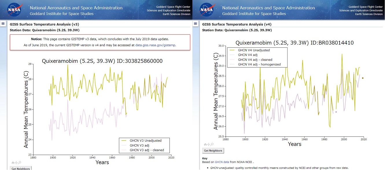
According to NASA, both are unadjusted data, but they aren’t in agreement.
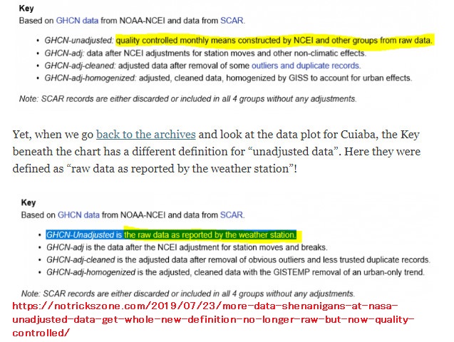
To make matters worse, as I tweeted July 21 2019, NASA used to claim that GHCN-Unadjusted is the raw data as reported by the weather station, but now they changed their explanatory text.
Once you see the post, you can easily see what I mean right away.
Then, let’s look at the GHCN V2 data set.

?Data Source: (1896 – 1991), (1987 – 2011)
As you know, NASA simply like changing their temperature data.