










Disrupting the Borg is expensive and time consuming!
Google Search
-
Recent Posts
- Three Years Since The Apocalypse
- Arctic Report card Summer 2026
- Elon Pushing Pushing Geoengineering
- Earth, Wind And Fire
- On The Road Again
- Vandalism At The Reflecting Pool
- Fifty Years Ago Today
- Truth Or Consequences
- US Climate Trend Maps
- Declining Spring Snow Cover In Northern New Mexico
- You Can’t Fool Mother Nature
- Cattle And The Climate
- One Atomic Bomb Per Hour
- New Video : Analyzing Oil And Gas
- Is Antarctica Melting?
- High Speed Analysis And Visualization
- El Nino To The Rescue?
- Fake News Update
- Growth Of Antarctic Sea Ice
- 65 Years Of Progress!
- El Nino To The Rescue?
- Worst March Drought On Record
- ChartGL Process Control Demo
- The Biggest Money Laundering Scam
- Drought In The Headwaters Of Lake Powell
September 2026 M T W T F S S 1 2 3 4 5 6 7 8 9 10 11 12 13 14 15 16 17 18 19 20 21 22 23 24 25 26 27 28 29 30 Recent Comments
- Tony Heller on Arctic Report card Summer 2026
- Bob G on Arctic Report card Summer 2026
- D. Boss on Arctic Report card Summer 2026
- Bob G on Elon Pushing Pushing Geoengineering
- Dave A on US Climate Trend Maps
- John Francis on Elon Pushing Pushing Geoengineering
- conrad ziefle on Elon Pushing Pushing Geoengineering
- Lonnie on Elon Pushing Pushing Geoengineering
California’s Fake Temperature Record
Using my new tool set, I am homing in on what is wrong with the California temperature record.
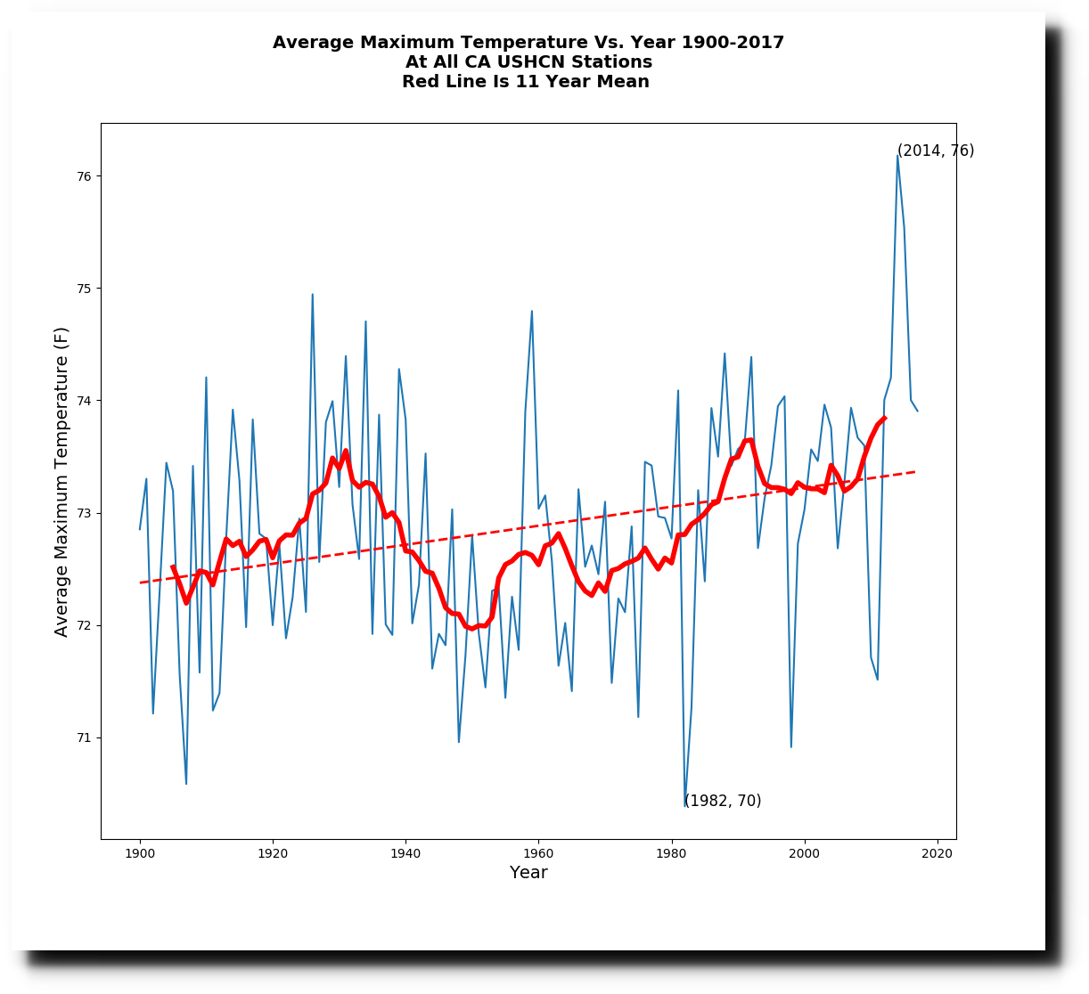
The first problem is just their usual data tampering, which doubles the slope. This is what the raw data looks like.
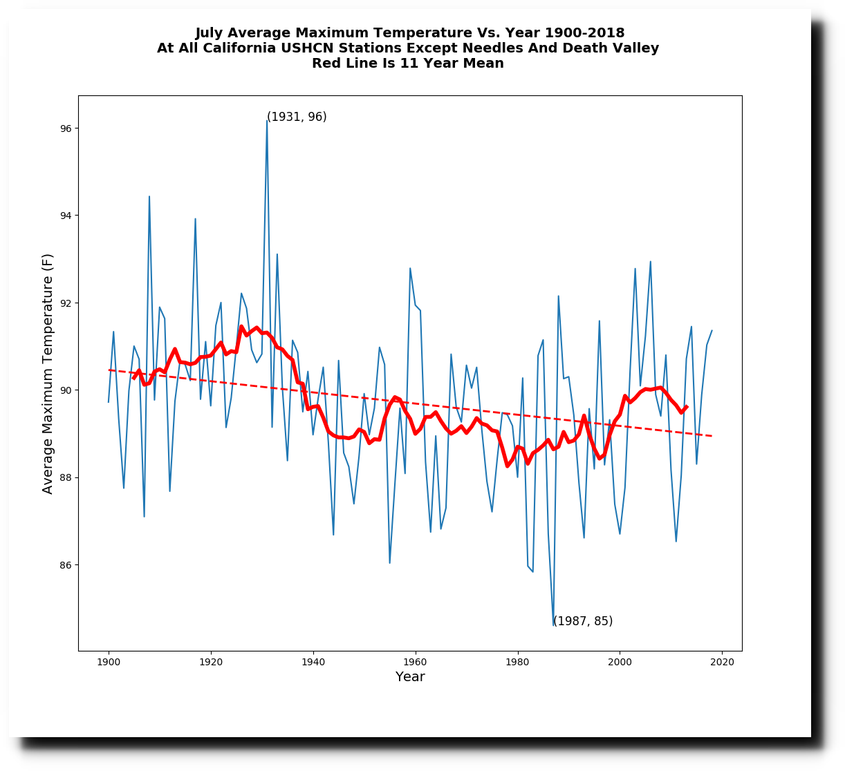
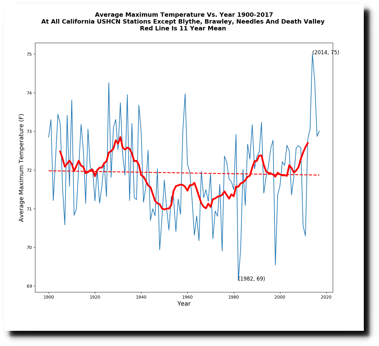
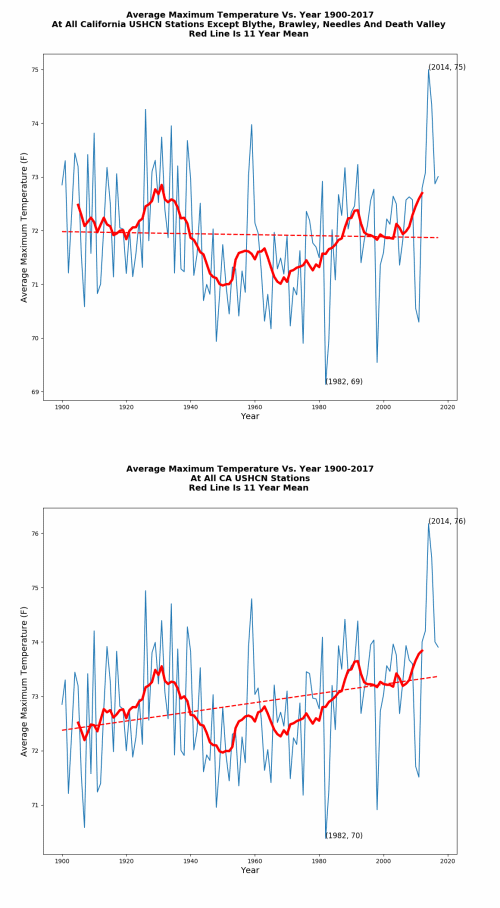
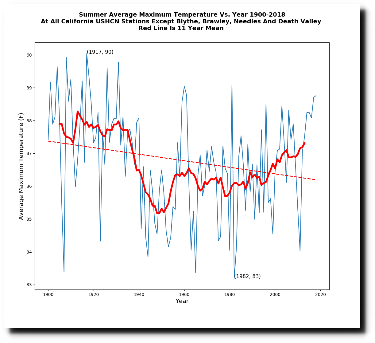
But the real dirty trick is that they successively added four hot stations over time, which pushed the temperature up on the right side of the graph. Brawley was added in 1910, Blythe was added in 1913, Needles was added in 1940, and Death Valley was added in 1961. If those stations are removed, then California maximum temperatures show no trend.
The animations below show how the successive additions of those four stations completely changed the California temperature graphs, and perverted science.
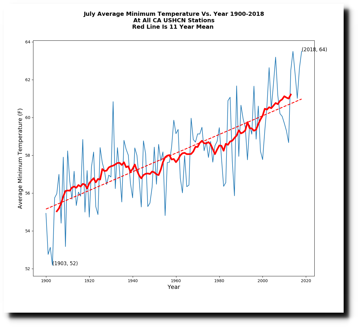
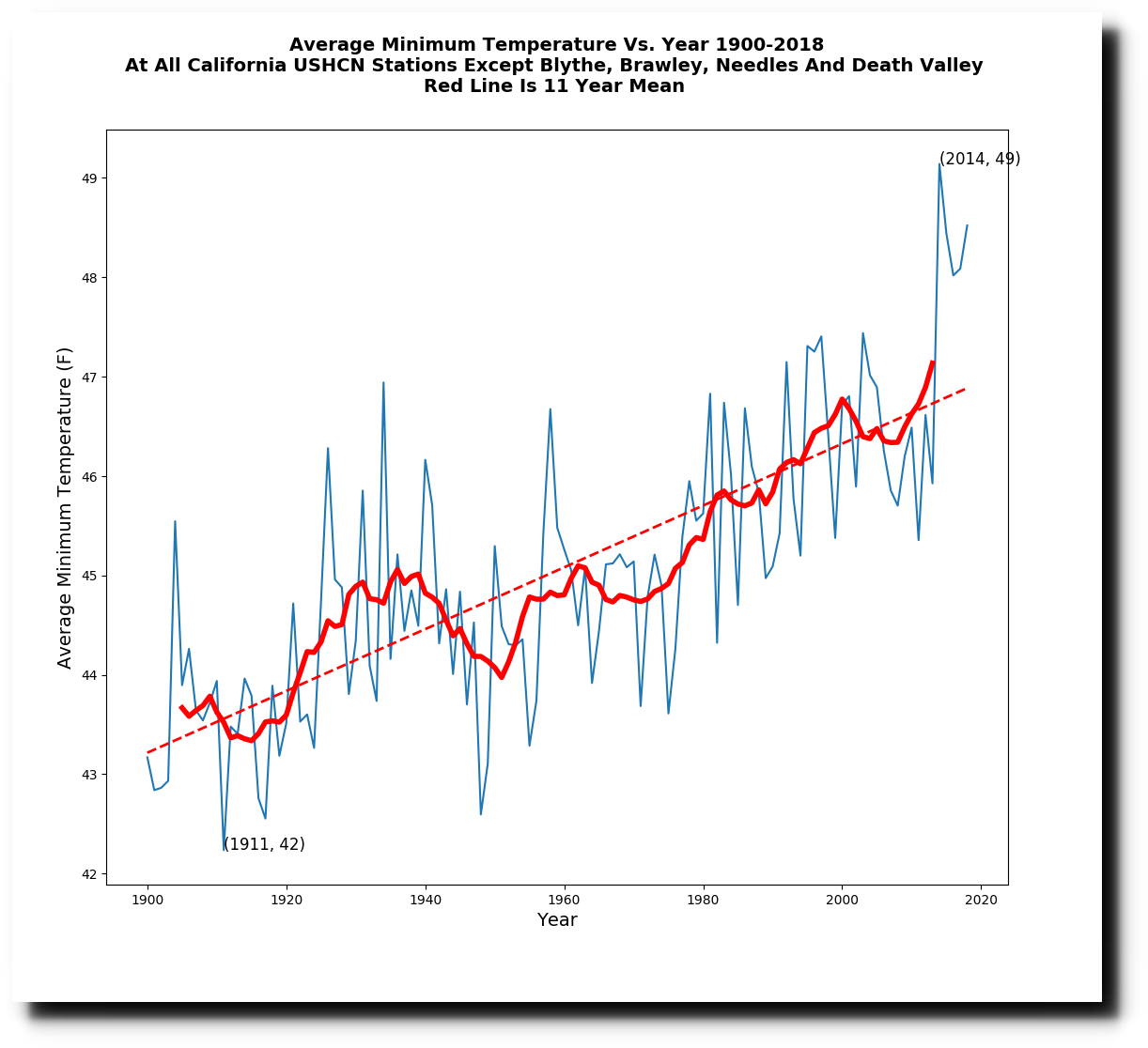
Minimum temperatures have increased, and I suspect this is primarily due to Urban Heat Island effects. I will be looking at this more soon.
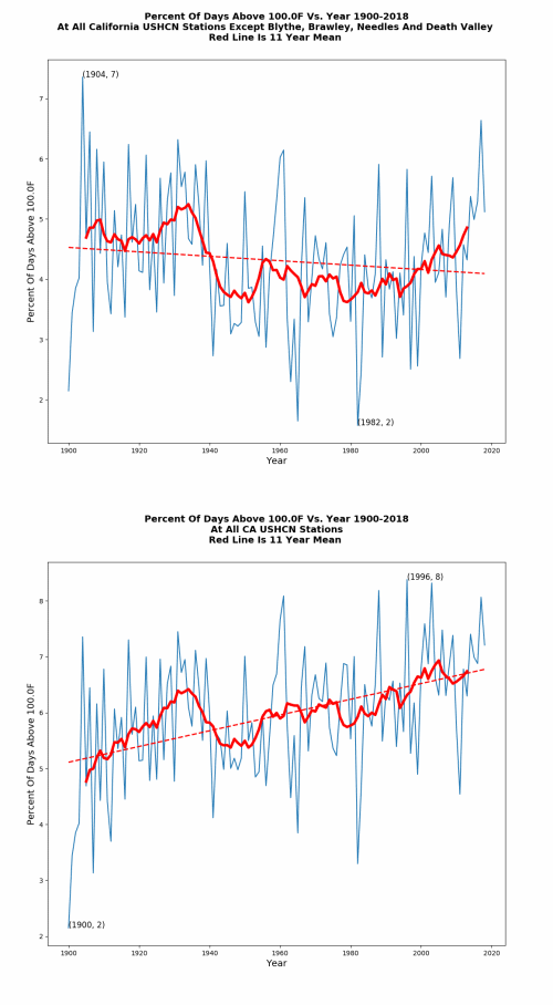
The spike in 2014 was due to the El Nino, and primarily affected winter temperatures. Without the four hot stations corrupting the trend, California summers have cooled sharply since the 1920’s.
Posted in Uncategorized
Leave a comment
New Ice-Free Arctic Date
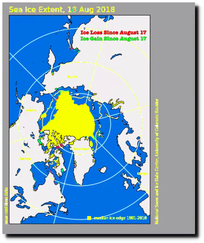
Like the day before, there was almost no change in Arctic sea ice extent yesterday.
Index of /DATASETS/NOAA/G02135/north/daily/images/2018/08_Aug/
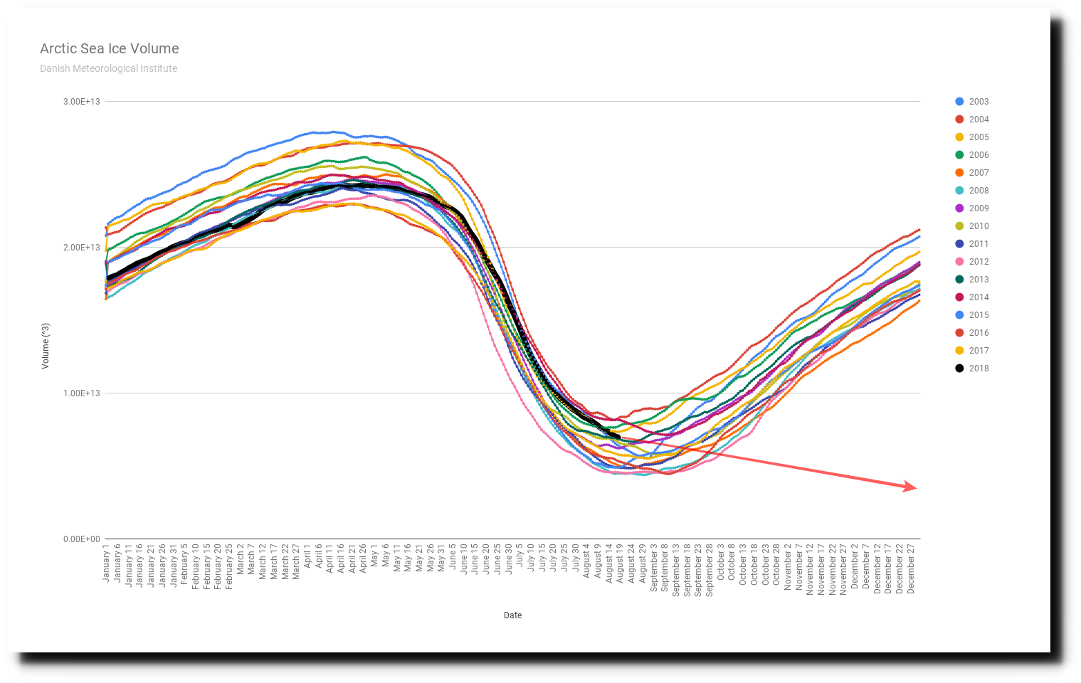
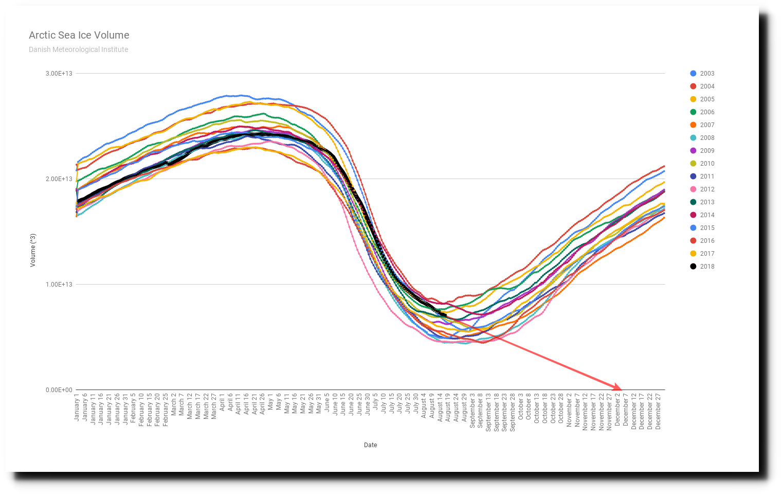
Nevertheless, at current volume melt rates, the Arctic will be ice-free on December 7, 2018 at 3:41 PM.
Posted in Uncategorized
Leave a comment
Advances In Climate Science Since the 16th Century
None.
In Shakespeare’s time, it was assumed that human actions affected weather
Symbolism of Weather in Macbeth by Dominic Denofrio on Prezi
Posted in Uncategorized
Leave a comment
Party Is Over In The Arctic
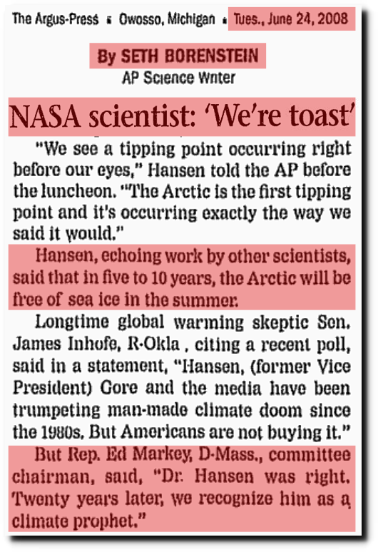
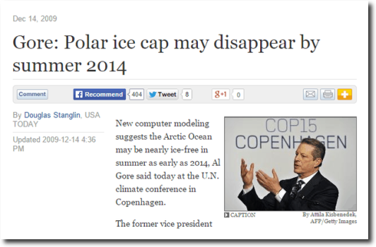
Ice conditions are not looking good for Reggie, James and Al.
Index of /DATASETS/NOAA/G02135/north/daily/images/2018/08_Aug/
Summer is over at the North Pole.
Ocean and Ice Services | Danmarks Meteorologiske Institut
And nothing but cold in the forecast.
Posted in Uncategorized
Leave a comment
The July 1915 Heatwave At Yosemite National Park
During the week of July 19-25, 1915, afternoon temperatures at Yosemite National Park headquarters were over 110 degrees every day, averaged 112 degrees, and peaked at 115 degrees on July 20.
The only other year when Yosemite reached 110 degrees was a year earlier in 1914 – and in 1913, Death Valley, CA set the world’s record temperature of 134 degrees.
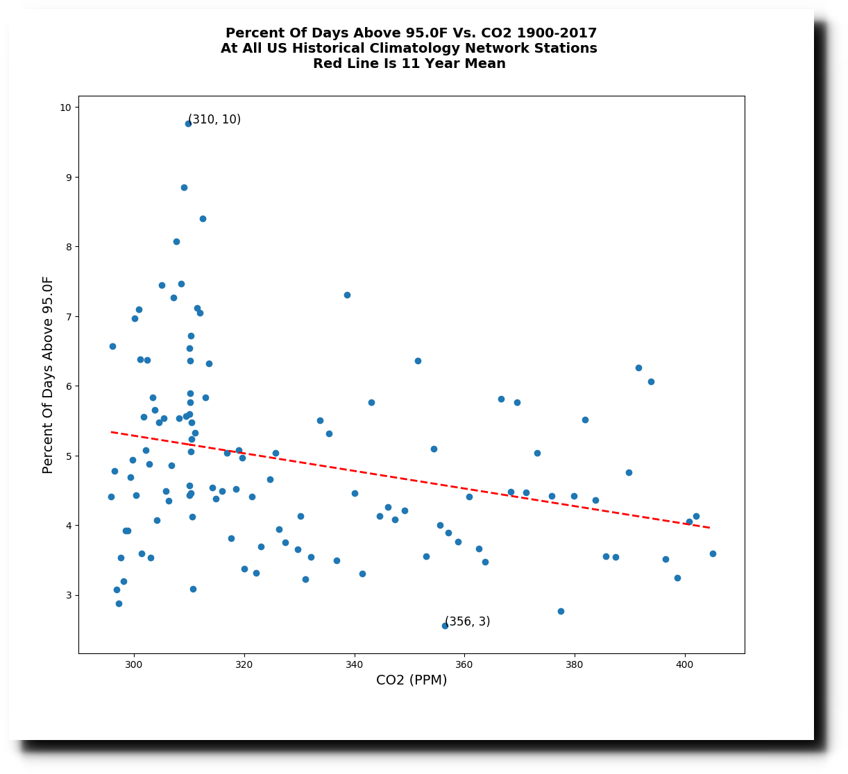
California was very hot when CO2 levels were low, but that certainly doesn’t stop climate scientists from lying about the non-existent relationship between heatwaves and atmospheric CO2.
Posted in Uncategorized
Leave a comment
Something Very Rotten In California
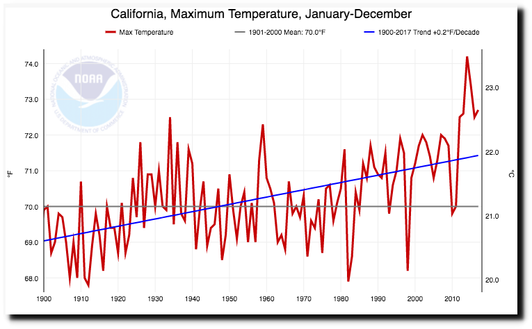
I have hesitated to discuss California temperatures until I had tools in place to analyze it properly, and I do now. NOAA shows maximum temperatures in California rising rapidly, and particularly a big jump after 2012.
Climate at a Glance | National Centers for Environmental Information (NCEI)
The actual average maximum thermometer data shows no net change over the past century prior to 2012, but a big jump over the past six years. (I excluded Death Valley from this analysis, because they started reporting in the 1960’s and cause a fake long term warming bias on the right side of the graph.)
However, something is seriously wrong. There are 53 USHCN stations in California, and only nine show warming since 2012, but thirty-one stations show cooling since 2012. Whatever is causing the post-2012 spike is not real. It must be something along the lines of cooler stations not reporting as many days as the warmer stations. I haven’t figured it out yet, but am quite certain that whatever is causing the recent spike in temperature is a data artifact.
Additionally, there are quite a few California stations which show long term cooling in their afternoon temperatures.
I no longer see any reason to believe California is warming.
Posted in Uncategorized
Leave a comment
Linear Thinking
Posted in Uncategorized
Leave a comment


