

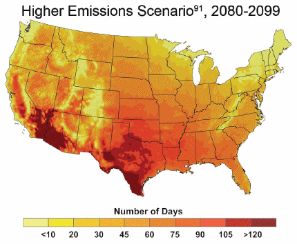
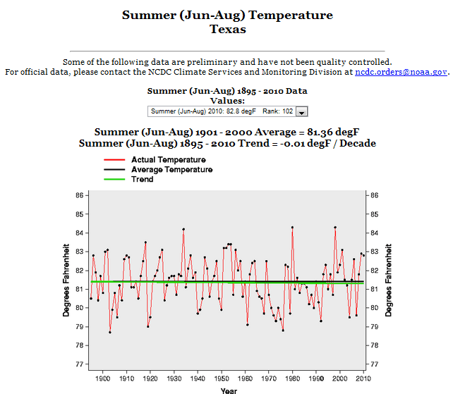
The National Academy of Sciences produced this map, claiming that Texas summers are going to get much hotter. This is in spite of the fact that Texas summers have not warmed for at least 120 years.
Disrupting the Borg is expensive and time consuming!
Google Search
-
Recent Posts
- One Atomic Bomb Per Hour
- New Video : Analyzing Oil And Gas
- Is Antarctica Melting?
- High Speed Analysis And Visualization
- El Nino To The Rescue?
- Fake News Update
- Growth Of Antarctic Sea Ice
- 65 Years Of Progress!
- El Nino To The Rescue?
- Worst March Drought On Record
- ChartGL Process Control Demo
- The Biggest Money Laundering Scam
- Drought In The Headwaters Of Lake Powell
- Unrealistic Expectations Of Water Availability
- Did Bill Gates Do This?
- Worst March Drought On Record In The US
- The Real Hockey Stick Graph
- Analyzing The Western Water Crisis
- Gaslighting 1924
- “Why Do You Resist?”
- Climate Attribution Model
- Fact Checking NASA
- Fact Checking Grok
- Fact Checking The New York Times
- New Visitech Features
Recent Comments
- Bob G on One Atomic Bomb Per Hour
- conrad ziefle on One Atomic Bomb Per Hour
- Timo, Not that one on One Atomic Bomb Per Hour
- Bob G on One Atomic Bomb Per Hour
- Crispin Pemberton-Pigott on One Atomic Bomb Per Hour
- william on 65 Years Of Progress!
- arn on One Atomic Bomb Per Hour
- Gordon Vigurs on One Atomic Bomb Per Hour


Well, they’re gonna get hotter damnit, because we’re going to change the chart. So they’d better just start shaping up and reporting what we put on our graph!
OT, but speaking of data and cool science stuff, have you seen this, Steve?
http://skysurvey.org/
It’s a 37,440 exposure, 5 gigapixel image of the night sky 🙂
The end is near (less than 70 years). And that does not even take superduperexponential warming into account! Of course, the superduperexponential rate of warming for 0 is 0.