This Continues to show the Dishonset Bias in the Ice Extent Data Compared to their version of normal by the Government Funded Scienist Promoting Global Warming at http://nsidc.org!
IMO, Those at http://nsidc.org will do whatever it takes to make this look like anything, but an anomily in the Continued Decline of the Arctic Ice Sheet!
The obvious MO is to produce Government charts that are obvious BS, then have the snot nosed cub reporters for the Washington Post and New York Times drool all over them and say that anyone who disagrees is paranoid, anti science and a tool of big oil.
How does one put a stop to this? This is worse than 1984.

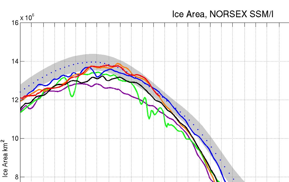
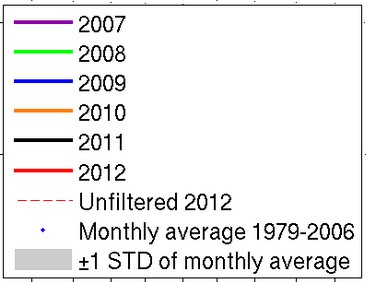


This Continues to show the Dishonset Bias in the Ice Extent Data Compared to their version of normal by the Government Funded Scienist Promoting Global Warming at http://nsidc.org!
‘ James L. Edwards (@patriotsrn1) says: ”
You beat me sort of to it.
Is NSIDC having measuring errors as their latest graph shows sea-ice heading closer to the 2007 line. That doesn’t appear to be right IMO?
http://nsidc.org/data/seaice_index/images/daily_images/N_stddev_timeseries.png
IMO, Those at http://nsidc.org will do whatever it takes to make this look like anything, but an anomily in the Continued Decline of the Arctic Ice Sheet!
The obvious MO is to produce Government charts that are obvious BS, then have the snot nosed cub reporters for the Washington Post and New York Times drool all over them and say that anyone who disagrees is paranoid, anti science and a tool of big oil.
How does one put a stop to this? This is worse than 1984.