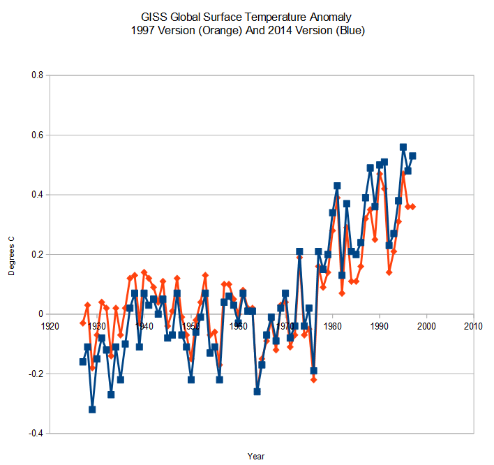
When our friends at NOAA and NASA do their data tampering, they pick a pivot point around the year 1960. Temperatures after 1960 get tampered upwards, and temperatures before 1960 get tampered downwards. The graph below shows changes to the GISS global surface record since 1997.
By splitting their data tampering around a central pivot point, it doesn’t look “all that bad”
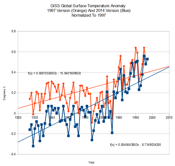
The next graph shows the identical data tampering, normalized to 1997. In this view you can more easily see the hockey stick of cheating which they have done just since 1997.
The pivot point is thus an essential part of this scam. It is a way of hiding the magnitude of their tampering.


Given all the data tampering, What I would like to know is are we in a ‘Pause’ or has the temperature started back down.
I realize a more meridional pattern jet stream gives us higher highs and lower lows and screwier weather making it harder to tell.
Looks a little closer to 1965 for that pivot…. and Gail, I think we’re certainly below the 30s, at least in the US. I think the tampering goes much further than what has been discovered.
The records for the US and Canada could not have been isolated to one continent.
http://icecap.us/index.php/go/new-and-cool/more_critique_of_ncar_cherry_picking_temperature_record_study/
There is also this:
http://www.sturmsoft.com/climate/suckling_mitchell_2000_fig2_3.gif
The Koppen climate classification via plants for the US Midwest. Look at the chart by decade at (200%) The 1990s are not the highest boundary and the 1970s are clearly well below the pack. Unfortunately it does not show this century.
Add that to the fall snow data http://www.ncdc.noaa.gov/sotc/service/global/snowcover-nhland/201310.gif
(If you change the number before .gif to the month like 01, 02, 11, 12 you can get the other six months)
It makes me think we have already turned the corner and are cooling.
Roy Spencer’s data is the only thing keeping me doubting that.
http://www.drroyspencer.com/latest-global-temperatures/
My experience on both sides of the Atlantic suggests that over the last 5 years it’s been cooling.
Ten or twelve years ago the places where I was had temperatures that seemed to coincide with ‘global warming’, and they had a recent history of warming. But now when the global temperatures continue to be the “hottest ever”, my own locations seem to have become detached from all of this, as if they had formed a separate island of their own. (At least that’s one way of looking at it.)
I would urge anyone interested in GIStemp to read E.M. Smith’s blog: http://chiefio.wordpress.com/gistemp/
Not only have the temperature data been faked (I am sorry, but “adjusted fails to convey the magnitude of their fraud) but E.M. found many instances where certain stations seemed to be systematically removed from the global calculations. What kind of stations, you say? Higher altitude (cooler) stations disappear while jungle and beach stations remain. The high beach temperatures are then used to infer the temperatures of what should be cooler areas. Imagine all the mountain readings of Bolivia removed and a coastal station in Peru being used for the entire region; no wait, you don’t have to imagine that, because that is what they do.
http://www.youtube.com/watch?v=58mDaK9bH5o&feature=player_embedded&lang=en
Psychotic and manic depressive folks talking about the phase and location of the northern hemisphere jet stream just isn’t cutting it these days:
http://weather.unisys.com/upper_air/ua_500.gif
The pivot point idea is interesting. That would explain why recent temperatures have been ‘adjusted’, which never made sense under the usual error-correction rationales.