Disrupting the Borg is expensive and time consuming!
Google Search
-
Recent Posts
- El Nino To The Rescue?
- Worst March Drought On Record
- ChartGL Process Control Demo
- The Biggest Money Laundering Scam
- Drought In The Headwaters Of Lake Powell
- Unrealistic Expectations Of Water Availability
- Did Bill Gates Do This?
- Worst March Drought On Record In The US
- The Real Hockey Stick Graph
- Analyzing The Western Water Crisis
- Gaslighting 1924
- “Why Do You Resist?”
- Climate Attribution Model
- Fact Checking NASA
- Fact Checking Grok
- Fact Checking The New York Times
- New Visitech Features
- Ice-Free Arctic By 2014
- Debt-Free US Treasury Forecast
- Analyzing Big City Crime (Part 2)
- Analyzing Big City Crime
- UK Migration Caused By Global Warming
- Climate Attribution In Greece
- “Brown: ’50 days to save world'”
- The Catastrophic Influence of Bovine Methane Emissions on Extraterrestrial Climate Patterns
Recent Comments
- Bob G on El Nino To The Rescue?
- Frank on The Biggest Money Laundering Scam
- Bob G on El Nino To The Rescue?
- Bob G on El Nino To The Rescue?
- conrad ziefle on El Nino To The Rescue?
- Bob G on El Nino To The Rescue?
- arn on El Nino To The Rescue?
- BenV on El Nino To The Rescue?
- Bob G on El Nino To The Rescue?
- Peter Carroll on Worst March Drought On Record
Temperature Data Tampering For Propaganda Purposes Vs. Actual Science
This entry was posted in Uncategorized. Bookmark the permalink.


Reblogged this on Centinel2012 and commented:
If you use a 12 month running average it really shows up.
Eric “Hot house”…
Is anyone else surprised that Japan seems on board with temp adjustments and the AGW meme?
I thought they would have been more objective.
I was surprised in 2001 when I encountered the same lock-step consensus “science” worldwide.
That helped me realize the extent of the problem.
If Japan can have EU and US patsies pay for R&D to bring solar, wind, tidal energy prices down; great. They import a lot of carbon to run Geisha billboards. Carbon tax does not actually cost governments money, it cost taxpayers money.
But meanwhile Japan is building new coal fired power stations and spending money supposedly budgeted for climate change programs ( as per UN “agreements”) on financing coal fired power stations in other South East Asian countries.
Here is a page worth looking at.
Look at the notation for figure 2.5 They must have “added” some pretty strange southern hemipsphere data to get the global one they have now !! 😉
http://wattsupwiththat.com/2013/06/11/sorry-a-time-magazine-cover-did-not-predict-a-coming-ice-age-it-was-just-a-time-article/
This is how they do it
https://manicbeancounter.files.wordpress.com/2015/03/031515_2345_understandi7.jpg?w=900
That South African “adjustment” by GISS is very similar to the GISS/BOM adjustments in Australia.
hemipsphere?
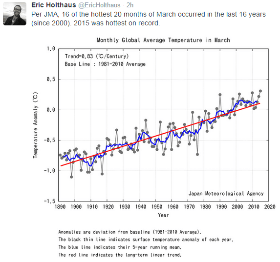
How can someone post a chart showing linear temperature increase for the last 125+ years, then claim the “baseline” is a horizontal mean drawn through 1981-2010?
The “baseline” is obviously the red trend line, and the rest are the climactic changes. Since we’re right at the long-term trend, there is no variation for human-influence left to explain.
Hey KTM! I was thinking something similar, but you said it better. The CAGW folk post a chart that shows warming started long before the CO2 showed any significant rise. The chart shows that the current warming (with higher CO2) is the same as the previous warming (without higher CO2). Their claim? “LOOK! We humans are causing a catastrophic change!” Those idiots don’t even realize that they have just disproved their own scam.
Interesting point. Even if you accept that BS chart at face value, the rate of rise was roughly the same between 1890 to 1930 as it was from 1975 to 2015. Since CO2 rise was not significant between 1890 and 1930 and was between 1975 and 2015, the logical conclusion is that the rate of CO2 rise is a non factor with respect to temperature change.
if only this were a rational debate about data
the only thing that matters to them is that there is a square
with squiggly lines
and a scary red line that goes up at a really scary angle
if the line were flat then it wouldn’t be scary and it wouldn’t be red
if went down, then it would be scary again and be red
it is also important that the .0 gradations are sufficiently large on the vertical scale in
relation the horizontal scale as to look more scary
tenths of a degree compared to decades…not an issue
nobody reads the little numbers on the side so it’s ok
remember the words of the great philosopher David Lee Roth
“it doesn’t matter what you do as long as you look good doing it”
+1
Holthouse needs to wake up. The linear interpolation line in his graph show monotonic warming from the late 19th century on. Just what year signifies when the heating is from the Man-Made CO2? Looks to me like the entire graph shows absolutely nothing but recovery from the LIA.
Oh, Holthouse, what is the “correct” temperature of the earth? I’m hoping it’s warmer than now. Some like it hot!
If just once, they would stop it with the “hottest ever” claims, they might actually fool those who are not complete idiots.
Used car salesmen, the world over, are feeling pretty good about themselves right now.
Ask the CAGW crowd, “If today’s climate is the warmest ever, why are most of the state’s high temperature records seventy years old?”
The most probable answer? “But, but, but, 97%!”
“Used car salesmen, the world over, are feeling pretty good about themselves right now.’
They have every reason to with the snake oil salesmen in town.
“Used car salesmen,”
You mean, Mosher ! Dodgy Bros in the flesh !!
It’s hard to soar like an eagle when you’re surrounded by turkey’s. Gable gable, gable gable.
I’m confused. Are you a Clark Gable fan?
https://www.youtube.com/watch?v=4XE988jxfxQ
Or is it this…
https://www.youtube.com/watch?v=sU0oZsqeG_s
😉
So am I. A surprising choice for a rooster, with a fricative “G” to boot:
https://www.youtube.com/watch?v=YrI2-bZ7wpc
Klok-klok klok-klok?
https://www.youtube.com/watch?v=Oh5f0QhTf3k
Do you speak Foxese?
https://www.youtube.com/watch?v=VwYKqlz59lo
A French friend once told me the hardest French word for Americans to say is…
https://www.youtube.com/watch?v=qslCLnfkDog
Interestingly, Jeremy Clarkson claims the same about Germans and “squirrel”…
https://www.youtube.com/watch?v=SskKMbX6qmk
Clarkson thought it was all a great joke because he didn’t understand the sheer horror he stumbled upon. How much more evidence do we need? It’s not about the Germans (or the French). It’s He Who Must Not Be Named who hates being named. Stunted speech and impaired judgment are only the mildest symptoms afflicting those who try. It must never be done. Clarkson paid for his error.
The scientist who gave his account in the attached post was foolish enough to call Him by His Name even though he knew better. He was lucky to survive. His diary is incomplete but we know he was defeated and had to leave the country:
The people in the following story also paid dearly for Naming Him:
https://www.youtube.com/watch?v=0dLJUQHuTHw
https://www.youtube.com/watch?v=1EnDwkclDcA
Squirrel, James Squrrel.
JMA’s plot/curve fit looks pretty flat from about 2000 on. And a real data 0.83 C/century straight line trend is pretty far below IPCC’s modeled values of 4.0 C or 2.0 C or 1.5 C or whatever it is this week. Ask JMA what they see for a sea level rise trend. Last I checked what they saw was within historical variations.
They’ve adjusted themselves into a corner. Why the temperature rise from 1910 to 1945? This was prior to large scale man made emissions of CO2.
The CO2 scare is based on the idea that natural variation will be dominated by a massive upward acceleration of temperatures.
This isn’t scary.
https://stevengoddard.files.wordpress.com/2015/04/screenhunter_1509-apr-14-11-31.gif
They are predicting a massive shift in the nature of the trend line, from variation around a straight line to a parabolic or exponential increase.
https://stevengoddard.files.wordpress.com/2015/04/screen-shot-2012-01-02-at-10-42-58-am-1.png
Linear increases in sea level for the last 150+ years are not scary, either.
http://wattsupwiththat.com/2014/07/16/latest-noaa-mean-sea-level-trend-data-through-2013-confirms-lack-of-sea-level-rise-acceleration-2/
Sea level all around the country and around the globe continues its slow march upward at a linear rate, there is simply no acceleration evident in any of the data. This isn’t proof of the climate scare, it’s disproof.
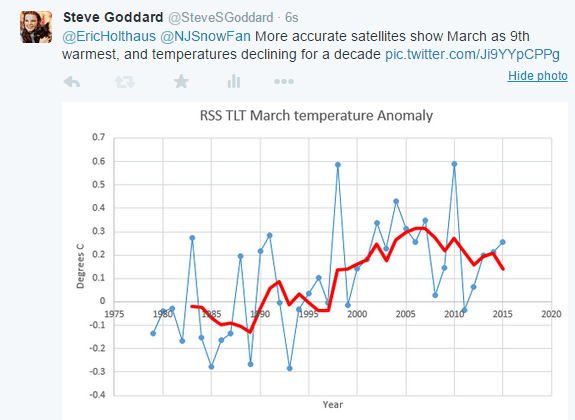
Eh, I meant to link Hothouse’s chart not Steve’s, but the point stands.
It’s a travesty
https://www.youtube.com/watch?v=bphR-6Xi1_I
KTM +1
They are desperate, Hope.
This is the final curtain on a game plan Stalin directed to save the world from nuclear annihilation in 1945.
http://personalliberty.com/endgame-arrived/
JMA use Gavin’s NCDC/GHCN fabrications, don’t they?
This makes their temperature series meaningless and irrelevant against reality.
“JMA use Gavin’s NCDC/GHCN fabrications, don’t they?”
Good question, need to confirm the answer. They might have their own independent data.
When Mr Holthaus can explain how the world’s climate climate went from Roman Warming to cold Dark Ages to MWP to LIA, then he might be able to explain why 20thC warming was not also caused by natural factors.
I’m always looking forward to your article.
I’m Japanese, but I don’t believe a report of JMA.
I believe satellite data.
And I believe your words.
The report of JMA is an advertisement of mere Global warming.
They disregard the actuality always.
You may enjoy the book by Paul Kazuo Kuroda (1917-2001) on “Synthesis of the Chemical Elements and the Oklo Phenomenon” or this recent paper on “Solar energy” based on Kuroda’s research:
https://dl.dropboxusercontent.com/u/10640850/Supplement.pdf
Thank you very much.
When Svensmark visited Japan last year, I heard explanation that cosmic rays, a cloud and solar activity were related to temperature.
I know that the change of the temperature is explicable by a natural change.
It is a result by Japanese excellent scientists.
http://omicsonline.org/2157-7617/2157-7617.S1.013-005.pdf#search='shigenori+maruyama+1000+cosmic+rays‘
??the climate change of the 21st century based on the relationship among galactic cosmic rays
(GCRs) (?14C), sunspot number, and global temperature (?14 C and sea-level change). The result indicated the temperature
would decrease gradually since 2000.??
Very interesting – thanks for the link!
If JMA is advertising AGW they are doing a poor job of it with this graph.
Why did it go up from 1890 to 1990 then?
Compared to what? Not the US trend. Consider how small Japan is compared to US. And less than 1.0 C delta. Where are the uncertainty bands? If they want to portray an ominous trend this graph doesn’t do it.
Dear Eric,
14 of my 12 tallest years all happened after I stopped growing. Should I check my pituitary gland?
116%?
Funny how no-one seems to mind the little red line in Steve’s graph going down from 2014 to 2015 while the little blue line (presumably the actual temp) goes up from 2014 to 2015…