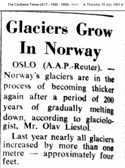
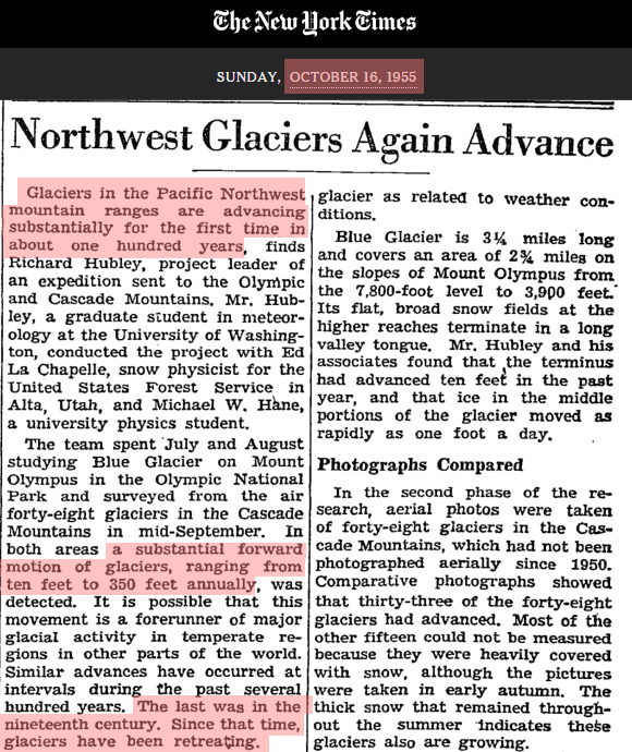
During the 1950’s and 1960’s, glaciers in Europe and the US were growing, for the first time in hundreds of years.
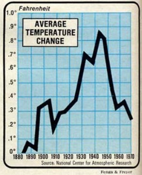
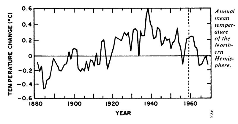
Scientists reported that the Earth had cooled sharply.
NCAR newsweek_coolingworld.pdf
National Academy Of Sciences Science News
National Geographic reported the same thing.
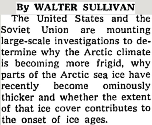
The US and Russia were concerned about Arctic cooling.
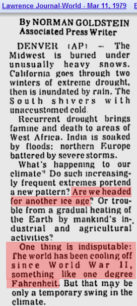
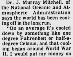
Scientists said that global cooling was “indisputable”
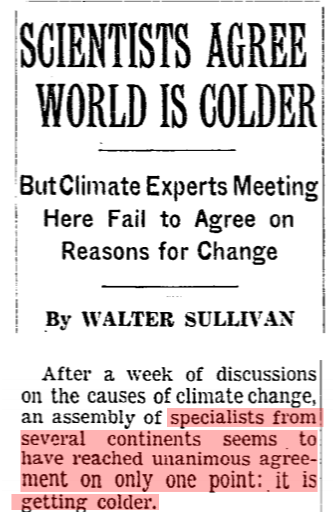
There was unanimous consensus that the world was getting colder.
There was never any question that the earth cooled sharply after the 1930’s, but it didn’t fit the political narrative, so NASA and NOAA simply made the cooling disappear.
In the Climategate E-mails, they were very up front about their intentions to do this.
From: Tom Wigley <[email protected]>
To: Phil Jones <[email protected]>
Subject: 1940s
Date: Sun, 27 Sep 2009 23:25:38 -0600
Cc: Ben Santer <[email protected]>It would be good to remove at least part of the 1940s blip, but we are still left with “why the blip”.
The temperature record from government agencies is completely fraudulent and has no scientific value. Its sole purpose is to assist political agendas.




Don Easterbrook studied the Mt Baker glaciers.
http://wattsupwiththat.com/2015/09/13/mt-baker-glaciers-disappearing-a-response-to-the-seattle-times/
Here is just one of the graphs. (others are pretty similar.)
https://wattsupwiththat.files.wordpress.com/2015/09/clip_image004.png
Reblogged this on Give Me Liberty.
But, but, but, it was only a couple articles in Time that supported cooling. 99.9% of scientists believed in warming. /s for the slow.
In a 2012 video PHil Jones admitted adjusting ocean temperature data to match warmer land data as discussed here at WUWT arguing the “bucket data” was too cold because canvas bags have a cooling effect http://wattsupwiththat.com/2014/01/17/phil-jones-2012-video-talks-about-adjusting-sst-data-up-3-5c-after-wwii/
Now Karl adjusts the data again to eliminate the warming hiatus by arguing state of the art ARGO floats didn’t match the warmer “bucket data.” Its amazing they don’t smell their own stink and/or assume they can fool the public.
Apparently they *can* fool (most of) the public.
I’m trying to follow here and better understand the argument so let me see re-phrase and you all can correct any misunderstandings.
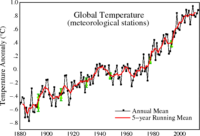
http://futurepath.org/wp-content/uploads/2010/07/770px-Instrumental_Temperature_Record.png
Ok, so the above is a global temperature chart that is slightly different than what Tony posted. I just did a quick search on bing for global temperatures 20th century and this is one of the first that popped up.
So what do we see? As the scientists point out in the articles that Tony links to they said it was indisputable that the world cooled after the 1940’s. That is shown in Tony’s map, that is shown in the map that I show. So I don’t think there is any dispute now or then, right?
Despite the hyperbolic body of the article (earth cooled in the 40’s!), the point seems to be to set up the climate gate quote about fixing the 1940’s blip. Obviously, in my graph there is a much more pronounced blip in around 1940 that went real high. In Tony’s graph it is obviously not nearly as pronounced. So they appear to have “fixed” this blip.
From the skeptics point of view you seem to imply that it is nefarious. So can someone enlighten me as to what the scientists said about why it needed to be fixed? And then from the skeptics point of view why is that wrong and why is it therefore sketchy that the graph went roughly from mine to roughly Tony’s?
Appreciate it.
Fixing the 1940s blip
Also the unadjusted data matches the satellites, post 1979 of course, with no current divergence.
Koop, I count 11 dots (annual) after 2000, making your 1st found chart 2011. Thanks, you have just provided more evidence that there is nefarious-ism going on. Keep up the good work, but most here have witnessed the annual adjusting.
Yep, they have gradually chipped away (re Tom Wiggly’s suggestion) at the 1940’s PEAK.
Its now nearly flat , such is the erosion of science by these guys.
This is the clincher graph for me. You do not get perfect correlation (R=1.0) by happenstance.
https://stevengoddard.files.wordpress.com/2014/08/screenhunter_1618-aug-03-09-45.gif
“The most damning graph of all though is the one below, showing how NOAA (red) is cooling the past relative to their own thermometer data (blue)”
https://stevengoddard.files.wordpress.com/2014/02/bgqd5wpcmaajkg3.png
“Before data tampering by NCDC, US temperatures show essentially zero correlation with atmospheric CO2. Climate sensitivity of zero.”
https://stevengoddard.files.wordpress.com/2014/12/screenhunter_5685-dec-30-18-55.gif
MORE on the changes made to the temperature record:
https://stevengoddard.wordpress.com/2014/02/20/a-consistent-pattern-of-data-tampering-across-the-planet/
My analysis and others independent of Steven’s
TOBS = Time of Observation.
my comment:
https://stevengoddard.wordpress.com/2015/01/06/fixing-the-past-at-the-ministry-of-truth/#comment-477742
Steve addresses TOBS in another manner:
https://stevengoddard.wordpress.com/?s=tobs
March of the Thermometers
my comment:
https://stevengoddard.wordpress.com/2015/01/18/how-gavin-cheated-to-create-the-required-talking-point/#comment-482838
CONTINUED (so I don’t get kicked into moseration)
UHI
They reckon the UHI in Peking is at least 3’C,
http://www.dailymail.co.uk/sciencetech/article-3002906/Electric-cars-combat-urban-heat-problem-study.html
E.M. Smith’s summary post: https://chiefio.wordpress.com/2012/06/20/summary-report-on-v1-vs-v3-ghcn/
The EFFECT:
https://chiefio.wordpress.com/2010/01/08/ghcn-gistemp-interactions-the-bolivia-effect/
“Urban Island Heat” effect. NOAA and a rebuttal by Steve McIntyre
https://stevengoddard.wordpress.com/2014/09/17/fake-adjustments-from-fake-scientists/#comment-424001
Roy Spenser on Heat Island Effect
paper: http://www.drroyspencer.com/2010/03/the-global-average-urban-heat-island-effect-in-2000-estimated-from-station-temperatures-and-population-density-data/
Las Vegas: Poster Child for the Urban Heat Island Effect – a good demonstration
http://www.drroyspencer.com/2014/06/las-vegas-poster-child-for-the-urban-heat-island-effect-updated-corrected/
As you can see from the above, whenever you do a ‘dig here’ on the explanations for the different adjustments you find a thin veneer covering a lie.
This one is a real kick in the teeth to the CAGW conjecture.
Misunderstanding of the Global Temperature Anomaly from Chem Engineer John Kehr
(Word Unpress censors the link to this website so I can not post it.)
You will find skeptics are often either engineers or geologists or people with a bit of training in geology and thermo.
http://blogs.ei.columbia.edu/wp-content/uploads/2013/06/CO2-chart-780-600×412.jpg
We know co2 is a coolant. Every time in the past 800 k years when co2 was high temperatures went down.
http://www2.sunysuffolk.edu/mandias/global_warming/images/stratospheric_cooling.jpg
CO2 radiates above the bulk of the atmosphere at COLD TEMPERATURES. This jives with what Mike Sanicola, a professional infrared astronomer said
Gail, just to keep things in the open, Mike Sanicola was a pseud I was using for a while due to some legal papers I had signed when working for GE’s infrared division back in the 1980’s designing IR telescopes. I’m not using a pseud anymore.
Guilty.
Engineers can do math. “Alarmist scientists” cannot or rather they “modify data to give a desired outcome”.
Politicians & govt bureaucrats prefer to work with malleable (see def. – weak minded) fools who can be easily influenced. Then these politicians/bureaucrats get a high paying job in academia, finance or industry which benefits from the various carbon tax, carbon credit, “renewable energy grant” boondoggles.
It’s all in plain sight.
Powerful stuff Gail ; this will certainly upset the Warmist cult……
Thanks Marsh.
Every time you actually look at what is being shoveled by the ClimAstrologists you find it has been ‘Adjusted’ to match the models. NONE of the data sets are pristine ALL have been tampered with,
Temperature data
CO2 data
Sea level data
ocean temperature data.
now solar data
and I understand they are even going after the radiosonde data to ‘adjust it’ so it shows the missing ‘hot spot’
WOW, Look at that Arctic sea ice go !!
https://sunshinehours.files.wordpress.com/2015/10/arctic_sea_ice_extent_zoomed_2015_day_280_1981-2010.png
Wouldn’t it hilarious if it climbed up somewhere near the 1981-2010 average by December 😉
Unfortunately it would not matter. The Paris-ites meeting has nothing to do with climate and everything to do with making the UN a world government with the RIGHT to directly tax us. It is also about wealth redistribution.
They have point blank said they want to strip the middle class of its wealth and ‘redistribute it’ as bribes to the corrupt leaders of third world leaders. The real goal is a return to the dark ages with an Aristocracy and a serf class. The elite have hated the middle class since the time of the American and French revolutions and they now see the goal of destroying middle class prosperity and freedom almost within their grasp. I doubt if anything will stop them especially since we have so many ignorant fools begging for their slave collars.
I am very very glad I am old and have no offspring.
http://arctic.atmos.uiuc.edu/cryosphere/IMAGES/seaice.recent.arctic.png
Wow, look at the arctic sea ice growth stall.
But seriously, if the ice is growing at record rates why is the anomaly growing when it is already negative?
Because the anomaly is based on the first 10 years of the downward leg of the AMO cycle, you brainless moron !!!
Whoops, the anomaly is based on the downward leg of the AMO (don’t know how “the first 10 year” part got in there. )!
koop, Andy’s post shows 5.79 million sq K. Do you dispute the graphic shown in the post?
Reblogged this on Climate Collections and commented:
Good post and comments.