Michael Mann, a climate scientist of Pennsylvania State University, said: “We may see warming even faster than what the models are predicting.”
And Michael England, a professor at the University of New South Wales in Australia, said global temperature has steadily climbed by 1.4 F since 1880.
He said: “Global temperatures may rise another 4 to 7 F (2 to 4 C) by 2100.”
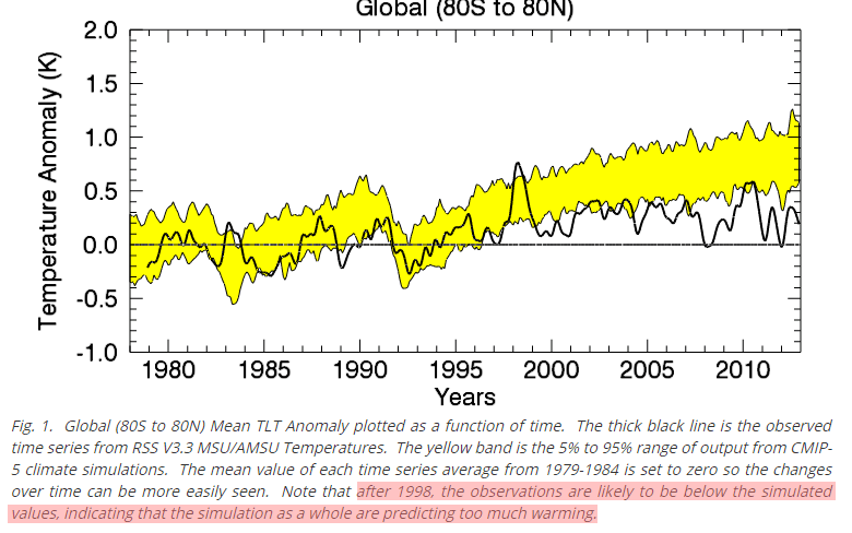
The exact opposite of fraudster Michael Mann’s claim is true. Essentially all models have predicted too much warming.
England’s claim “global temperature has steadily climbed by 1.4 F since 1880. “ is equally fraudulent.
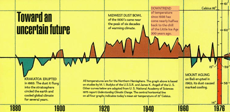
In 1978, National Geographic reported “DOWNTREND of temperature since 1938 has come nearly halfway back to the chill of the Little Ice Age 300 years ago”
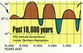
They also reported that temperatures were warmer for most of the past 10,000 years.
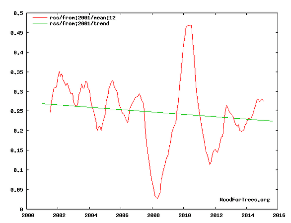
England’s claim that global temperatures may rise 4 to 7 degrees is equally as fraudulent. Tropospheric temperatures have fallen this century. There is no legitimate reason to expect a large rise
These people are not scientists. They are scamsters telling lies to keep the money coming in.


Obama bombing Alaska for Climate change
http://www.guampdn.com/story/news/2015/10/07/cnmi-asks-military-spare-volcanic-island-1008/73500726/
http://www.huffingtonpost.com.au/2015/05/29/pagan-island-marines-military_n_7342168.html?ir=Australia
So they are supposedly losing their island, so Obama goes and bombs one that could replace it LOL
http://www.seattletimes.com/nation-world/with-obama-to-visit-nearby-alaskan-villagers-struggle-as-their-island-disappears/
Butterflies were 6 metres in Size 15,000 years ago, when the Ice Age ended they started to shrink till they got to current size? http://www.smithsonianmag.com/science-nature/greenland-has-butterflies-and-they-are-shrinking-temperatures-rise-180956847/?no-ist
the comments section of the news article is hilarious
A strong geomagnetic storm break the polar vortex.
http://oi62.tinypic.com/24zdpbm.jpg
http://oi59.tinypic.com/2llnbbs.jpg
My Direct TV signal went to locked pixels at times yesterday. That coronal hole was aimed right at us.
For those that haven’t seen it..
This is TRULY UGLY for the AGW scammers..
http://blogs.news.com.au/heraldsun/andrewbolt/index.php/heraldsun/comments/cruz_vs_warmist_its_ugly/
Sit back and have a good laugh.. avoid coffee on keyboard etc etc
Direct link to video.
https://youtu.be/Sl9-tY1oZNw
SERIOUSLY embarrassing for the alarmista !!
I really would ask that everybody PLASTER this video URL far and wide.
Twit it, Faceplant it, whatever. 🙂
If it “disappears”… I have a copy of the video.
I wish Cruz had continued to point out the fallacy of the 97% claim, that nonsense needs to be buried once and for all. Cruz had the opportunity to put a nail in the consensus coffin, and failed.
The time limits suck sometimes.
I was thinking the same thing. BOY that sierra club talking head did not have any brains just a mouth that repeated the same nonsense ad nauseum.
If 97% of a small fraction of people told you to drink the Kool-aid would you?
It seems that talking head would.
That 97% lie MUST be refuted at every opportunity, and EVERY time it is mentioned. It is yet another gross example of data fraud.
IF 97% of scientists agreed on CAGW, that would actually be significant and a valid point of discussion, but it is a lie, and liars need shaming. To me, the destruction of the false 97% claim should be one of the top priorities of skeptics, honest politicians (I know), and real scientists.
And people have asked me why there are never any good debates between real skeptic scientists and Climate change “scientists” in the media! That video sure helped me answer that question.
Heck look at what is happening to Dr Evans. The pseudo-sceptics have created a Strawman (GCMs) and are busy killing that strawman over at Bishophill and Lucia’s Blackboard but DON”T bother to read what Dr Evans has written (and see it is a strawman) or ask Dr Evans what he he is actually talking about at Jo Nova’s where his ideas are being presented and debated. Instead they want to lure him into wasting his time chasing all over the internet. Dr Evans evenwent to Bishophill and told them they were tilting with a strawman but that didn’t stop Lucia from piling on.
Smells a heck of a lot like controlled opposition to me.
WUWT did the same thing to Tony to kill his discovery.
wow
don’t know whether to laugh or cry
reminds me of the joke
“world to end tomorrow, poor and minorities hardest hit”
Absolutely wonderful,
if Sierra Club president Aaron Mair is the top gun, no wonder alarmists wont debate, it was like watching a 4yr old child.
And Aaron knew it !! 🙂
Tantrum.. much ! 😉
One person claimed it reminded him of when Al Capone was being questioned.
Reminded me of the hearing with Richard Windsor- I mean Lisa Jackson and Sen Inhofe wiped the floor with her about extreme weather and other nonsense, pulling out graphical data that refuted everything she was trying to be alarmist about.
Aaron Mair relies on knowledgeable experts. Like this guy…
https://www.youtube.com/watch?v=Uif1NwcUgMU
I’ll probably get into trouble for this pic..
http://s19.postimg.org/npq26jepf/canadian_muslims.jpg
Bottoms up old bean
Either that or they are protesting about the climate !
https://wattsupwiththat.files.wordpress.com/2014/11/heads-in-sand.jpg?w=720
It’s somewhere to park your bike !!
Heads in the sand….
You’re fine as long you don’t claim it’s a picture of Moosamed.
“We may see warming even faster……..”
“Global temperatures may rise another…….”
May? Always May. This May? Or are they talking about next May?
the funny thing is
although the sun is getting brighter / hotter
earth is getting cooler,
https://i0.wp.com/oi62.tinypic.com/33kd6k2.jpg
once you figured out why, you are a real climate scientist.
@Donna Becker
the idea of this protest in Au was that people put their heads in the sand when it comes to climate change. Seems like it is mostly women?
Must say that although I disagree with AGW, I do believe in GMGC, ie, God made global cooling.
https://i0.wp.com/oi62.tinypic.com/33kd6k2.jpg
The end result seems the same
but it is not unique in the history of mankind….
Joseph of the bible was able to correctly predict 7 years of abundance and 7 years of famine. He probably observed the direction of the winds during droughts (Gen. 41:23&27) and may have had some access to the records of the flooding of the Nile (the Egyptians were good at keeping an eye on this).
If you all knew that the Gleissberg (87/88 years) continuity exists,
and we have 50% i.e. 43 years of reliable data – where I got Rsquare=1
then it should not be long for us to realize that we are up for global cooling = CLIMATE CHANGE
for quite some time to come.
The best we can hope for is a mirror image going up for the curve shown above, for the next 43/44 years….
I agree with you about global cooling. And yes, I think most people have their heads in the sand, most of the time. In fact, when I was 11, I wrote a paper entitled, “The American Ostrich.”
J.P Morgan and friends have owned the US news media since 1915. The progressives trashed the US school system via John Dewey at the same time.
It is amazing that there is anyone in the USA who is not a Socialist/Communist/Progressive after one hundred years of systematic brainwashing.
Ok, so here is a graph that Tony posted earlier today. I’ll assume because he used it in an argument that he stands by it.
http://realclimatescience.com/wp-content/uploads/2015/10/Fig.A-7.gif
Then in this post he says: England’s claim “global temperature has steadily climbed by 1.4 F since 1880. “ is equally fraudulent.
So a skeptic might look at his statement and then at the graph. On first glance I must admit that it looks like the earth has warmed by actually more than 1.4 F since 1880. So is the graph wrong? Is Tony’s statement wrong? Or what am I missing that would cause somebody to post that graph and then state that somebody that says that the world has warmed by (at least) 1.4 F is wrong?
@ Koop
you simply cannot compare the data collected before 1970 with those from after 1970.
After 1970, continuous recording, (usually every second) with thermocouples, and computers were introduced to calculate the average for the day. Before that time we had to have people taking a reading from a mercury thermometer every 4 or 6 hours and that was converted to the “average” for the day. In fact, before the 1950’s they used thermometers that were never even re-calibrated. The earliest proof that I could find of a certificate of re-calibration is 1948.
By making such graphs [from 1880] and by drawing conclusions from such graphs is the same as trying to compare apples with pears…….
I figured that the proposed mechanism of AGW implies that more GHG would cause a delay in radiation being able to escape from earth, which then causes a delay in cooling, from earth to space, resulting in a warming effect. It followed naturally, that if more carbon dioxide (CO2) or more water (H2O) or more other GHG’s were to be blamed for extra warming we should see minimum temperatures (minima) rising faster, pushing up the average temperature (means) on earth.
I subsequently took a sample of 54 weather stations, balanced by latitude, analysed all daily data, and determined the ratio of the speed in the increase of the maximum temperature (maxima), means and minima.
My finding was that if we take the speed of warming over the longest period (i.e. from 1973/1974) for which we have very reliable records, we find the results of the speed of warming, maxima : means: minima at 0.034 : 0.012 : 0.004 in degrees C/annum. That is ca. 8:3:1. So it was maxima pushing up minima and means and not the other way around. Anyone can duplicate this experiment and check this trend in their own backyard or at the weather station nearest to you. In addition, I find the following trends in minimum temperature records over time: 0.004K/annum (from 1974), 0.007K/annum (from 1980), 0.004K/annum (from 1990) and -0.009K/annum (from 2000). Putting these values out against the time periods indicated, i.e. 40, 34, 24 and 14 years respectively, you get the acceleration/deceleration of warming. I was astonished to find an absolute perfect curve, a quadratic function, with Rsquare=1. That means 100% correlation. If there were any man made warming at all, one would expect to see some chaos in that curve…..(i.e. less than 100% correlation)
There isn’t any. By looking at the speed of warming in K/annum you eliminate a lot of error on the difference of recording between stations. All my three data sets, maxima, means and minima show that earth started to cool off around 20 or so years ago, ON AVERAGE, looking at minima/maxima. Earth itself (means) started the downtrend from 1998 or “pause” , as the RSS satellite data are showing.
Unfortunately, in nature, there is no pause. It is either cooling or it is warming. My data sets and those of RSS suggest that earth has cooled by at least 0.1K since 2000.
All results point to further acceleration of global cooling to come.
Henry P says:
That is not quite true.
Meteorology: A Text-book on the Weather, the Causes of Its Changes, and Weather Forecasting
By Willis Isbister Milham 1918 mentions the Six thermometer and says the accuracy was not good so the US weather service used the two thermometers mentioned above.
He also states there are 180 to 200 ‘regular weather stations ordinarily in the larger cities, 3600 to 4000 coop stations and 300 to 500 special stations.
Meteorology: A Text-book on the Weather, the Causes of Its Changes, and Weather Forecasting By Willis Isbister Milham (1918)
I thought it quite interesting that Willis Isbister Milham was talking about 20 years of hourly data in 1918.
On page 68 he says a thermometer in a Stevenson screen is correct to within a half degree. It is most in error on still days, hot or cold. “In both cases the indications of the sheltered thermometers are too conservative.”
on Page 70
“The Ventilated thermometer which is the best instrument for determining the real air temperature, was invented by Assman at Berlin in 1887…will determine the real air temperature correctly to a tenth of a degree.”
A paper in The American Meteorological Journal, Volume 8 from 1891 also mentions the Richard Freres thermograph
There is also the handbook given to volunteers in the USA from 1892 and Australia has pictures of Stevenson screens from 1879!
http://www.warwickhughes.com/blog/?p=604
At this point I would trust that old data a lot more than I would the crap data from today.
https://upload.wikimedia.org/wikipedia/en/2/2b/Heartland%2C_Surface_Stations_siting_example.jpg
From Anthony Watts Surface Station Project:
https://i0.wp.com/www.surfacestations.org/Figure1_USHCN_Pie.jpg
Climate Reference Network Rating Guide – adopted from NCDC Climate Reference Network Handbook, 2002
Class 1 (CRN1)- Flat and horizontal ground surrounded by a clear surface with a slope below 1/3 (=1C) – Same as Class 2, except no artificial heating sources within 10 meters.
Class 4 (CRN4) (error >= 2C) – Artificial heating sources = 5C) – Temperature sensor located next to/above an artificial heating source, such a building, roof top, parking lot, or concrete surface.”
http://www.surfacestations.org/
@Gail
I have not seen any re-calibration certificates from thermometers those days? They simply did not do it/ realize it until later.
It seems they only started with that after the 1950’s
Furthermore, [to my previous comment]
Koop’s “global” graph is presumably a mixture of weather stations, which they all threw together, simply because they had the data, but if we were to look at all stations together they are not balanced on latitude. They are biased towards the NH. This makes comparison even worse.
[longitude does not matter, as long as we look at the average change in temperature per annum]
So, inevitably, all data sets except my own or the satellite records will give you bias.You have to give the balancing problem some thought……
Reblogged this on Roald j. Larsen.
here I show you what happens when you do not balance your weather stations
http://oi58.tinypic.com/2mnhh74.jpg
Notice from my previous comment, that every place on earth is on its own curve, presumably, depending on its atmospheric composition TOA. It shows that in southern africa there never was any warming whatsoever. The curve is there, but it only shows negative values…….!!!!
So, to get a global average, you have to come up with a globally balanced sample. If you take the route that I took , namely by looking only at the rate of change in K/annum, you only have to balance by latitude. Do you know why in that case I don’t have to worry about longitude?
Henry P
You are correct about how they balance the data.
https://2.bp.blogspot.com/_vYBt7hixAMU/SzpY-r3HTbI/AAAAAAAAALI/bIMyN3qFjGE/s400/March+of+the+Thermometers.bmp
Chart showing the distribution of temperature station records by latitude according to E.M.Smith’s lattitude band classification Original Data
For Canada the station drop out vs the change in temperature.
https://diggingintheclay.files.wordpress.com/2010/04/canadadt.png
Climate Data: Effects of Station Choice – Location
Verity Jones, E.M.Smith, Jeff Id and many others have look at the data.
Gail says
Henry P
You are correct about how they balance the data.
Henry say
You mean: how wrongly balanced the surface data are?
hence the reason why hadcrut 4 is not reliable, it is the odd one out
\
http://www.woodfortrees.org/graph/hadcrut4gl/from:1987/to:2016/plot/hadcrut4gl/from:2002/to:2016/trend/plot/hadcrut3gl/from:1987/to:2016/plot/hadcrut3gl/from:2002/to:2016/trend/plot/rss/from:1987/to:2016/plot/rss/from:2002/to:2016/trend/plot/hadsst2gl/from:1987/to:2016/plot/hadsst2gl/from:2002/to:2016/trend/plot/hadcrut4gl/from:1987/to:2002/trend/plot/hadcrut3gl/from:1987/to:2002/trend/plot/hadsst2gl/from:1987/to:2002/trend/plot/rss/from:1987/to:2002/trend/plot/esrl-amo/from:2002/to:2016/trend/plot/jisao-pdo/from:2002/to:2016/trend
E.M. Smith explains THE TRICK used to turn a flat or declining trend into a heating trend for a country. It is all in station choice and ‘Krigging.
Another look at Physically unjustifiable NOAA GHCN adjustments by still another person.
Ha ha
http://ct.politicomments.com/ol/pc/sw/i57/2/4/15/pc_a8c7214873f9275d26b6f215f4c87f5f.jpg
We have covered this already. The poll was not of scientists in general, it was conducted amongst one far left fraternity.
Stupid much? 😆
Results for the scientist survey are based on 2,533 online interviews conducted from May 1 to June 14, 2009 with members of the American Association for the Advancement of Science (AAAS), under the direction of Princeton Survey Research Associates International.
http://www.people-press.org/2009/07/09/about-the-survey-16/
And who is AAAS?
http://www.aaas.org/about-aaas
Yep! Thanks for confirming your PhD in Advanced Gullibility. 😆
And here I thought that RICO was the family name of a Niagara Falls disc jockey who was honored by a Gene Roland composition for the Stan Kenton band called ” Jump For Joe “