
I live in the epicenter of climate fraud, surrounded by NCAR, NOAA, NSIDC and the University of Colorado – who showed in 2004 that sea level was rising 2.8 mm/year.

By 2015, they had bumped that up to 3.3 mm/year, even though their graph showed sea level rise had slowed after 2004.
I overlaid the two graphs at the same scale below, and you can see several interesting smoking guns. The first is obvious – they simply increased the rate of sea level rise from 1993 to 2004 . But the more interesting one is that the peaks no longer line up. In the earlier version, the 1998 peak came in 1998. Now it comes in 1997. This tells us that they are either completely incompetent or are simply making stuff up.
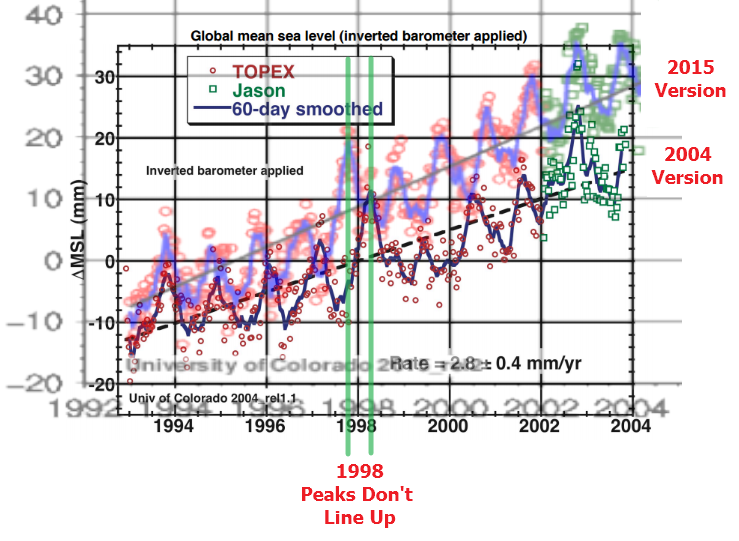
I can make the peaks line up by expanding the X-axis of the 2015 graph, but then the years don’t line up and the Jason data starts a year later in the 2015 graph than it does in the 2004 graph. It is apparent that these people are simply making data up as they go along, and not being very careful about it.
Carl Mears recently used satellite orbital decay as an excuse to bump up RSS temperatures (as if they hadn’t already corrected for that.) Orbital decay would be a huge problem for sea level readings, because they require sub-millimeter precision.
CU satellite data reports almost double the rate of sea level rise as NOAA tide gauges, and orbital decay would be a likely culprit for the discrepancy. But they won’t fix it, because it would hurt their funding if the did.
the absolute global sea level rise is believed to be 1.7-1.8 millimeters/year.

Adjustments are made to increase funding, not increase accuracy.

Having the ability to detect faksehhoods disguised as consensus science is both a BLESSING and a CURSE.
I accumulated evidence of this over my entire research career (1960-2016), but did not have the courage to call it “FRAUDULENT SCIENCE” until I observed official responses to Climategate emails after late NOV 2009.
Once you start to awaken to the sad state of government science in the United States today, you may also start to recognize kinship with scientists who lived under USSR domination in Rusia and Eastern Europe.
E.g., precise isotopic analysis of nine stable xenon isotopes implanted in lunar soil samples from 1969 Apollo Mission to the Moon at NASA Manned Spacecraft Center, UC-Berkeley, Cal Tech, Bern University, etc. – all found and reported that lighter mass xenon isotopes in the solar wind are selectively enriched by about 3.5% per mass unit over the entire twelve mass range (124-136 amu).
This strong empirical evidence for about nine theoretical stages of diffusive mass-fractionation in the Sun was explained by a revolutionary paper on the abundances of the elements in the iron-rich Sun in 1983, confirmed by the 1995 Galileo Probe of Jupiter, but hidden from the public until finally released in 1998:
https://m.youtube.com/watch?v=m3VIFmZpFco
Your point is valid, but less so than you state. The first plot is not GIA adjusted (at least not so labeled), the second plot is plainly so labeled. IIRC the U. Colorado/ NCAR GIA adjustment is +0.3mm/yr so the comparison apples to apples is 2.8 to 3.0. GIA is a modelled SWAG for how global ocean volume changes in response to removal of continental ice age weight and plate tectonics.
The satellite altimetry measurements do not foot to reasonably geostationary tide gauge estimates. Sat is high. This also produces the closure problem. SLR (properly including GIA for this calculation) is appreciably higher than the estimated sums of ice sheet mass loss plus thermosteric rise (warming water expansion). The former from IceSat and Grace, the latter from ARGO. It is only possible to get closure if ‘true’ SLR with GIA is ~2.4mm/yr. That is much closer to geostationary tide gauges, which, depending on what set is chosen (and which do not need GIA) are ~2.0 to 2.2mm/yr compared to ‘closure minus GIA of ~2.1mm/yr.
There are a number of technical reasons the sat estimates are biased high that go beyond the scope of this comment. They are discussed with footnotes in essay PseudoPrecision.
The GIA adjustment is 100% fraudulent in the context of sea surface height. It might be a legitimate adjustment for ocean depth, or ocean floor height – but not sea surface height.
If sea level rise rates had accelerated after 1993 as NASA and every other climate fraudster claims, it would have been visible in tide gauges. It isn’t.
Relevant mainy for the closure problem. Why subtracted out to compare closue with geostationary tide gauges.
SLR ‘acceleration’ is a fabrication. Neither sats nor geostationary tide gauges show any. You can manufacture ‘acceleration’ by ending tide gauges in 1992 when sats start, then splicing the provably too high (via closure) sat reading onto the same chart. Very similar to ‘Mike’s Nature trick’. Apples to oranges.
ristvan, while the GIA adjustment came later, that has little to do with the El Nino peaks being so far off, and it only accounts for part (60%?) of the retro adjustment at most.
sorta on the line of orbital decay…
They don’t adjust for gravity either…..therefore you have that constant anomaly in the Pacific over the volcanoes and sea mounts
Yup. Orbital decay is one of several explanations for the geostationary tide gauge/sat alt discrepancy. Another is simple instrument drift up to 1 mm/yr (Jason-2 tech spec). Another is waves (since sat altimetry is not looking at a flat ocean surface…). Another is differential atmospheric humidity, since the radar (microwave) signal return time is retarded by higher humidity (no different that microwaves cook potatoes and pop popcorn). The spec for that is 3mm repeatability. Which is awful.
Orbital decay is the most correctible variable in this measurement mess, as sat orbit decay can be determined by laser ranging and by GPS.
All laid out in essay PseudoPrecision.
Steven Goddard, this post, and your Multi year ice post here… https://stevengoddard.wordpress.com/2016/04/23/nsidc-busted/
are very damming. I will be curious to see if the rest of the skeptical community picks up on this. Just for drill perhaps you should write both sources, and see what their response is. (That is if they ever respond to you) Thanks for all your work.
Funny how the alarmists insist that their satellite SL data is the standard while claiming that surface station data is the standard for temperatures because satellites aren’t accurate enough.
Here’s my two year old graph on the topic:
http://oi58.tinypic.com/331k5ya.jpg