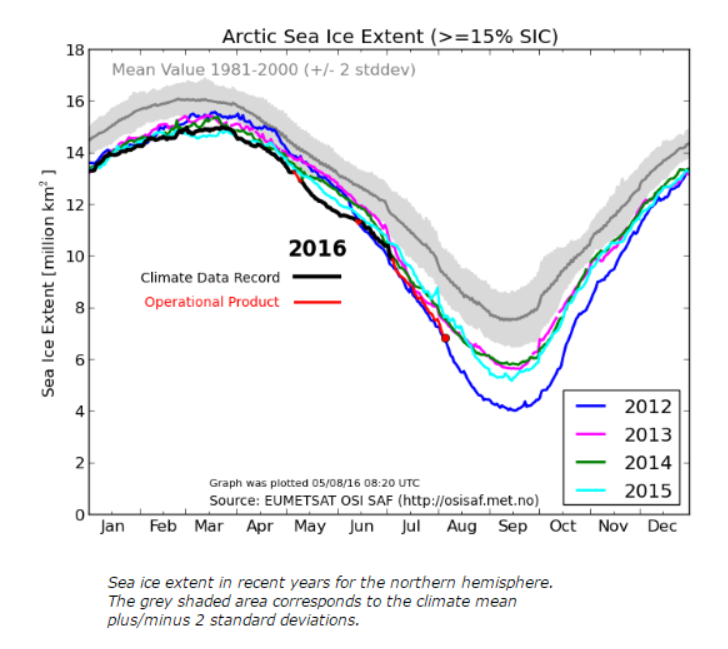
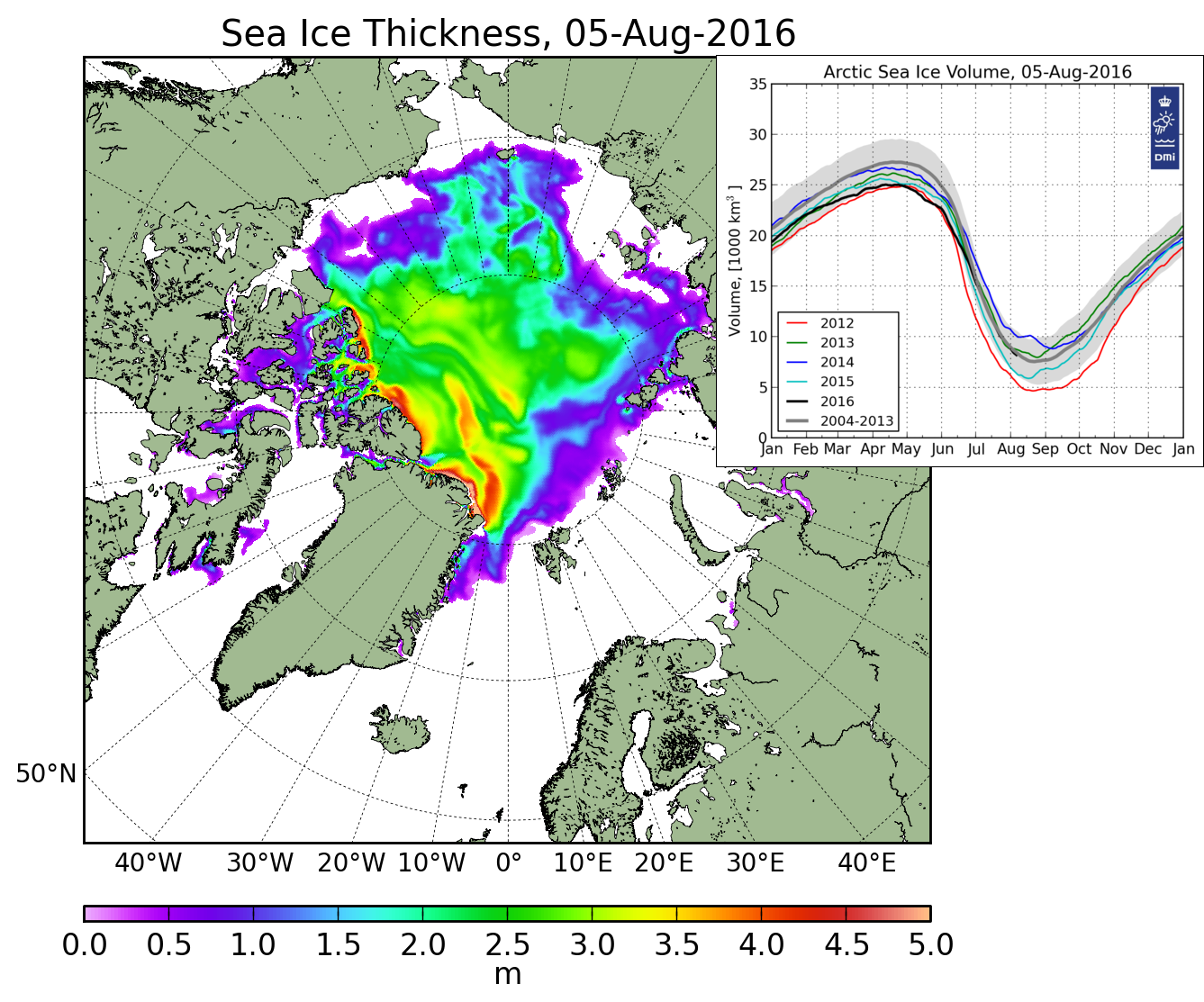
DMI’s graph shows Arctic sea ice extent about the same as 2012.
Ocean and Ice Services | Danmarks Meteorologiske Institut
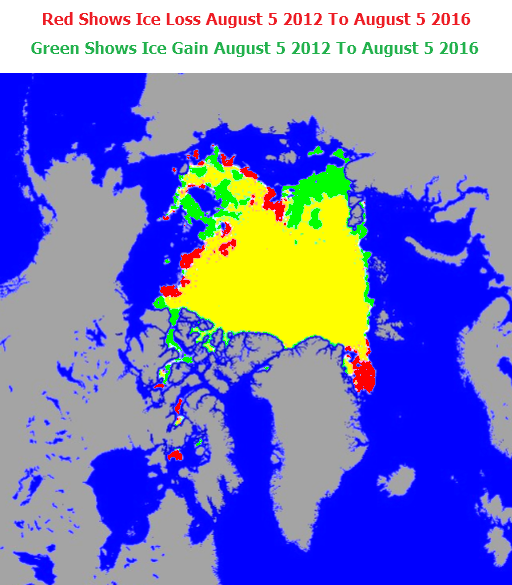
But their maps show 12% more ice than 2012.
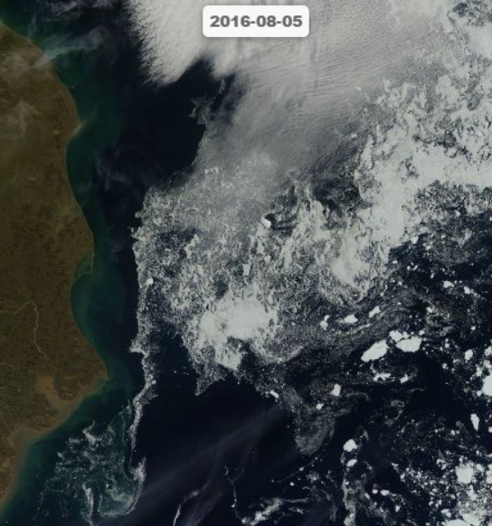
As bad as that error is, their maps are missing huge areas of ice visible in satellite photos, like this ice in the Chukchi Sea.
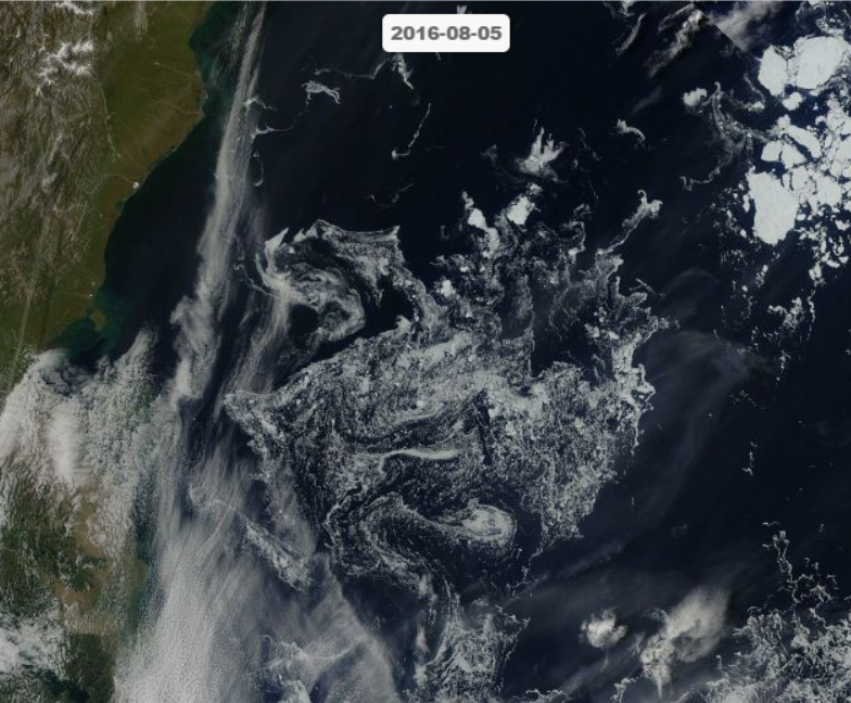
And this ice in the Beaufort Sea.
However, their ice thickness map accurately shows the missing ice, and shows the Arctic full of ice.
FullSize_CICE_combine_thick_SM_EN_20160805.png (1337×1113)
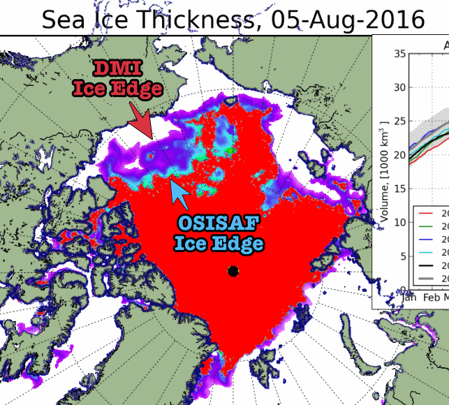
This comparison shows how much ice is being missed.
Climate science is complete garbage.
Meanwhile, the Ship of Fools reports : “ice breakers having such a hard time of it in the strait“

