
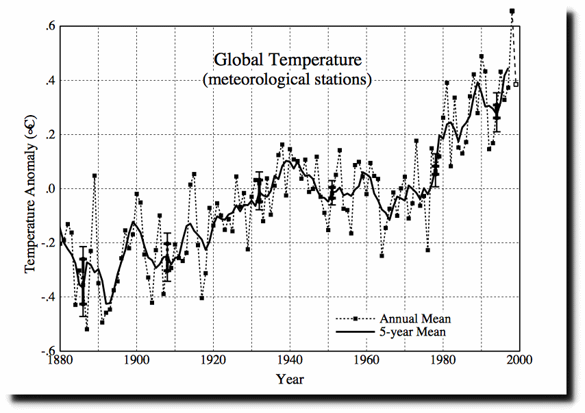
In 1999, NASA showed 0.6C warming over land from 1880 to 1999.
https://pubs.giss.nasa.gov/docs/1999/1999_Hansen_ha03200f.pdf
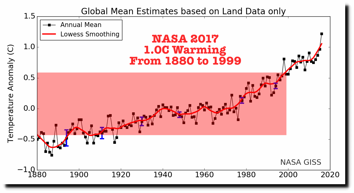
NASA now shows 1.0C warming from 1880 to 1999.
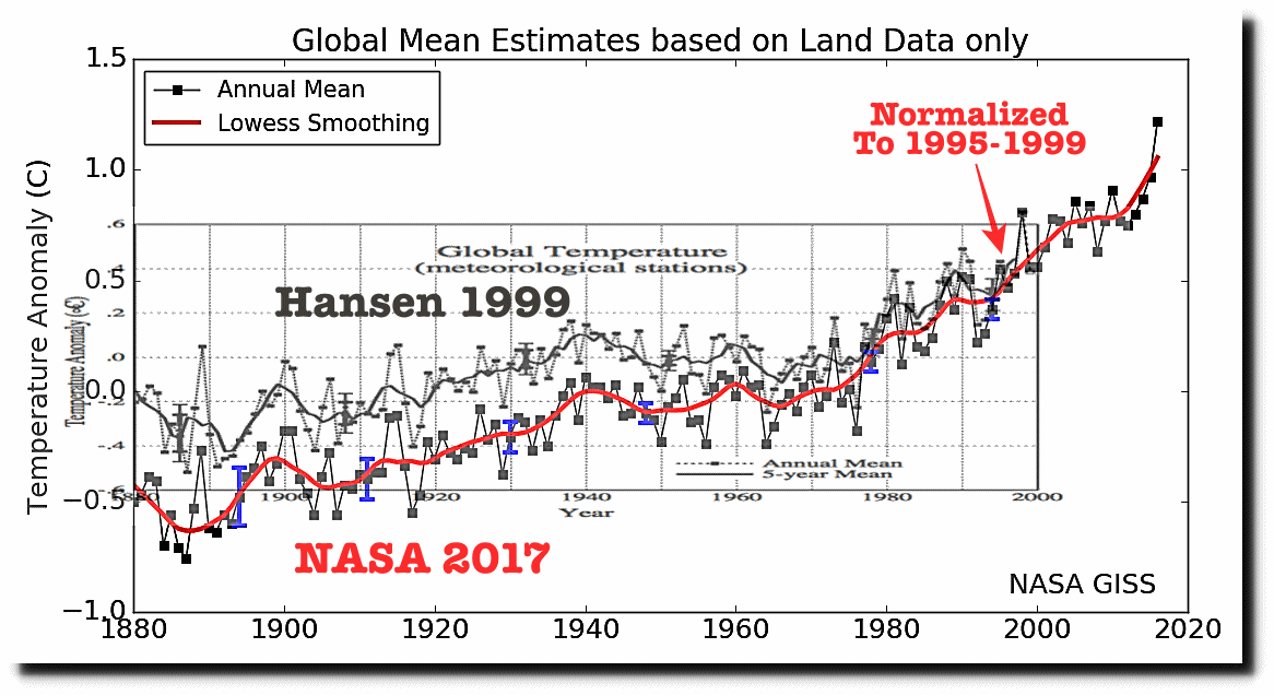
Overlaying the two graphs at the same scales, and normalizing to the most recent common years (1995-1999) it becomes clear what NASA did. They massively and increasingly cooled the past, to create non-existent warming.
The data before 1999 is fake. But what about the hockey stick since 1999? That is even faker. Satellites show that the post-1999 NASA hockey stick doesn’t exist.
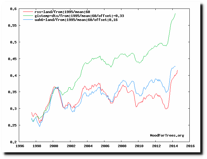
Wood for Trees: Interactive Graphs
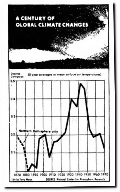
To be fair, NASA is just one player in the greatest scientific fraud in history. But the story gets worse. By 1999, NASA had already erased most of the 1940-1970 global cooling reported by NCAR and the National Academy of Sciences in 1974. There is no legitimate reason to believe earth is warmer now than it was in 1940.
14 Jul 1974, Page 1 – Lincoln Evening Journal
There is not one real thing about NASA temperature graphs, other than the fact that they bring in money and enable the global warming scam.
