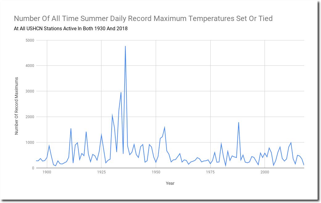
Despite all the fake news about record heat, this summer (June-August) so far has had a near record low number of daily maximum temperature records in the US. The vast majority of summer daily maximum temperature records were set more than 60 years ago, and never matched again.
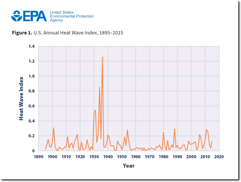
Even the climate hacks at the EPA know that the 1930’s were much hotter than any years since.
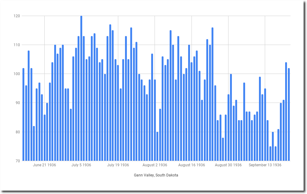
From June 25 to August 24, 1936, afternoon temperatures at Gann Valley, South Dakota averaged 105 degrees. They had twenty days over 110 degrees that summer.
I love that EPA graph and this one
https://www.fs.fed.us/research/sustain/images/criteria-indicators/indicatorimages/figure16-1.JPG
that you can’t get to anymore, but it’s still there.
Tony / Steve …. I like this one on which u can see the hot daily lows cross the hot daily highs! A clear example of urban heat island effect buggering the data when comparing today to the ’30s …. keep up the good work gents.
https://www.epa.gov/climate-indicators/climate-change-indicators-high-and-low-temperatures
We haven’t had a real scorcher of a summer for years here in Southern Arizona – sure, it’s hot but it is a desert climate here!
I’ve been recording temperatures for the last four years and have given myself an analysis assignment. It goes like this: take temperature readings on regular intervals, I sample every three seconds. Construct a Simpson integration (if that term is new to you, Google it… it’s a powerful analysis technique, but fundamentally easy to understand).
This would yield a somewhat weird physical unit since the X-axis is time; and the Y-axis temperature but could be used as a metric to determine whether one period of time, say an arbitrary summer, had more heat than another summer. And it could be done for days vs. nights as well.
To me, measuring just the daily highs fails to capture the detail of the daily heat content, and stating the averages…well, it suffers all the flaws of averages. What is the average of 1, 2, 99, 3? Something pretty close to 99…
This idea came to me from living in the desert southwest. It’s hot here in the summer. But. There are different kinds of hot days.
6 AM and it’s 101. High of 108 that persists until 6:30 PM. ( A hot day in Phoenix)
6 AM and it’s 90. High of 103 and 100 at 6:30. ( A balmy day in Phoenix)
6 AM and it’s 95. High of 115 and 95 at 6:30. (A heatwave day)
All temperatures in Fahrenheit.
The so-called heatwave days occurred the last two Junes prior to this one; this June was quite moderate. So there are days out here that increase to a peak high that lasts only and hour or so; and days that are less hot, but the heat persists throughout the day; just to point out two types of hot days. Which one is hotter? A day that hits 115 for half an hour; or one that hangs at 108 for six hours?
The same could be done for sea-ice.
Very interesting….!
Yes, heat content – or total energy – is more informative than just maximum temperature for the reasons you stated above. “Temperature” is merely the ‘average kinetic energy’ of the particles being studied; whereas “Heat” (better: “Energy”) is the sum total of the kinetic energies of the particles. This seems nitpicky but it’s very important
Q: Which has more energy, a thimble of scalding-hot water at 100 C, or a bathtub of ice-water at 0 C? A: The bathtub contains *far* more energy… waaaay more energy. Any real discussion needs to look at Joules
Integrating under a curve like that would accomplish that… and if you plugged in the ‘heat capacity’ of the gas you could easily convert the values to actual Joules
You could take this idea many directions…
Thanks for getting it! I’m just a humble semi-retired mechanical engineer and am just playing out thought experiments…maybe when I get some time I’ll play with this idea some and see what I come up with. I wonder why climate-scientists don’t do something like this when they go a-searching for that Mann-Made Fingerprint of Global Warming. Perhaps measure the…Warming? Naw! Sensationalize daily highs and blather on about anomalies based on jacked up data.
I think it would be a worthwhile experiment to try to come up with “Kelvin-days” or “Kelvin-hours” for a given location using your integration method. If you went one step further, you could report “Joule-hours/cubic meter” for a given location. You don’t do a “heat balance” in other fields just by measuring temperatures, as you pointed out
Regarding your sea-ice idea:
Why do we just use “melted/not melted” as the metric? This is too binary. There’s a huuuuge swing in ENERGY between solid water and liquid water at the same temperature (273 degrees in the case of fresh water).
Before we confiscate all private property and implement Worldwide government by Seimens Engineering and Goldman Sachs and GooGull/Faceberg, can’t we have a actual energy balance of Artic Ice plotted over a reasonable period of time? Why are we pidgeon-holed into a melt/not-melt dichotomy? Why can’t we track the total Enthalpy of Arctic Sea Ice-plus-Arctic Ocean, based on some benchmark and reasonable assumptions
Nobody seems to recognize at the same time this in NY…