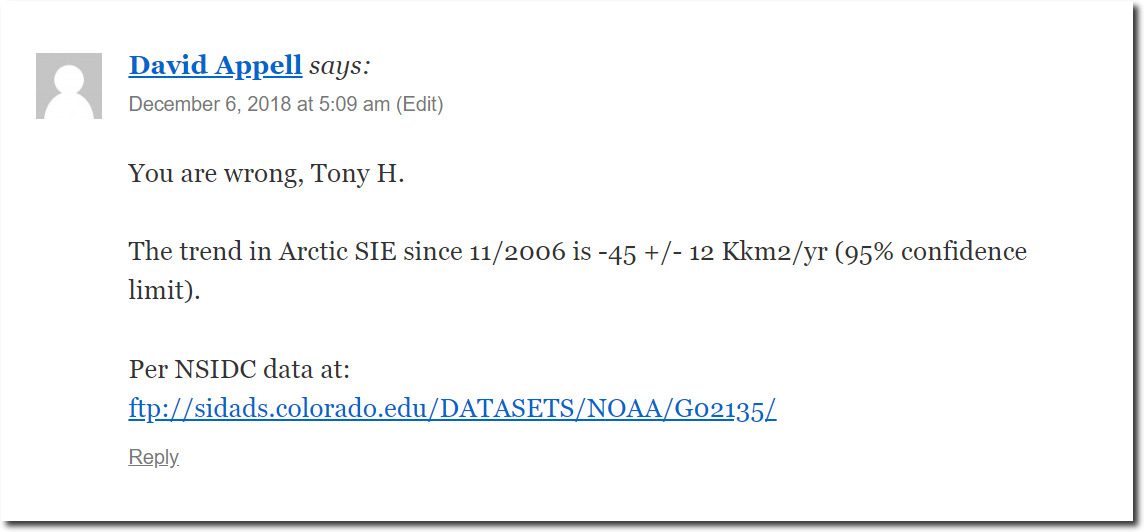
David Appell re-appears.
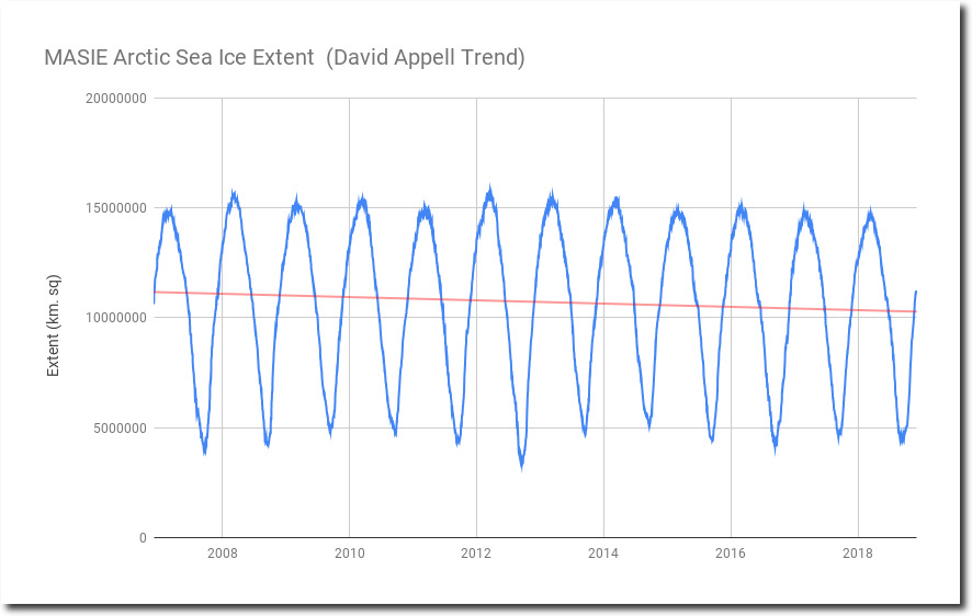
This is the graph David wants plotted, with a peak on the left side and a trough on the right side. The trend is down.
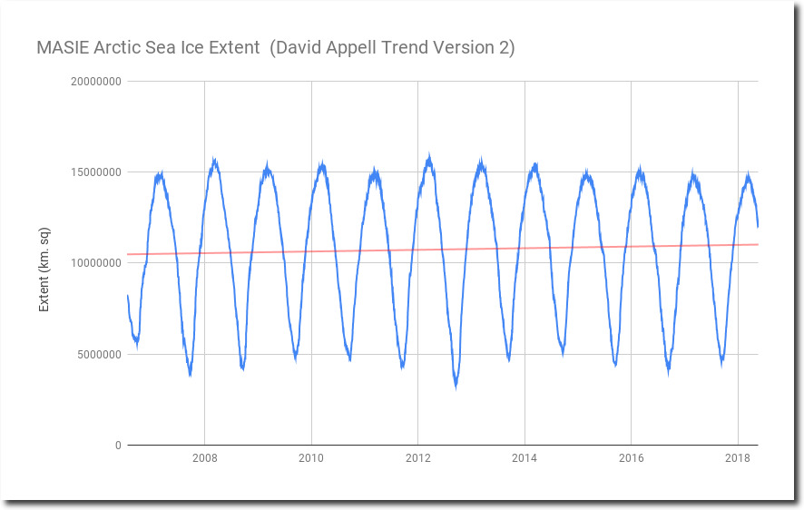
Let’s do the same plot with a trough on the left side, and a peak on the right side. Now the trend is going up.
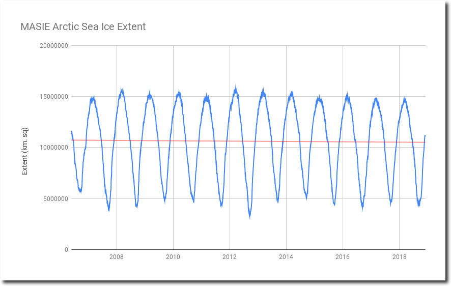
If you want to plot a meaningful trend through a cyclical function, the left and right ends have to be symmetrical, like I made it in the original post. This requires choosing the start and end dates appropriately.
masie_4km_allyears_extent_sqkm.csv
But thanks for the laugh, David.


