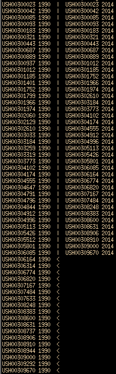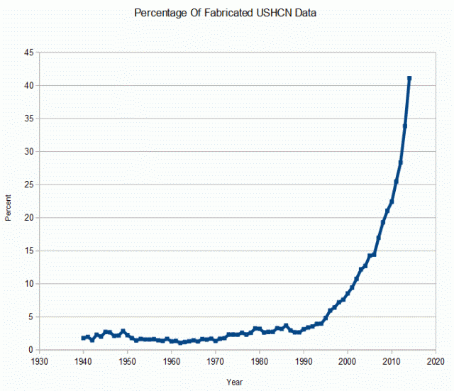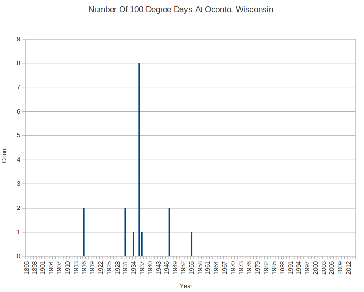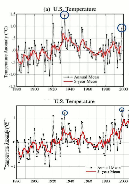
Over the past 15 years, NASA and NOAA have turned a long term US cooling trend into a warming trend. But it is even worse than that, because almost every year they make the past cooler and the present warmer.
The animation below starts at the NASA 1999 version, and progresses through 2013 – showing how they year after year tweak the measured cooling data to create the appearance of a warming signal – which does not exist in the thermometer data.
What is really ugly about this is that they overwrite the data in place, don’t archive the older versions, and make no mention of their changes on the web pages where the graphs are displayed. There should be prominent disclaimers that the actual thermometer data shows a 90 year cooling trend in the US, and that their graphs do not represent the thermometer data gathered by tens of thousands of Americans over the past 120 years.
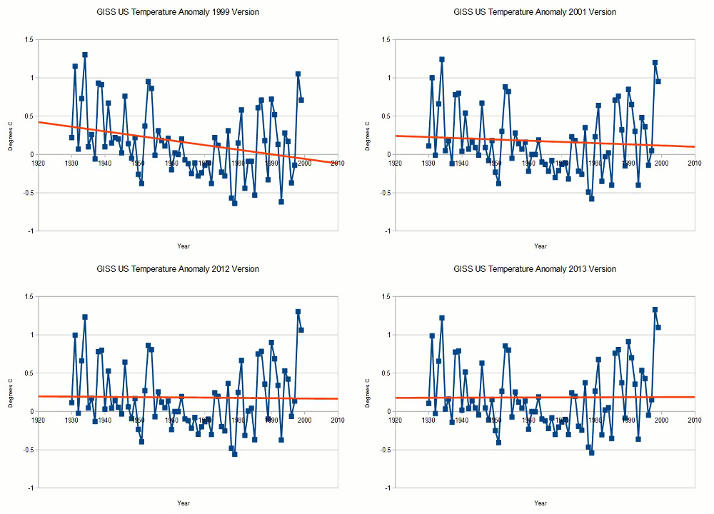
Fortunately, their data has been archived by other people over the years, so the history of these alterations is not lost. The web addresses shown below are the original addresses where the data was archived from.
1999 version : www.giss.nasa.gov/data/update/gistemp/graphs/FigD.txt
2001 version : www.giss.nasa.gov/data/update/gistemp/graphs/FigD.txt
2012 version : data.giss.nasa.gov/gistemp/graphs_v3/Fig.D.txt
2013 version : data.giss.nasa.gov/gistemp/graphs_v3/Fig.D.txt
NOAA does have discussions on obscure web pages describing their thought process behind the alterations, but few people know about this. The alterations are highly subjective, and could just as easily go the other way – making the present cooler due to urban heat island effects.
These alterations are being made by government employees with a strong vested interest in global warming, who should recuse themselves because of their overt conflict of interest. Their boss, the President of the United States, has made it clear that he will not accept any data which does not promote global warming theory. That is pretty strong motivation to generate warming data.