The graph below shows GISS US temperatures five year mean. At first glance, it looks like the US is really heating up.

data.giss.nasa.gov/gistemp/graphs_v3/Fig.D.txt
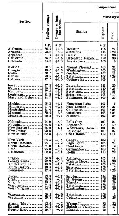
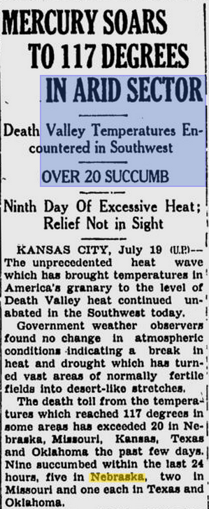
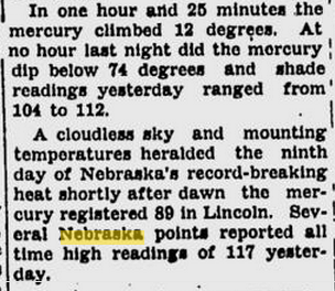
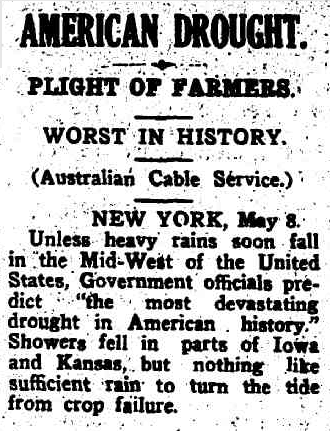
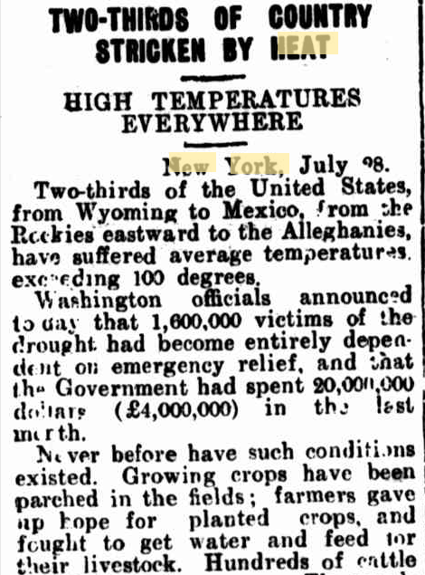
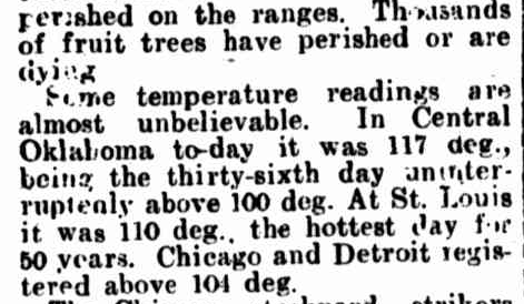
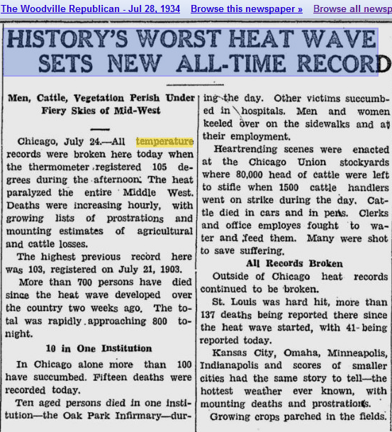
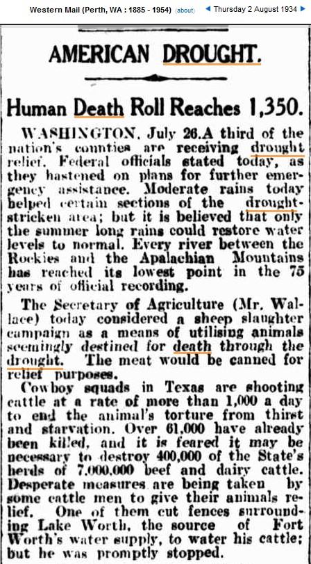
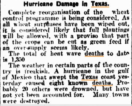
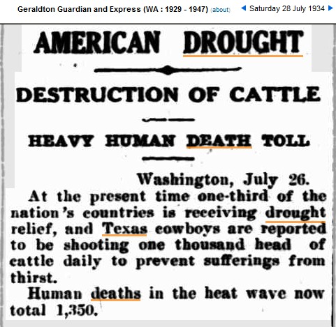
Now compare that to the actual GHCN thermometer data which the graph is based on. They look nothing alike. The 1930s were much hotter.
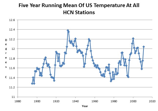
Index of /pub/data/ghcn/daily/hcn/
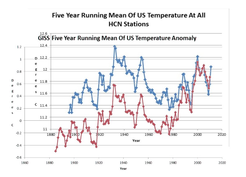
The next graph overlays the published GISS temperature (red) on the thermometer data (blue) normalized to 2003. You can see that they have massively cooled the past relative to the present – to create the appearance of non-existent warming.
Next, let’s compare the actual data to what GISS published in 1999, before they started their most serious tampering.
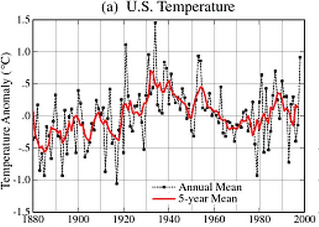
NASA GISS: Science Briefs: Whither U.S. Climate?
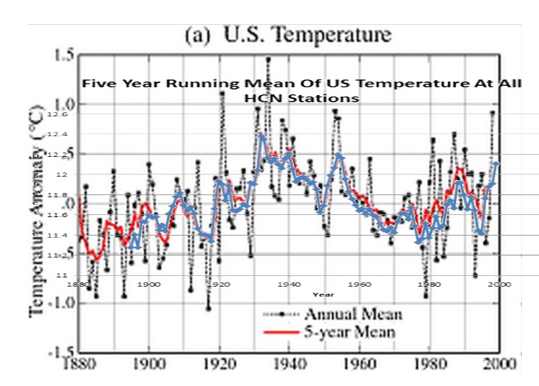
The next graph overlays the thermometer data (blue) on the 1999 GISS graph. You can see that there was much less tampering going on at that time.
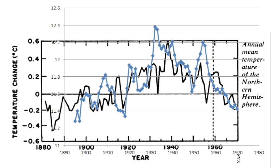
The next graph is a bonus, which overlays the thermometer data (blue) on the National Academy of Sciences 1975 Northern Hemisphere graph. The correlation is pretty decent.
GISS US temperature graphs are a complete fraud, and Hansen knows it. He wrote this in 1999.
Whither U.S. Climate?
By James Hansen, Reto Ruedy, Jay Glascoe and Makiko Sato — August 1999
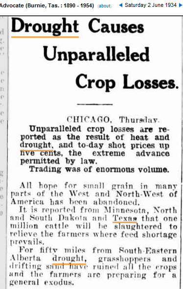
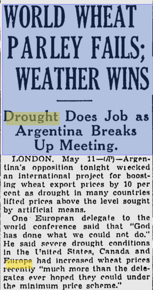
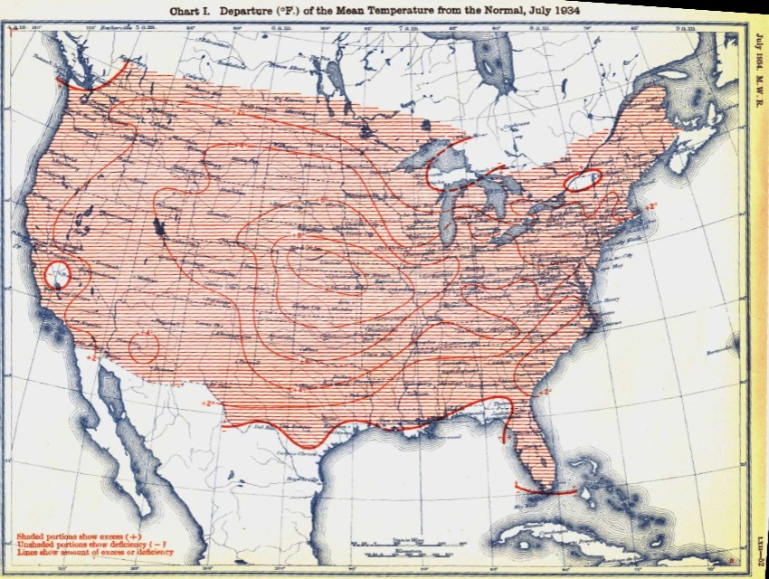
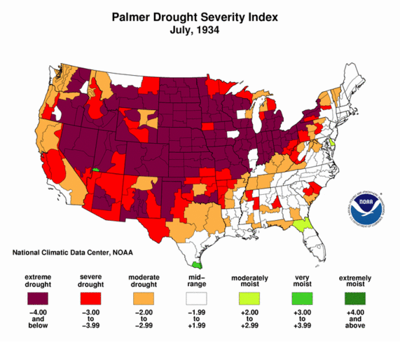
Empirical evidence does not lend much support to the notion that climate is headed precipitately toward more extreme heat and drought. The drought of 1999 covered a smaller area than the 1988 drought, when the Mississippi almost dried up. And 1988 was a temporary inconvenience as compared with repeated droughts during the 1930s “Dust Bowl” that caused an exodus from the prairies, as chronicled in Steinbeck’s Grapes of Wrath.
in the U.S. there has been little temperature change in the past 50 years, the time of rapidly increasing greenhouse gases — in fact, there was a slight cooling throughout much of the country
NASA GISS: Science Briefs: Whither U.S. Climate?