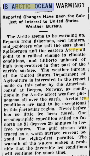
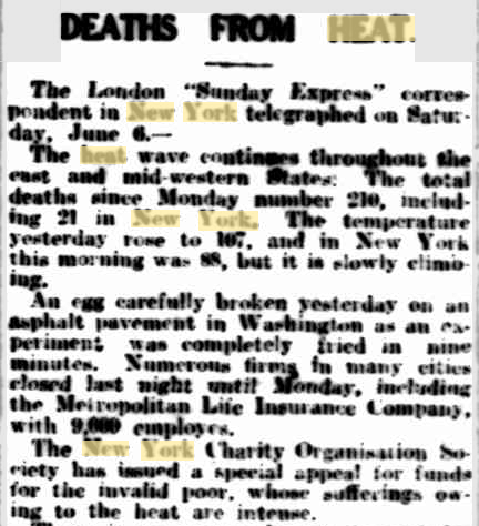
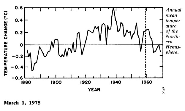
In 1975, the National Academy of Sciences published this graph and warned of dramatic global cooling.
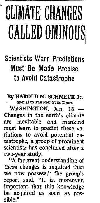
http://select.nytimes.com
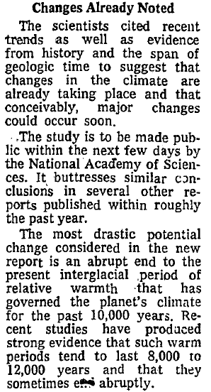
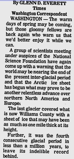
The National Science Foundation warned of the same thing.

The Bryan Times
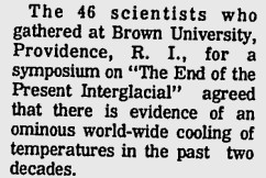
Never mind the actual history of the planet. The IPCC has a dirty job to do and has wiped out most of 20th century history with this graph, that shows no 1940s warmth and no 1970s global cooling scare. There is no “ominous world-wide cooling” shown in the IPCC graph from 1953 to 1973.
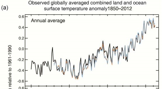
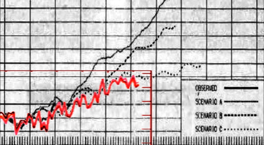
The next graph overlays the IPCC graph in red on the 1975 National Academy of Sciences graph at the same scale. Our scumbag friends have knocked half a degree off most of the 20th century.
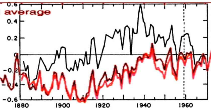
They will protest that the NAS graph is just for the Northern Hemisphere, trying to make the absurd case that from 1890 to 1910 the NH was warming rapidly while the SH was cooling even faster. Polarity divergence like that can’t happen, because both hemispheres are driven by ENSO.
Also note that the (scam) artist who created the IPCC graph forgot to put in the late 1930s peak.
The IPCC in conjunction with NASA and NOAA has completely rewritten Earth’s history, because they are criminally minded political organizations, not scientific ones.