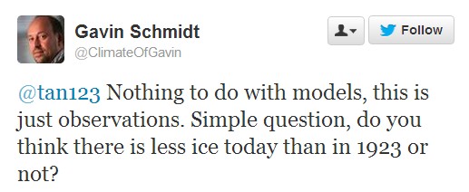
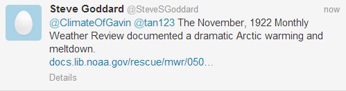
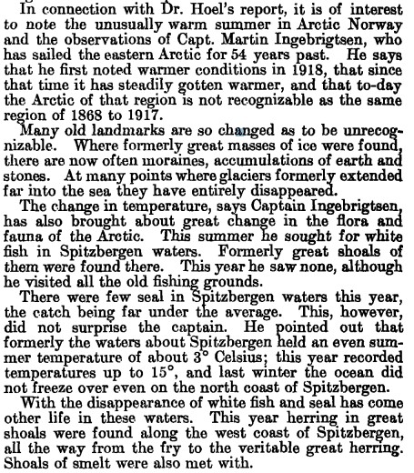
Alarmists like Nuttercelli are hiding behind what they call “the long term trend” in Arctic ice, as a way to avoid a serious discussion about the 60% increase in ice this year.
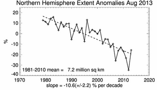
The first thing to note is that NSIDC starts their graph at the century maximum in 1979. In the early 1970s, sea ice was much less extensive than later in the decade. If NSIDC included the entire satellite record in their graph, it would look like a sine wave, not a straight line.
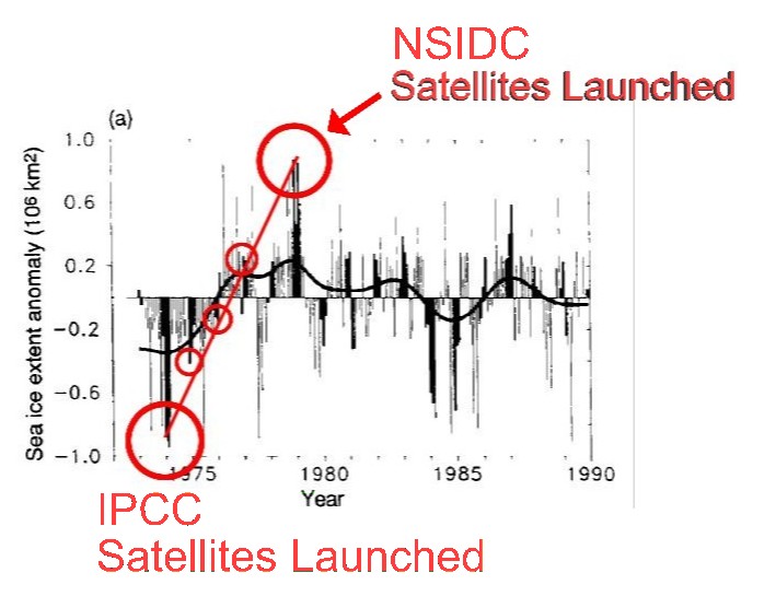
www.ipcc.ch/ipccreports/far/wg_I/ipcc_far_wg_I_full_report.pdf
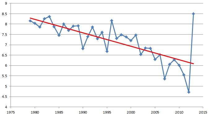
Another important issue is that plotting linear trends on short sections of a cyclical function – is junk science and mathematics. Even if August ice was at an all-time record high, the post-1979 linear trend would still be down, as shown in the demonstration purposes only graph below.
Temperatures always move in one direction from July-January. Would anyone be stupid enough to extrapolate January-July temperatures based on the July-January slope?