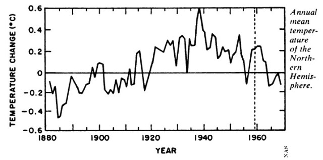
In 1975, the National Academy of Sciences published the graph below – showing that the 1930s were very hot in the northern hemisphere, and that there had been a sharp cooling trend since 1940.
Science News Ice Age
Neither of these facts fit Hansen’s theory, so he largely got rid of both.
Data.GISS: GISS Surface Temperature Analysis: Analysis Graphs and Plots
GISS has a link on their web page to the data.
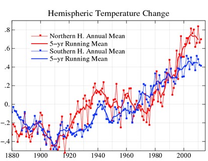
Annual and five-year running mean temperature changes with the base period 1951-1980 for the northern (red) and southern (blue) hemispheres.
available is a table
Data.GISS: GISS Surface Temperature Analysis: Analysis Graphs and Plots
Their public data link is of course forbidden, in the spirit of transparency.

403 Forbidden
Fortunately I was able to find a link in the Internet archive from 2010.
ZonAnn.Ts+dSST.txt
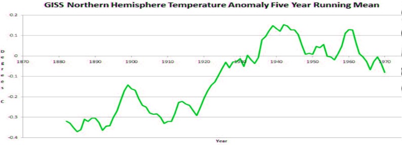
The graph below plots Hansen’s Northern Hemisphere five year running mean from that data set. Note that it shows very little cooling from 1940 to 1970.
The next graph overlays Hansen’s 2010 version of northern hemisphere temperature on the 1975 National Academy of Sciences plot. Hansen has subtracted about 0.2C from most of the pre-1955 data. It is also safe to assume that the 2013 version is even more corrupt than the 2010 version, because he has cooled the past by an additional 0.1C since 2010.
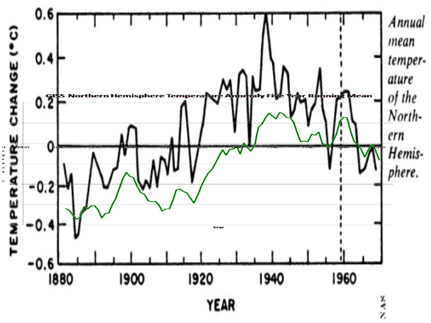
This wonderful achievement by James Hansen has eliminated both that pesky 1930s hot period, and the global cooling scare.
Kudos to James Hansen for first rate government sponsored data tampering.
Unfortunately he wasn’t able to erase the newspaper records, which show that he is committing fraud.
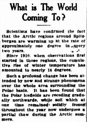
Sixteen degrees of Arctic warming between 1910 and 1939. Last time I checked, the Arctic was part of the Northern Hemisphere.

Continue reading →