
Disrupting the Borg is expensive and time consuming!

Google Search
-
Recent Posts
- Cattle And The Climate
- One Atomic Bomb Per Hour
- New Video : Analyzing Oil And Gas
- Is Antarctica Melting?
- High Speed Analysis And Visualization
- El Nino To The Rescue?
- Fake News Update
- Growth Of Antarctic Sea Ice
- 65 Years Of Progress!
- El Nino To The Rescue?
- Worst March Drought On Record
- ChartGL Process Control Demo
- The Biggest Money Laundering Scam
- Drought In The Headwaters Of Lake Powell
- Unrealistic Expectations Of Water Availability
- Did Bill Gates Do This?
- Worst March Drought On Record In The US
- The Real Hockey Stick Graph
- Analyzing The Western Water Crisis
- Gaslighting 1924
- “Why Do You Resist?”
- Climate Attribution Model
- Fact Checking NASA
- Fact Checking Grok
- Fact Checking The New York Times
July 2026 M T W T F S S 1 2 3 4 5 6 7 8 9 10 11 12 13 14 15 16 17 18 19 20 21 22 23 24 25 26 27 28 29 30 31 Recent Comments
- arn on Cattle And The Climate
- Bob G on Cattle And The Climate
- Robertvd on Cattle And The Climate
- Bob G on Cattle And The Climate
- Robertvd on Cattle And The Climate
- Billyjack on Cattle And The Climate
- Bob G on Cattle And The Climate
- Robertvd on Cattle And The Climate
- Robertvd on Cattle And The Climate
- Robertvd on Cattle And The Climate
Experts Say Carbon Dioxide Is “Highly Combustible”
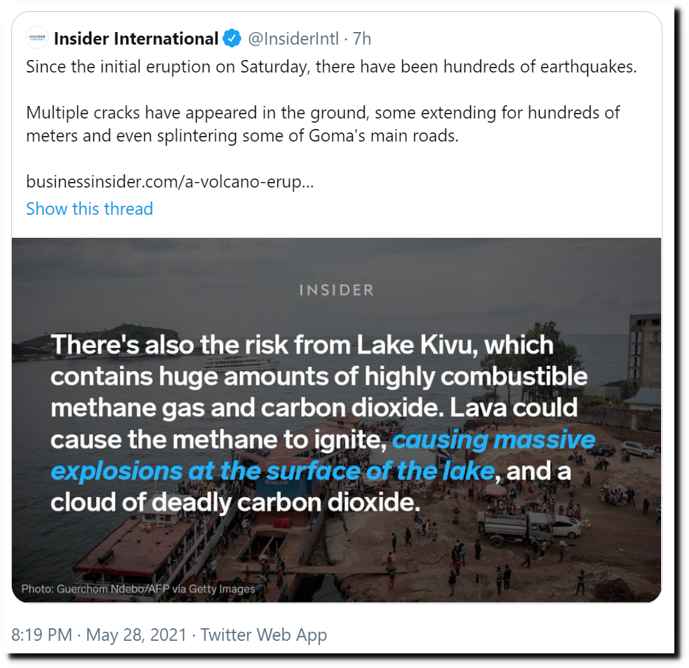
Someone better tell the fire extinguisher industry, which uses CO2 to put out fires.

Posted in Uncategorized
Leave a comment
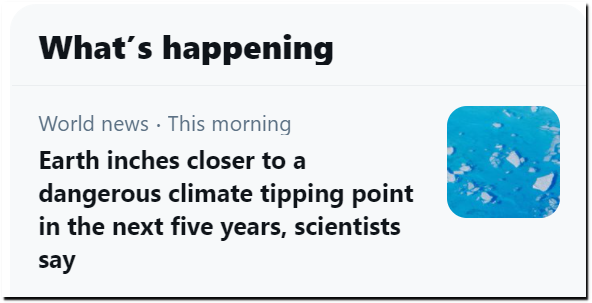
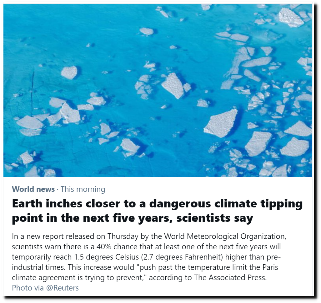
Five Years Left For The Planet
At the top of Twitter Trends tonight. Only five years left for the planet.
Posted in Uncategorized
Leave a comment
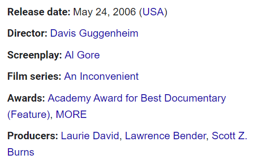
An Inconvenient Climate
Fifteen years ago today, Al Gore released his sci-fi flick.
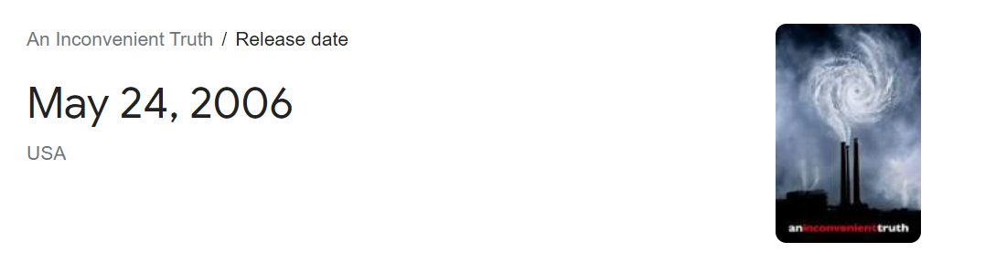
It won the Academy Award for best documentary and was produced by Laurie David.
The movie won Al Gore the Nobel Prize.
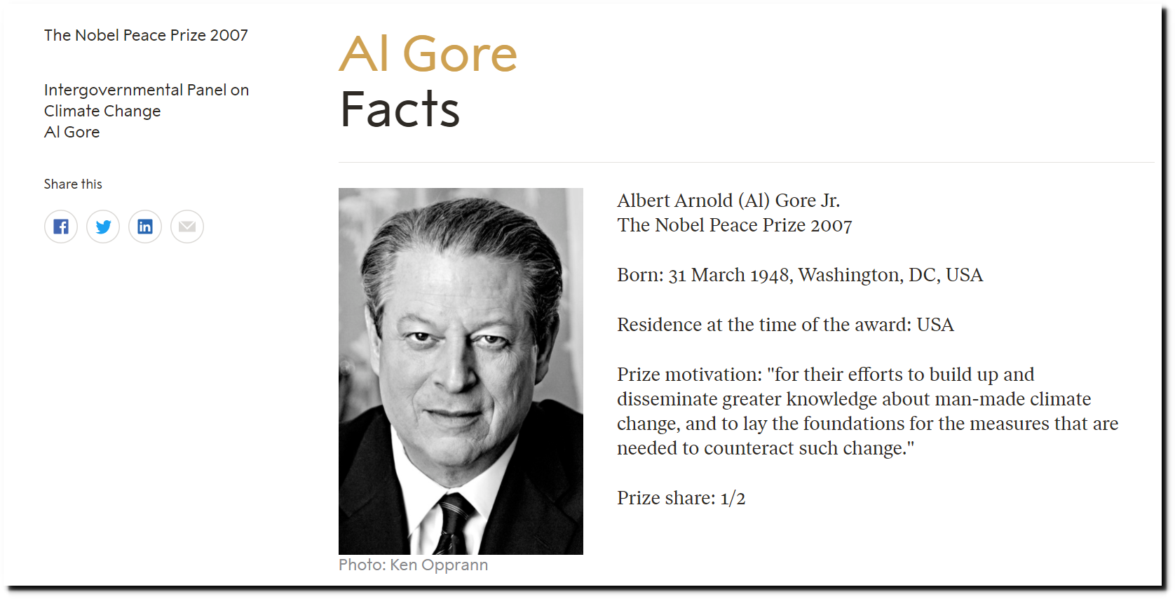
Al Gore – Facts – NobelPrize.org
The movie was released after the warmest January on record in the US.
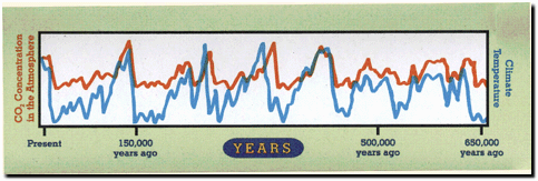
The centerpiece of his movie was this graph showing atmospheric CO2 and temperature over the past 650,000 years. He believed the graph showed that cyclical 50PPM changes in atmospheric CO2 produced 10F swings in temperature.
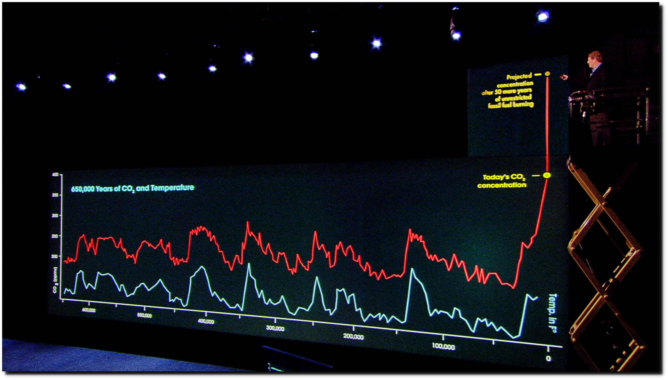
What the graph actually showed is that warmer ocean water outgasses CO2, and colder water absorbs CO2. Gore had been confused about this since at least 1990.
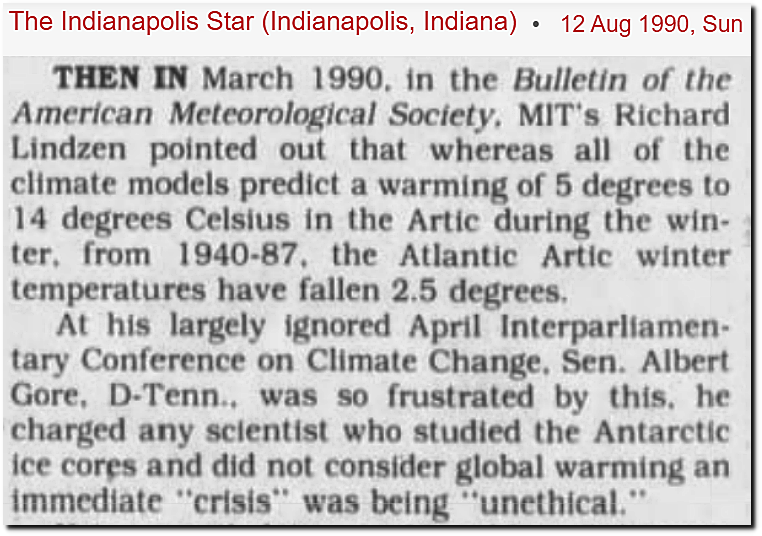 12 Aug 1990, Page 102 – The Indianapolis Star at Newspapers.com
When he became VP in 1993, he cut off funding to scientists like Dr. Bill Gray, who didn’t share Gore’s misinterpretation of the relationship.

The movie’s producer Laurie David at some point realized that temperature leads and CO2 follows, so in her school textbook she tampered with the graph to reverse the data and make it look like CO2 led temperature.
And at Sundance Film Festival in 2006, he said that we only had until 2016 to save the planet from global warming.
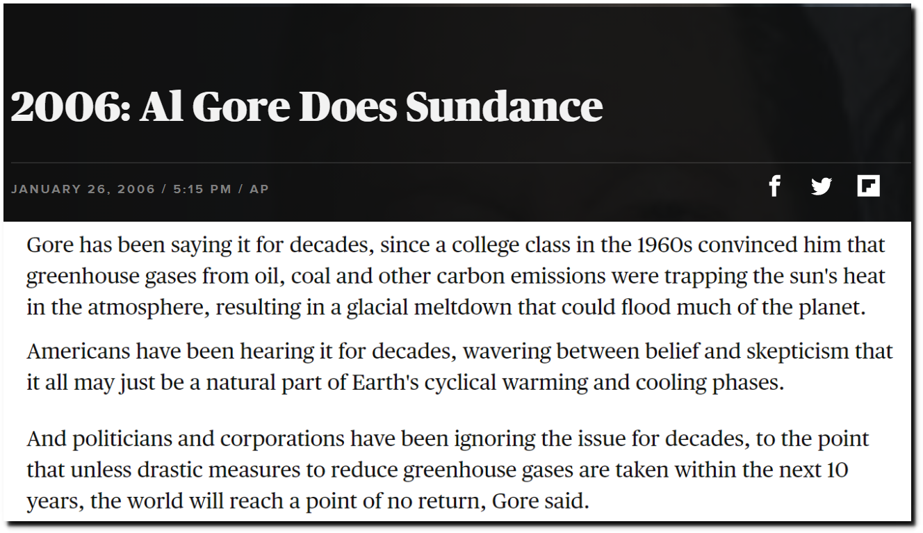
2006: Al Gore Does Sundance – CBS News
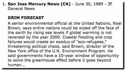
He actually gave the earth a sixteen year reprieve beyond the original UN forecast.
And AOC has since extended the date another fourteen years until the year 2030.
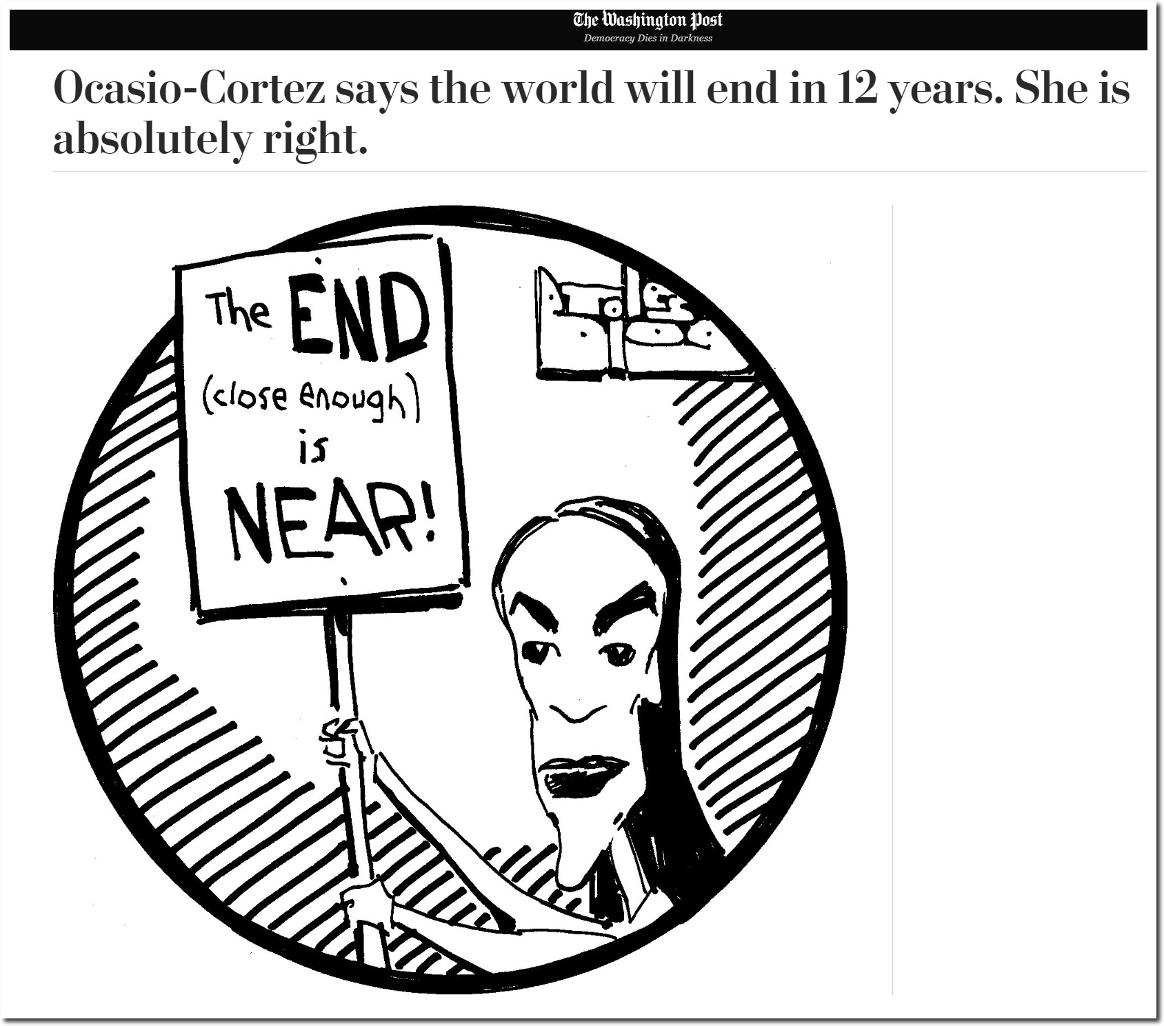
Ocasio-Cortez says the world will end in 12 years. She is absolutely right. – The Washington Post
Gore also predicted that the Arctic would be ice-free by the year 2014.
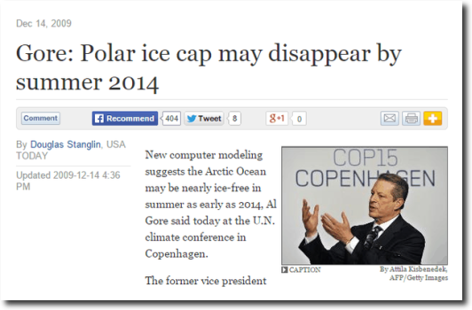
Gore: Polar ice cap may disappear by summer 2014
But there has been no change in Arctic sea ice extent since then.

ftp://osisaf.met.no/prod_test/ice/index/v2p1/nh/osisaf_nh_sie_daily.txt
Had Gore looked further back in the geologic record, he would have known that there is no large-scale relationship between CO2 and temperature.
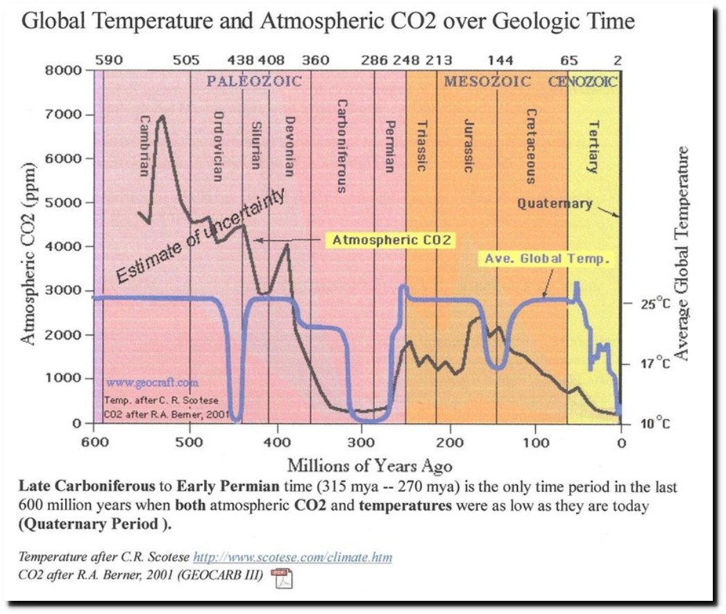
And under Gore’s model of climate sensitivity (10F/50PPM CO2,) temperatures should heave been more than 1,000 degrees warmer during the Cambrian Era, when CO2 levels were 7,000 PPM.
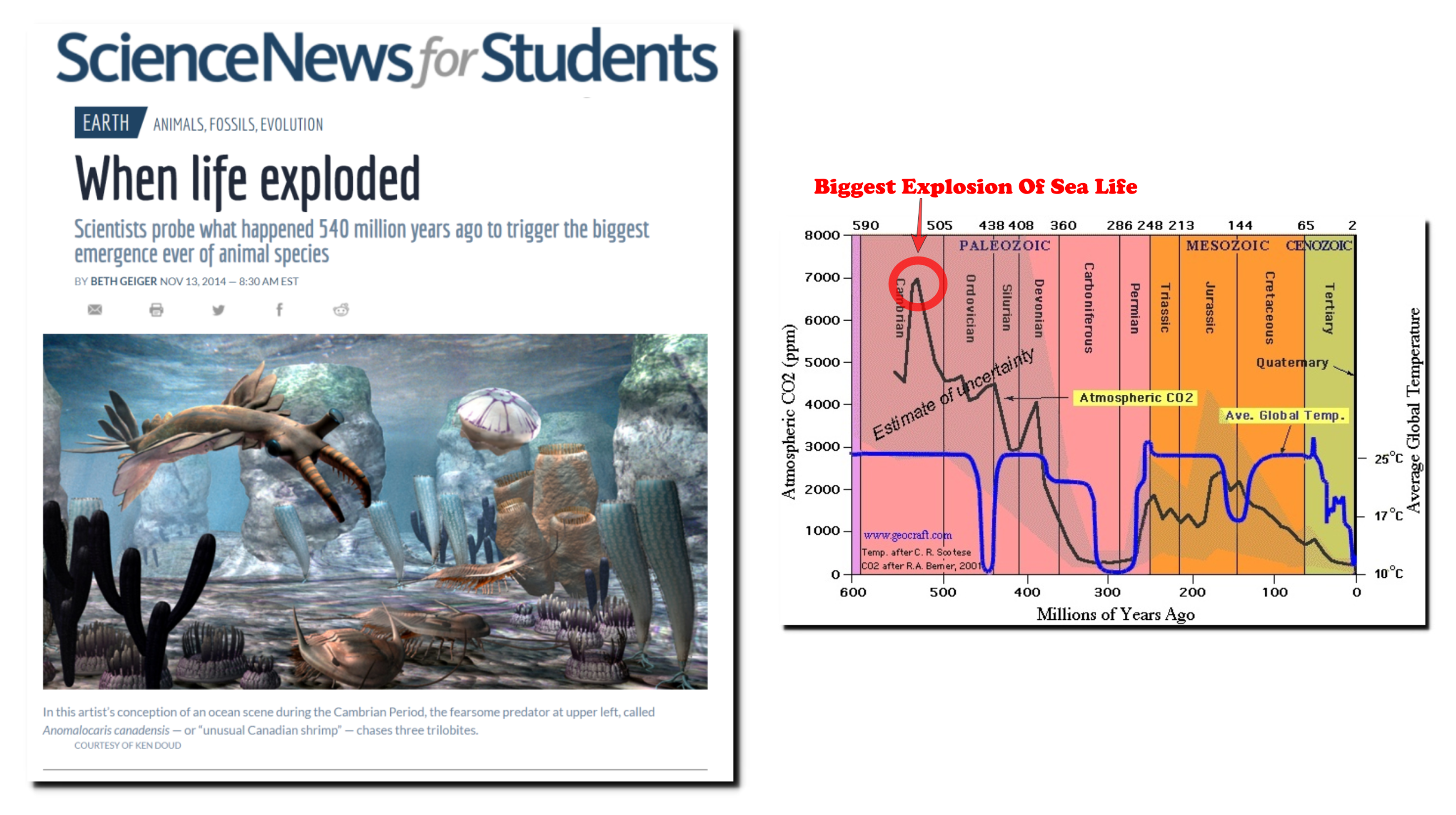
When life exploded | Science News for Students
There have been dozens of “climate agreements” since Gore became VP – and none of them have accomplished anything.
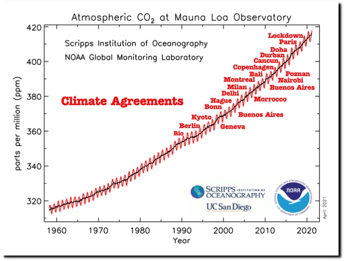
Global Monitoring Laboratory – Carbon Cycle Greenhouse Gases
Posted in Uncategorized
Leave a comment
ABC News – Cold Weather In The Mountains Is Not Normal
The press has been telling us for decades that cold and snow don’t happen much any more because of global warming, and now that we are having a lot of cold and snow – they call it “extreme weather” caused by global warming and say it is “not normal.”
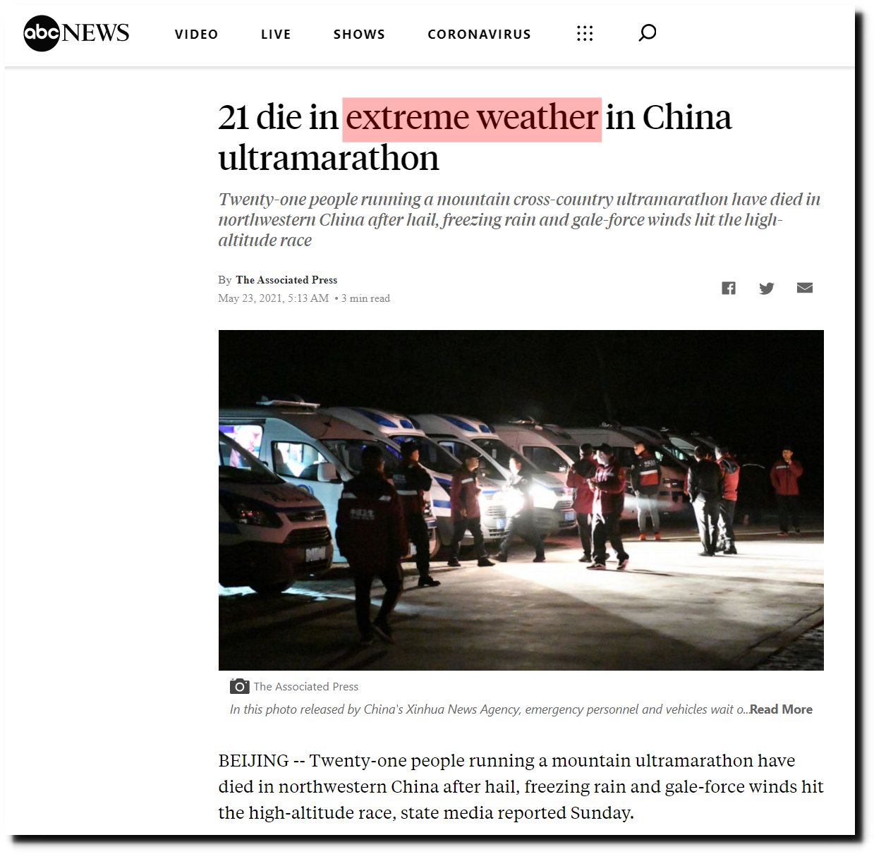
21 die in extreme weather in China ultramarathon – ABC News
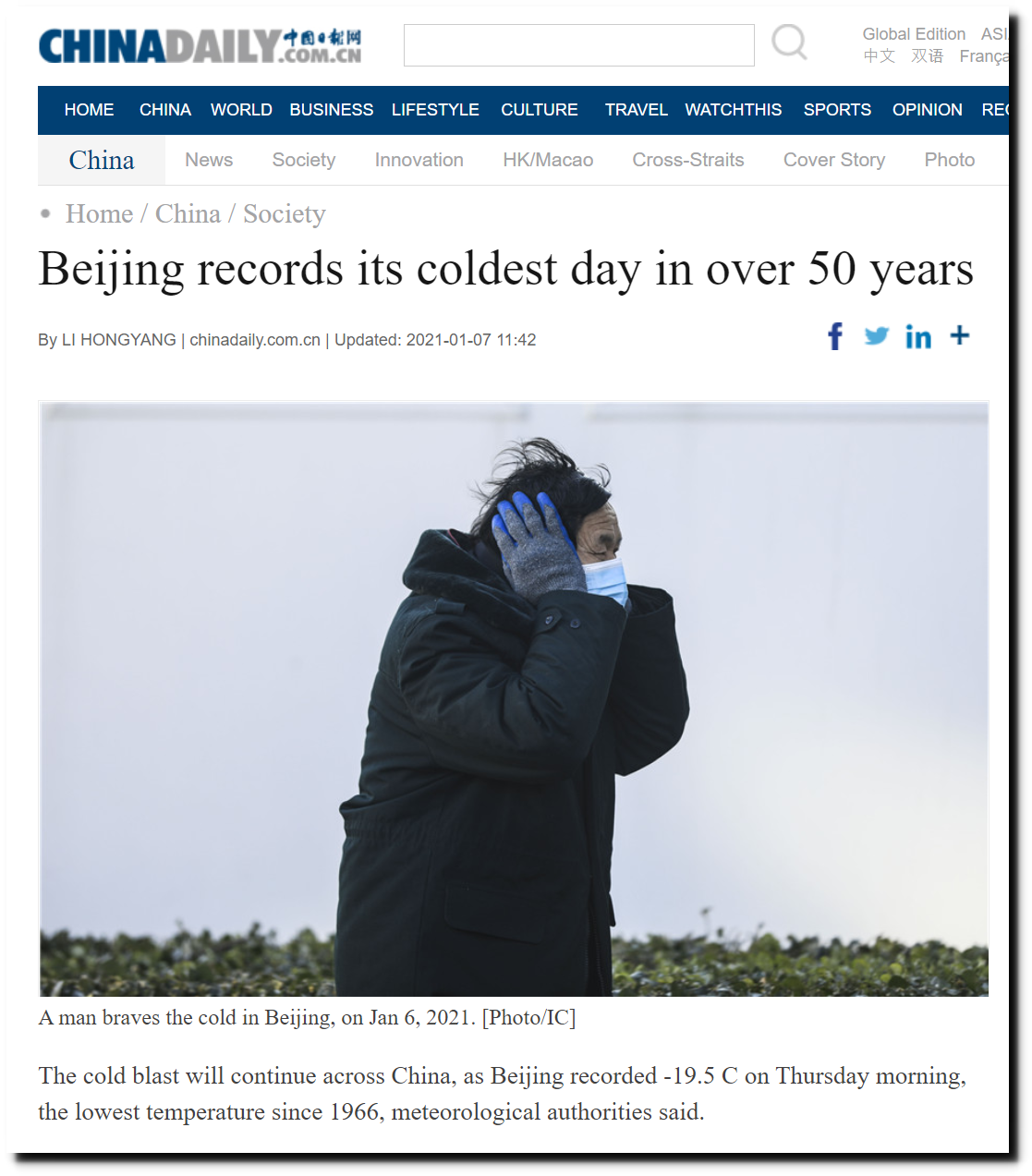
Beijing records its coldest day in over 50 years – Chinadaily.com.cn
Posted in Uncategorized
Leave a comment
UNHIDING V2 For Windows (And Experienced Mac And Linux Users)
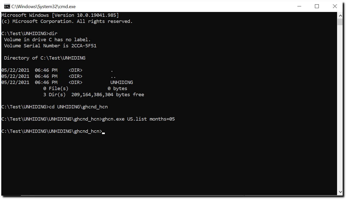
I have released a new version of the Unhiding The Decline climate graphing software. Download UNHIDING.zip from this link and unzip it. This will create a directory structure UNHIDING\UNHIDING\ghcnd_hcn\output
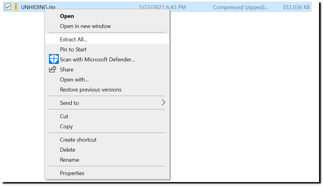
Open up a command prompt window in the UNHIDING directory which the unzip created, and enter these commands.
cd UNHIDING\ghcnd_hcn
.\ghcn.exe US.list months=05
Wait a few minutes and if things are working correctly, this window will pop up.
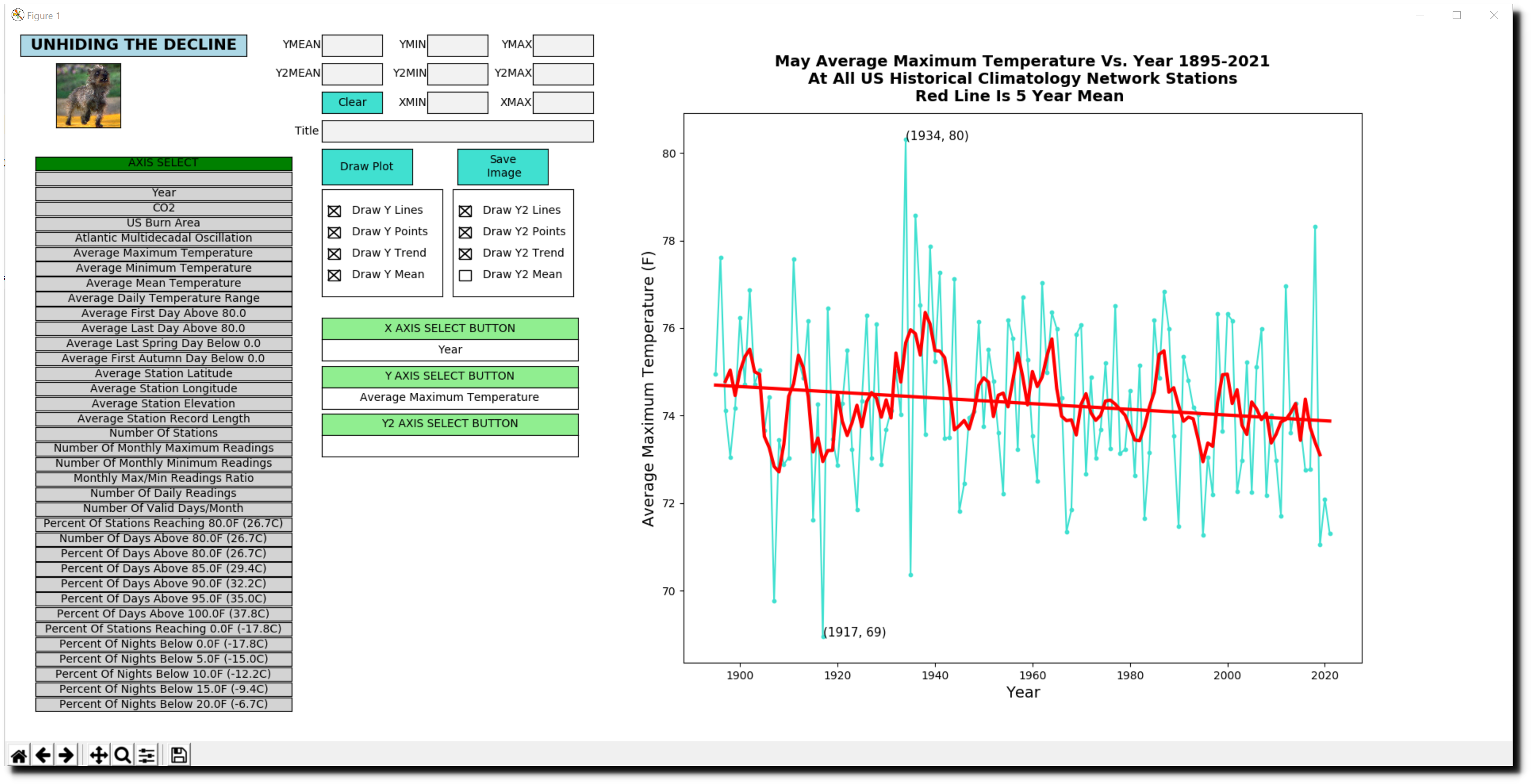
If you have used my earlier version, you will notice that the UI has changed. You can now plot two different graphs, Y and Y2. The graph below plots US Burn Area on Y, and atmospheric CO2 on Y2.

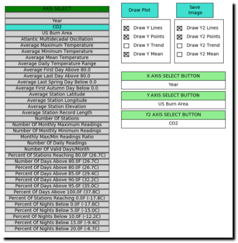
To create the graph above :
- Click on the Y AXIS SELECT button
- Click on US Burn Area in the grey box at left
- Click on the Y2 AXIS Select Button
- Click on CO2 in the grey box at left
Enter a start year of 1926, and end year of 2020 as shown below.
Set the checkboxes as shown below.
Press the Draw Plot button – that will create the graph.
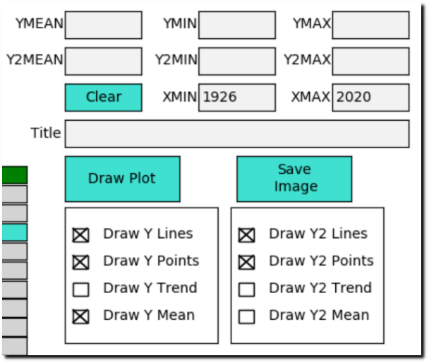
To save an image of the graph, press the Save Image button. That will save the graph image as a .png file in the UNHIDING\ghcnd_hcn\output directory.
The new code can also be run by experienced Mac and Linux users as a python script.
python3 ghcn.py US.list months=05
People with UNIX like environments can update the temperature data from NOAA with these commands:
cd ..
./get
cd ghcnd_hcn
The new code has a large amount of features which I haven’t documented here. Feel free to look at the python script ghcn.py and figure them out. Everything is contained in that file.
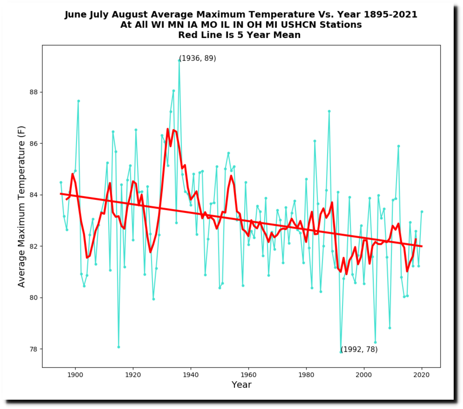
I will leave you with one more usage example for Upper Midwest summer temperatures.
.\ghcn.exe US.list months=060708 states=WIMNIAMOILINOHMI
I plan to make a video showing usage in more detail.
Posted in Uncategorized
Leave a comment
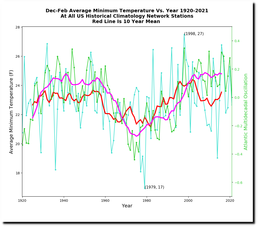
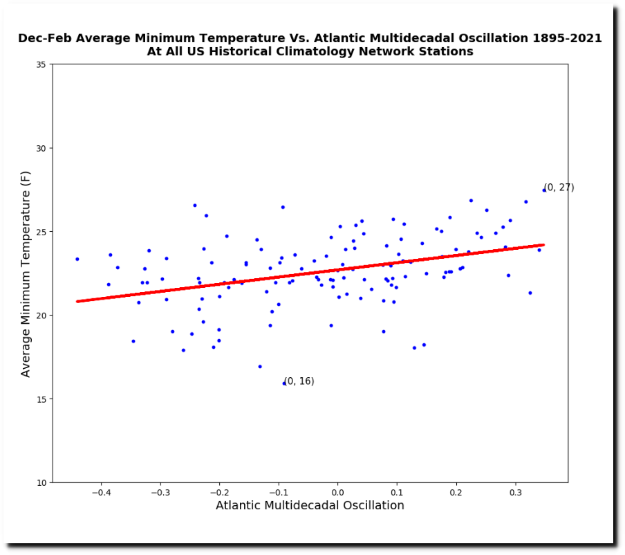
US Winter Temperatures Track AMO
Kirye(@KiryeNet) suggested that I add the Atlantic Multidecadal Oscillation into my graphing software. US winter temperatures track the AMO.
Posted in Uncategorized
Leave a comment
Climate Change Indicators
The EPA has brought back their website detailing “ongoing climate threats” which were being suppressed by the Trump Administration.
Heat waves across the country are more frequent, more intense, and last longer. Wildfires are burning more land. The East and Gulf Coasts are flooding more often, while ice sheets are disappearing and sea levels are rising.
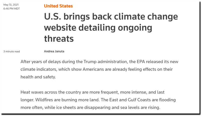
U.S. brings back climate change website detailing ongoing threats | Reuters
The first graph on their website shows CO2 concentrations, in an attempt to link CO2 with climate.

Climate Change Indicators in the United States | US EPA
Then they have heatwave graphs going back to the 1960s, showing heatwaves increasing.
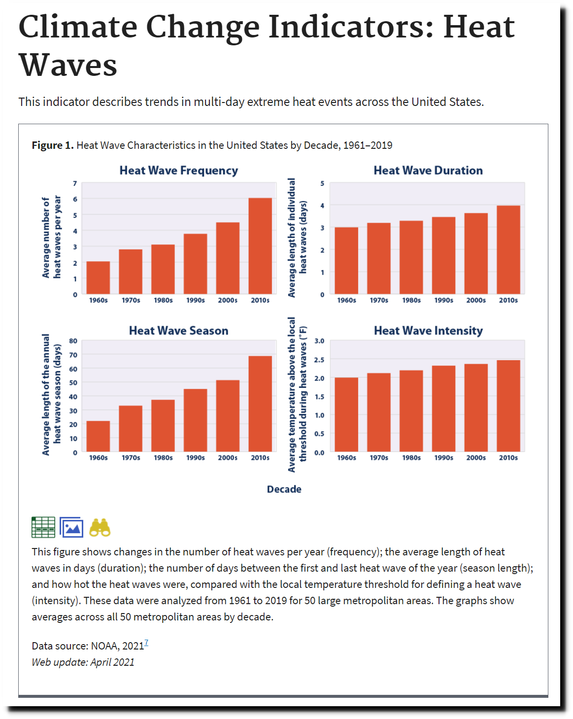
Climate Change Indicators: Heat Waves | Climate Change Indicators in the United States | US EPA
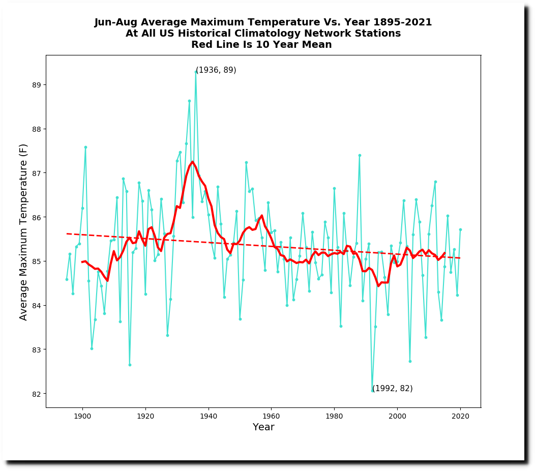
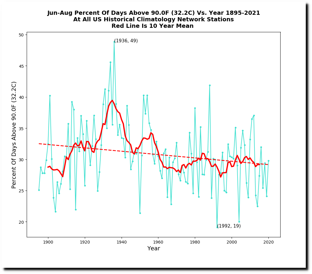
Their old heatwave graph shows that they cherry picked the lowest point in the dataset, and that heatwaves were much less severe in the second half of the 20th century than in the first half.
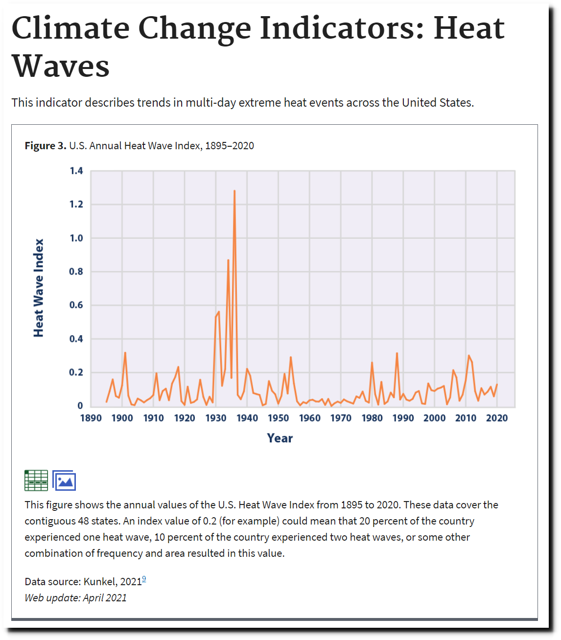
Climate Change Indicators: Heat Waves | Climate Change Indicators in the United States | US EPA
The National Climate Assessment showed the same thing.

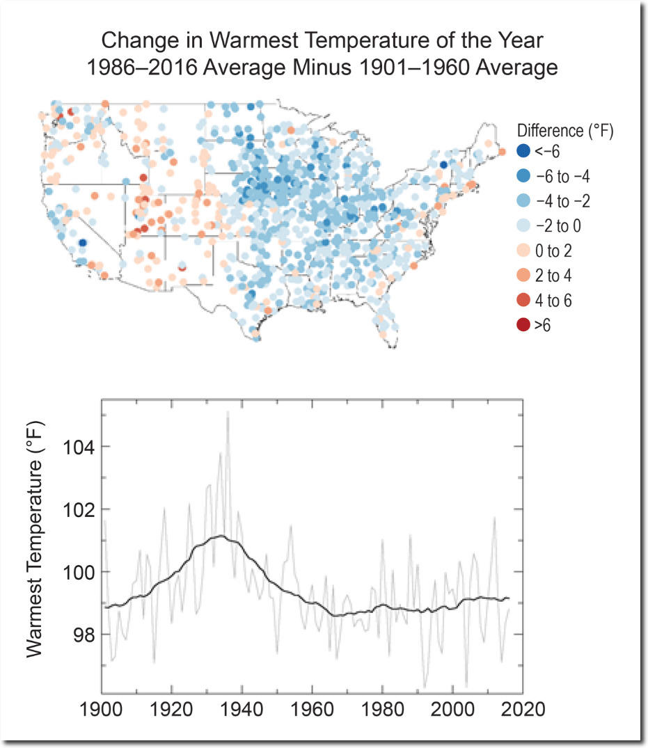
Temperature Changes in the United States – Climate Science Special Report
Summers are also getting shorter, with May temperatures getting cooler


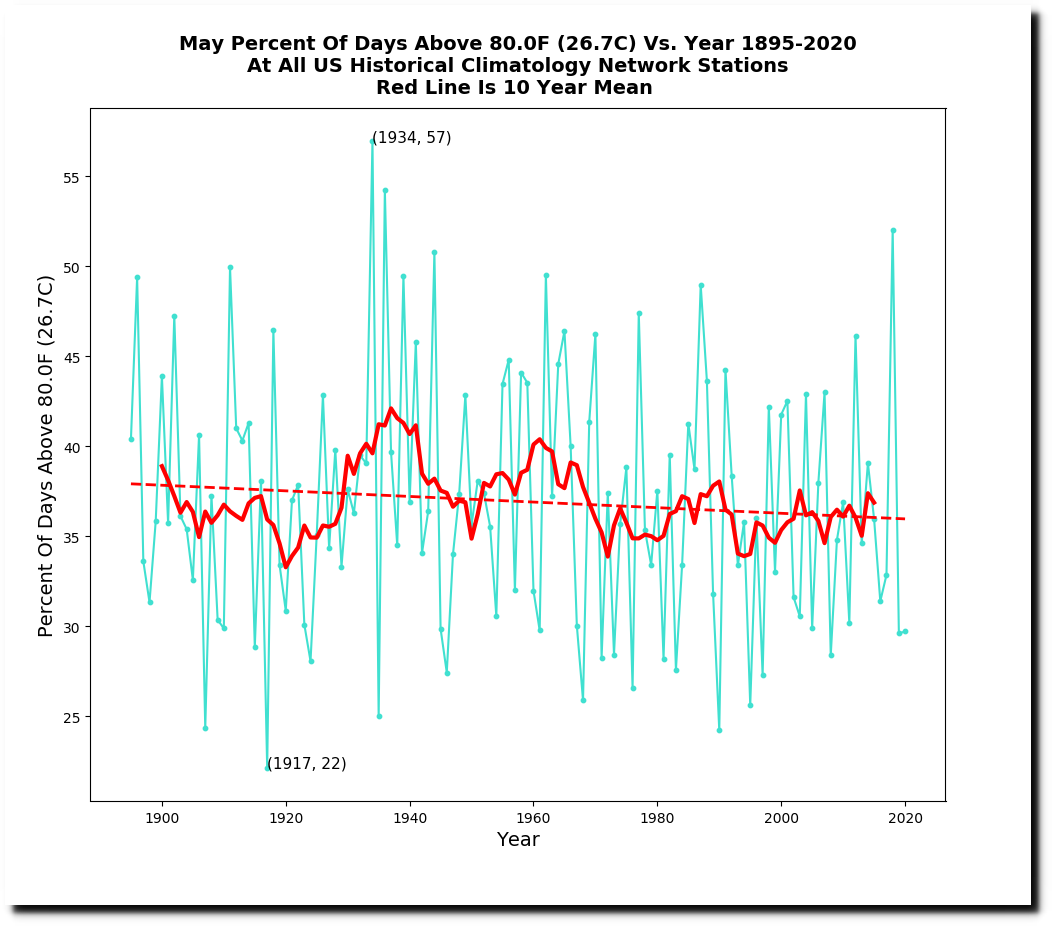
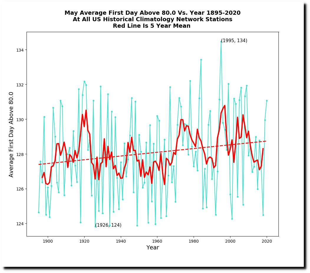
Summers have gotten much cooler in the US over the past century.
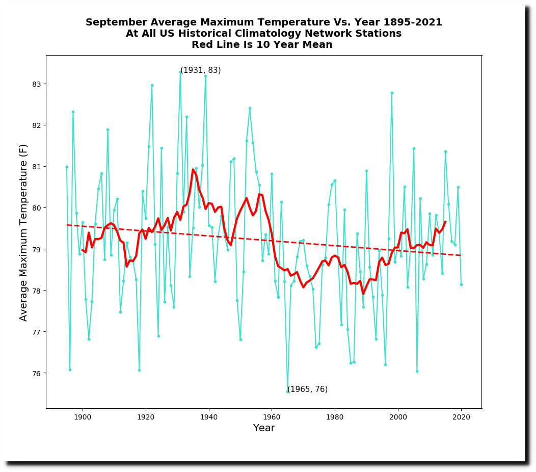
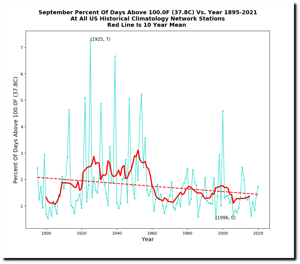
September temperatures are getting cooler as well.

On May 22, 1911, almost the entire northeast US was over 90F (32C) and Maine was over 100F (38C.)
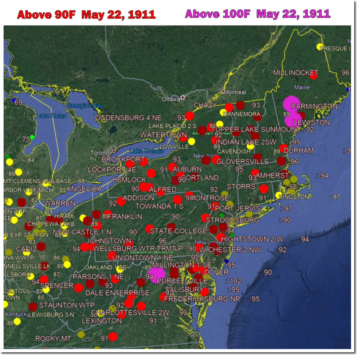
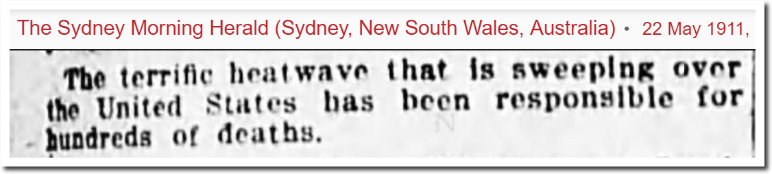
22 May 1911, Page 1 – The Sydney Morning Herald at Newspapers.com
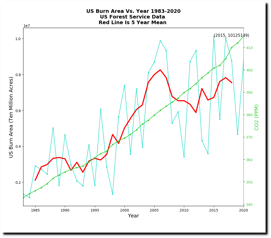
The EPA shows forest fires burn acreage has been increasing since 1983.

Climate Change Indicators: Wildfires | Climate Change Indicators in the United States | US EPA
The entire US Forest Service data set shows that burn acreage has plummeted as CO2 has increased.

National Report on Sustainable Forests — 2010
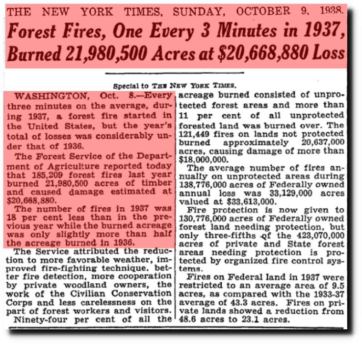
TimesMachine: October 9, 1938 – NYTimes.com
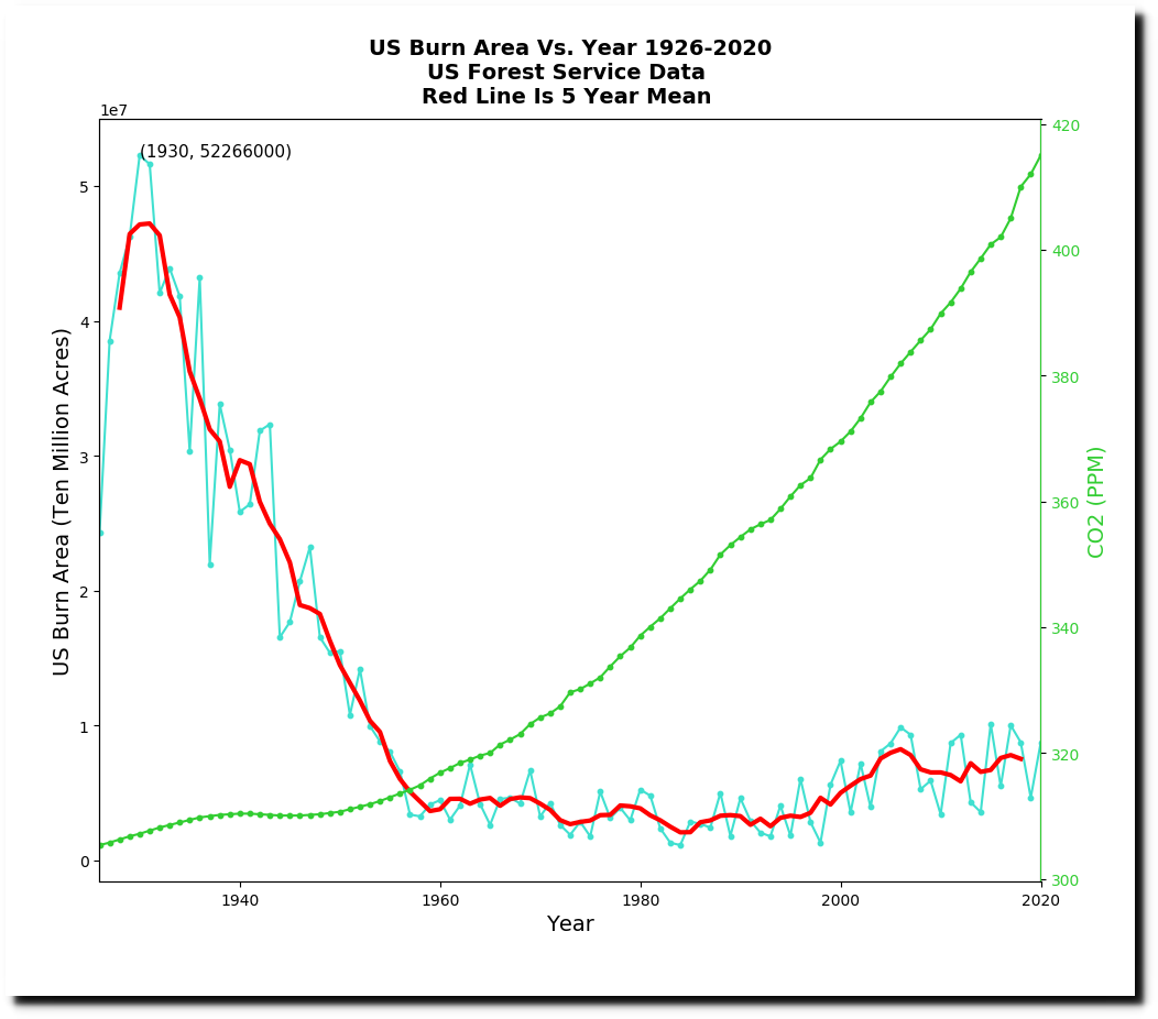
By cherry-picking a start date of 1983 and greatly exaggerating the Y-axis, they make it appear like CO2 and burn acreage correlate.
Their drought graph shows that the climate isn’t changing
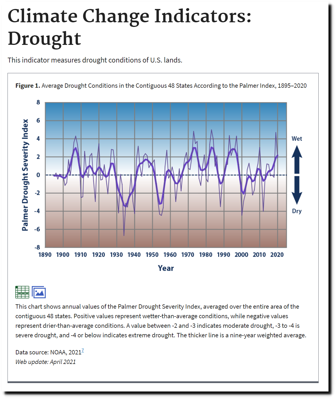
Climate Change Indicators: Drought | Climate Change Indicators in the United States | US EPA
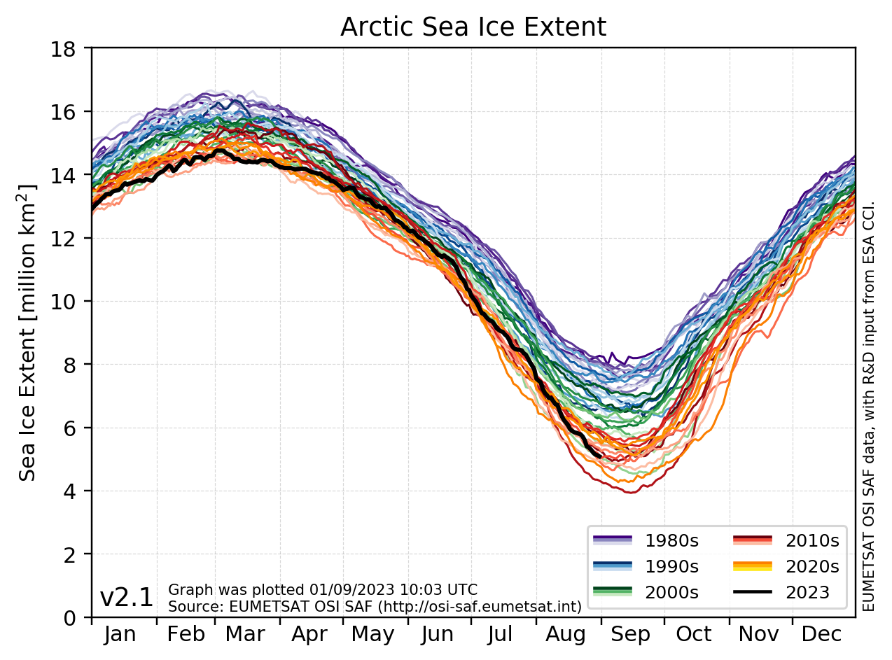
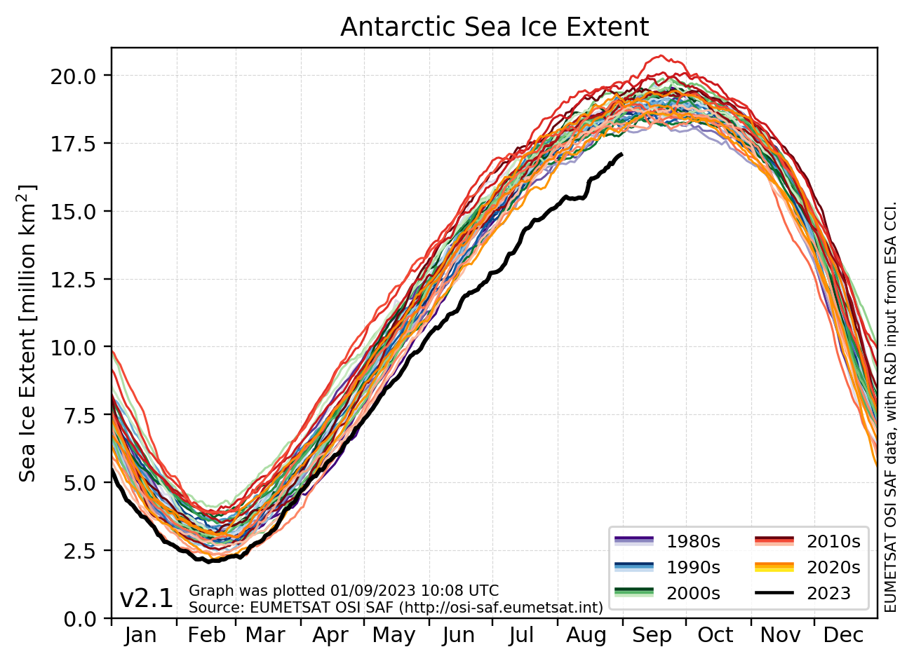
Sea ice extent at both poles is close to the 1981-2010 median.
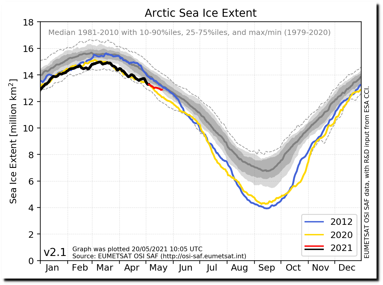
osisaf_nh_sie_daily-all.png (1274×943)
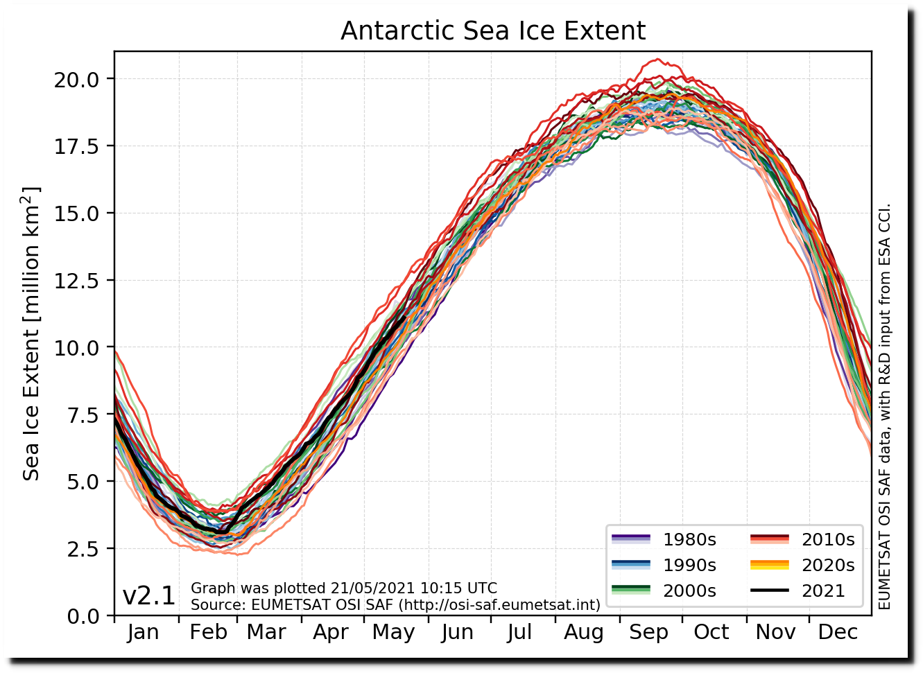
osisaf_sh_sie_daily-all.png (1303×943)
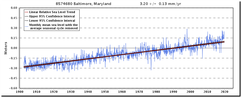
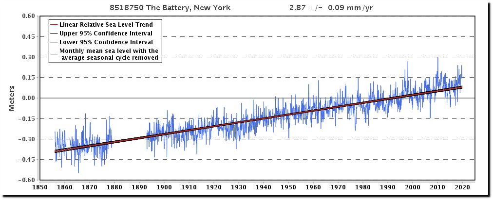
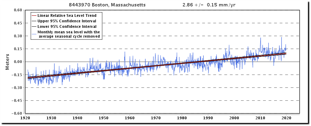
Se level has been rising for 20,000 years, and there is no indication it is accelerating
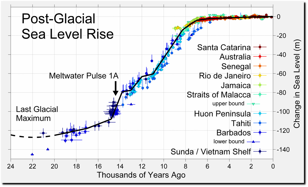
File:Post-Glacial Sea Level.png – Wikimedia Commons

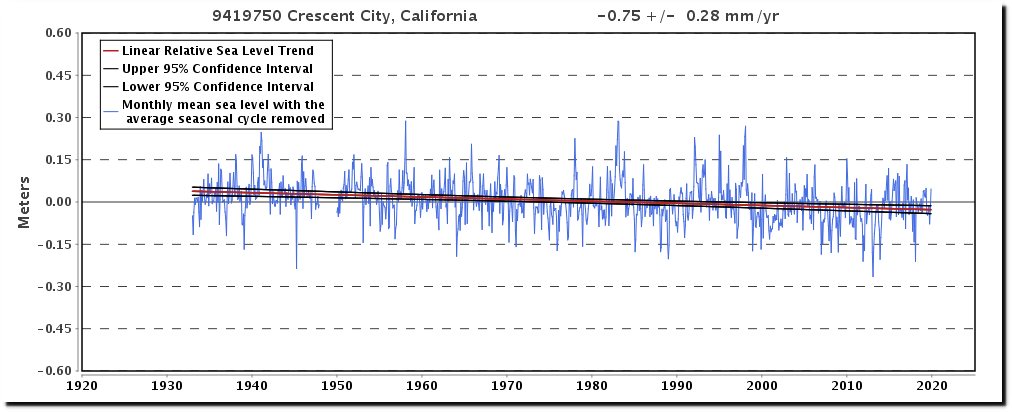
9419750 Crescent City, California
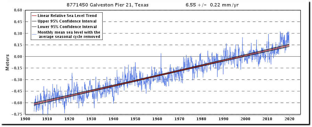
8771450 Galveston Pier 21, Texas
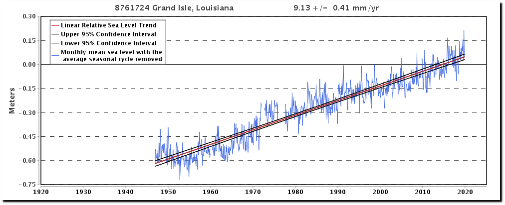
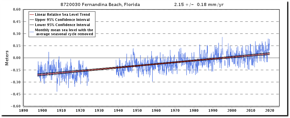
8720030 Fernandina Beach, Florida
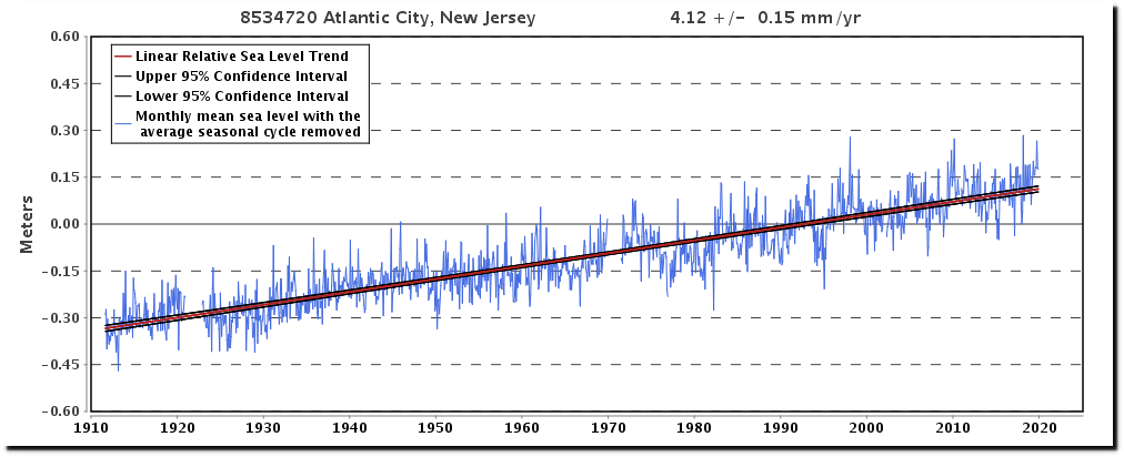
8534720 Atlantic City, New Jersey
The last time CO2 levels were this high, temperatures were 5F warmer – meaning that this time, they are 5F cooler. In other words, CO2 doesn’t control the temperature.
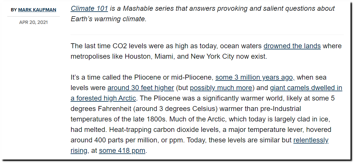
What Earth was like last time CO2 levels were as high as today
Posted in Uncategorized
Leave a comment