
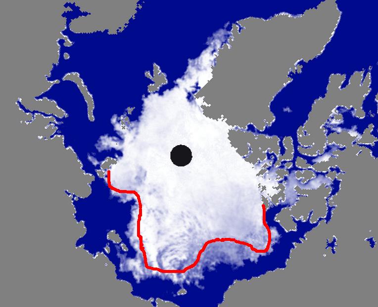
The red line represents the minimum amount of loss likely over the next month. It could melt back further than that, but probably not less.
Disrupting the Borg is expensive and time consuming!
Google Search
-
Recent Posts
- One Atomic Bomb Per Hour
- New Video : Analyzing Oil And Gas
- Is Antarctica Melting?
- High Speed Analysis And Visualization
- El Nino To The Rescue?
- Fake News Update
- Growth Of Antarctic Sea Ice
- 65 Years Of Progress!
- El Nino To The Rescue?
- Worst March Drought On Record
- ChartGL Process Control Demo
- The Biggest Money Laundering Scam
- Drought In The Headwaters Of Lake Powell
- Unrealistic Expectations Of Water Availability
- Did Bill Gates Do This?
- Worst March Drought On Record In The US
- The Real Hockey Stick Graph
- Analyzing The Western Water Crisis
- Gaslighting 1924
- “Why Do You Resist?”
- Climate Attribution Model
- Fact Checking NASA
- Fact Checking Grok
- Fact Checking The New York Times
- New Visitech Features
Recent Comments
- conrad ziefle on One Atomic Bomb Per Hour
- Timo, Not that one on One Atomic Bomb Per Hour
- Bob G on One Atomic Bomb Per Hour
- Crispin Pemberton-Pigott on One Atomic Bomb Per Hour
- william on 65 Years Of Progress!
- arn on One Atomic Bomb Per Hour
- Gordon Vigurs on One Atomic Bomb Per Hour


I assume that line was only drawn wrt the Alaskan side. Presumably, we can expect some losses in the Greenland Sea, for instance. I think it’d be interesting if the Greenland Sea ice remained, however, and I’d be curious as to the implications of having a stronger ice pack there this winter and how it affects flow out of the Fram Strait.
-Scott
Greenland Sea ice is all doomed ice and not really important.