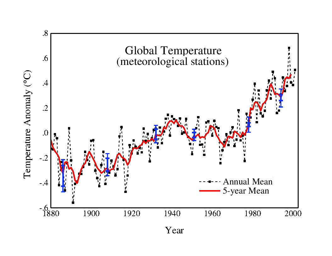
I found this 2001 version of the GISS global station graph in the web archive. Note that the 1880’s used to be just as warm as the 1960’s.
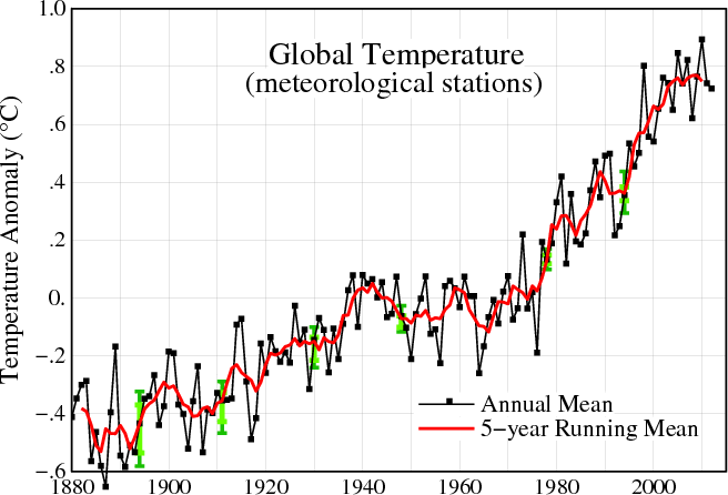
Here is the current version. Note that the 1880’s have cooled about 0.4ºC since 2001, and are now much colder than the 1960’s. (Funny how that works.)
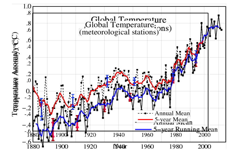
Next graph is a composite, normalized to 1998, with the 2013 version in blue.
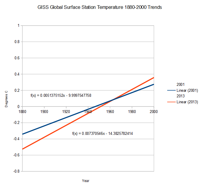
And finally the trend graphs, which show that 45% of all current warming is due to “adjustments” since 2001. This of course doesn’t include how much of the trend is due to tampering prior to 2001.
2001 version : http://www.giss.nasa.gov/data/update/gistemp/graphs/FigA.txt
2013 version : data.giss.nasa.gov/gistemp/graphs_v3/Fig.A2.txt


They can only hide the truth in the past or in the future, or deep in the sea. And the truth is that it’s all a big lie. How can they sleep at night ?
How I see this data, at first look: The blue slope is 70% of the red slope, so 70% of the “adjusted temperature” increase (red) is accounted for by the unadjusted temperature trend (blue), and only 30% is due to adjustments, not 45%.
It has been adjusted upwards by 45%
I don’t know whether it’s worthwhile answering this, but the title of the post is still wrong, so I will. red slope is 0.00737…, blue slope is 0.00514…; the ratio of the two slopes is 1.435, approx. (not 1.45, quite). You wrote “45% of all current warming” is due to adjustments; but call the red warming rate “1”, so the adjusted rate is “1.435”–and that is “all the current warming”, of which 0.435 is due to adjustments, or 0.435/1.435 = 30%. You can properly say adjustments since 2001 have increased the warming rate by 43.5%–or about 45%–but you can’t rightly say 45% of GISS surface trends, or “all current (adjusted) warming”, are due to that data tampering.
….call the unadjusted, BLUE, warming rate “1”, and the adjusted rate “1.435”…
These people are disgusting.