Unfortunately for them, we have something known as actual temperature records. The actual temperatures say that most of the US has been below normal, not average to above. NOAA is ;pathetic.
Holy crapola, there must be large sums of money at stake with these kinds of fraudulent and downright deceptive tactics.
The worthless pieces of sheet are nearing their end, and that is of course the scary part!
The spike in January was due to an “MJO heat release”, possibly as a result of the failed El Nino of 2012,
“The recent MJO wave [Jan/2013] released a historically large amount of latent heat from the tropical oceans. It stagnated for 10 days in its most convectively active mode, at high amplitude, until the walker cell caved.
[in December] .. it was clear the SSW event would ignite the MJO.
The global temp will crash starting mid February.” http://westernusawx.info/forums/index.php?showtopic=33725&page=26#entry631284
I said, “the temps really dropped in February and continued to fall at the same rate as since mid 2012.”
and the graph I showed is in connection with this statement.
Any period of strong El Nino+La Nina distorts the linear trend dramatically, but locally. It does not necessarily mean that the trend disappeared or changed.
If you follow the trend since 2001, you’ll see that it is positive with some oscillation only until 2006. After 2007, inclusive, it becomes negative, with the only exception of the 2001-2010 period, which was almost exactly flat (no trend).
The trend after 2010 is stable and negative, whether you like it or not.
In fact, if the climate was warming the trend after 2010 should be positive, because the two La Ninas of 2010 and 2011 would only have decreased a little the rate of warmth without changing it, and this would be observed in the measurements of the following years, in 2012 and 2013.
But, as my second link shows, http://www.woodfortrees.org/plot/rss/from:2010/to:2014/plot/rss/from:2010/to:2014/trend
the trend after 2010 is even more pronounced than in the 2001-2013 period, showing in fact that the cooling is accelerating.
Whether you like it or not.
Are we witnessing another change of tactic here? Instead of unprecedented rates of warming now the metric is how long the positive anomaly has been hanging around?
With geologic time scales being the standard of measure this should be a good strategy for another decade or so as damage control. But its hardly going to get anybody excited about CAGW.


Colorado warmer than average? Really?
Weather underground has the straight scoop unbiased as always complete with giant red world map.
November 2013 Global Temperature Was Hottest On Record
http://www.wunderground.com/news/november-2013-global-temperature-was-hottest-record-20131217
Unfortunately for them, we have something known as actual temperature records. The actual temperatures say that most of the US has been below normal, not average to above. NOAA is ;pathetic.
Record hot year in Australia?
Reblogged this on Edonurwayup's Blog and commented:
NOAA clowns at it again.
NCDC visual must be GCM model output
😉
Jeff Masters at wunderclown is spewing the lies as well. Cold December in US means time to pump the propaganda.
Holy crapola, there must be large sums of money at stake with these kinds of fraudulent and downright deceptive tactics.
The worthless pieces of sheet are nearing their end, and that is of course the scary part!
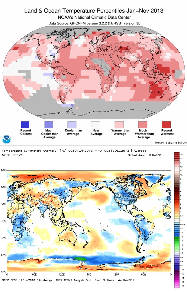
Something isn’t right here. The chart above is not the same as the one on this page, but it’s supposed to show the same thing: http://www.fdlreporter.com/usatoday/article/4052839
That chart is for November 2013.
The one at the top of the page is for January to November.
Bottom is since January
Also the chart at the top of the page is percentiles.
The equivalent one for anomalies is here:
http://www.ncdc.noaa.gov/sotc/service/global/map-blended-mntp/201301-201311.gif
Now that is amazing. In this day and age, NOAA has no data just east of Northern Japan, no data just SW of Alaska, no data for most of Hudson Bay?
Interesting that NOAA shows +1°C anomaly in Labrador, whereas the local meteorologists measured a -1.6°C anomaly
NOAA : Naturally, outrageous adjustments abound.
RSS is showing the same approx. +0.1 (*ONLY*), as it was at the end of 2012,
http://www.woodfortrees.org/graph/rss/from:2001/plot/rss/from:2001/trend
The spike in January was due to an “MJO heat release”, possibly as a result of the failed El Nino of 2012,
“The recent MJO wave [Jan/2013] released a historically large amount of latent heat from the tropical oceans. It stagnated for 10 days in its most convectively active mode, at high amplitude, until the walker cell caved.
[in December] .. it was clear the SSW event would ignite the MJO.
The global temp will crash starting mid February.”
http://westernusawx.info/forums/index.php?showtopic=33725&page=26#entry631284
and the temps really dropped in February and continued to fall at the same rate as since mid 2012.
Despite this oscillation the present trend indicates that we’ll be probably nearing 0.0 C world anomaly by the end of 2015,
http://www.woodfortrees.org/plot/rss/from:2010/to:2014/plot/rss/from:2010/to:2014/trend
try http://www.woodfortrees.org/plot/rss/from:2008/to:2014/plot/rss/from:2008/to:2014/trend – notice the difference?
I said,
“the temps really dropped in February and continued to fall at the same rate as since mid 2012.”
and the graph I showed is in connection with this statement.
Any period of strong El Nino+La Nina distorts the linear trend dramatically, but locally. It does not necessarily mean that the trend disappeared or changed.
If you follow the trend since 2001, you’ll see that it is positive with some oscillation only until 2006. After 2007, inclusive, it becomes negative, with the only exception of the 2001-2010 period, which was almost exactly flat (no trend).
The trend after 2010 is stable and negative, whether you like it or not.
In fact, if the climate was warming the trend after 2010 should be positive, because the two La Ninas of 2010 and 2011 would only have decreased a little the rate of warmth without changing it, and this would be observed in the measurements of the following years, in 2012 and 2013.
But, as my second link shows,
http://www.woodfortrees.org/plot/rss/from:2010/to:2014/plot/rss/from:2010/to:2014/trend
the trend after 2010 is even more pronounced than in the 2001-2013 period, showing in fact that the cooling is accelerating.
Whether you like it or not.
Are we witnessing another change of tactic here? Instead of unprecedented rates of warming now the metric is how long the positive anomaly has been hanging around?
With geologic time scales being the standard of measure this should be a good strategy for another decade or so as damage control. But its hardly going to get anybody excited about CAGW.