Data going back to 1866.
Correlation between lunatic NSA mass spying and the massive loss of orders of American IT industry and defense industry, although graph is still underway. http://freebeacon.com/boeing-loses-4-5b-contract-with-brazil-nsa-leaks-cited/#
This country is run into the ground by the current clique of idiots in charge and theur clueless helpers.
unrelated, but you may be interested in this about areans and wind turbines.:
http://news.nationalpost.com/2014/01/16/p-e-i-arenas-say-their-new-wind-turbines-an-expensive-burden-want-them-removed/
John M Reynolds
https://www.youtube.com/watch?v=6TGbfyPzcLo
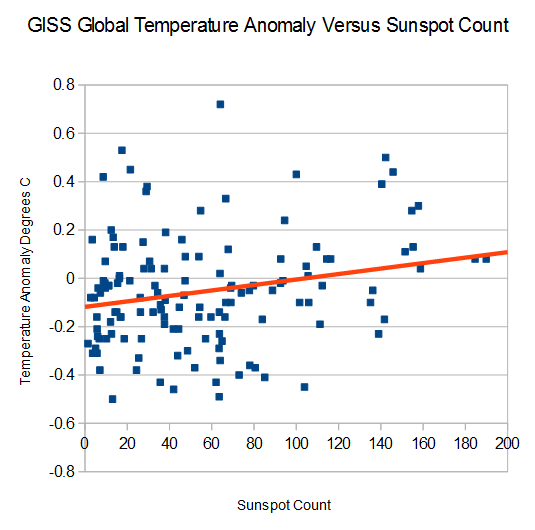
No correlation at all. Interesting.
Old Jedi Mind Trick
2/3 of readings above 120 spots have positive temperature anomalies. 2/3 of readings below 100 spots have negative temperature anomalies.
Odds of that being a coincidence are close to zero.
Might be so. Still think correlation is much weaker than expected. Never seen that plot before, by the way.
I wonder if the unadjusted numbers do any better
I’d be curious what the relationship is when you “lag” the temperature by a few years. That is, how does the data look when you compare sunspot count in Year X with temperature in Year X + Y?
Your email address will not be published. Required fields are marked *
Comment *
Name *
Email *
Website
Save my name, email, and website in this browser for the next time I comment.


Correlation between lunatic NSA mass spying and the massive loss of orders of American IT industry and defense industry, although graph is still underway.
http://freebeacon.com/boeing-loses-4-5b-contract-with-brazil-nsa-leaks-cited/#
This country is run into the ground by the current clique of idiots in charge and theur clueless helpers.
unrelated, but you may be interested in this about areans and wind turbines.:
http://news.nationalpost.com/2014/01/16/p-e-i-arenas-say-their-new-wind-turbines-an-expensive-burden-want-them-removed/
John M Reynolds
https://www.youtube.com/watch?v=6TGbfyPzcLo
No correlation at all. Interesting.
Old Jedi Mind Trick
2/3 of readings above 120 spots have positive temperature anomalies.
2/3 of readings below 100 spots have negative temperature anomalies.
Odds of that being a coincidence are close to zero.
Might be so. Still think correlation is much weaker than expected. Never seen that plot before, by the way.
I wonder if the unadjusted numbers do any better
I’d be curious what the relationship is when you “lag” the temperature by a few years. That is, how does the data look when you compare sunspot count in Year X with temperature in Year X + Y?