
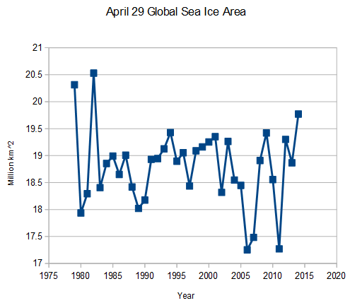
 arctic.atmos.uiuc.edu/cryosphere/timeseries.global.anom.1979-2008
Disrupting the Borg is expensive and time consuming!

Google Search
-
Recent Posts
- The Real Hockey Stick Graph
- Analyzing The Western Water Crisis
- Gaslighting 1924
- “Why Do You Resist?”
- Climate Attribution Model
- Fact Checking NASA
- Fact Checking Grok
- Fact Checking The New York Times
- New Visitech Features
- Ice-Free Arctic By 2014
- Debt-Free US Treasury Forecast
- Analyzing Big City Crime (Part 2)
- Analyzing Big City Crime
- UK Migration Caused By Global Warming
- Climate Attribution In Greece
- “Brown: ’50 days to save world'”
- The Catastrophic Influence of Bovine Methane Emissions on Extraterrestrial Climate Patterns
- Posting On X
- Seventeen Years Of Fun
- The Importance Of Good Tools
- Temperature Shifts At Blue Hill, MA
- CO2²
- Time Of Observation Bias
- Climate Scamming For Profit
- Climate Scamming For Profit
Recent Comments
- arn on The Real Hockey Stick Graph
- arn on The Real Hockey Stick Graph
- Gordon Vigurs on The Real Hockey Stick Graph
- Peter Carroll on The Real Hockey Stick Graph
- Robertvd on The Real Hockey Stick Graph
- Robertvd on The Real Hockey Stick Graph
- Gordon Vigurs on The Real Hockey Stick Graph
- Jack the Insider on The Real Hockey Stick Graph
- Bob G on The Real Hockey Stick Graph
- conrad ziefle on The Real Hockey Stick Graph
Hmmm… Do I detect an upward trend showing ever increasing global sea ice? It is not sine qua non evidence, but it is certainly consistent with all the other data you publish, Steve, showing a global cooling trend.
I think (correct me if I’m wrong) this as as far back as we have satellite records for sea ice… and just as a casual observer I’d say that it looks like a couple of high outliers, and a couple of low outliers that taken together really don’t change the mean much, and otherwise the mean looks like it hangs around 18.75-ish. We don’t have a long record to compare it to, but it kinda looks like what I’d call an emerging picture of normal variation.
Hi
Can you break this down into Arctic and Antarctic graphs?