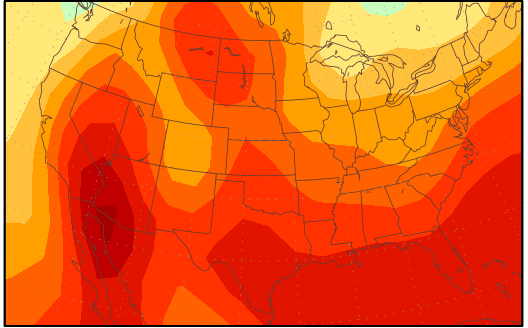
I wonder if there is any way to track the exaggerations / modifications to temperature color scale over time.
For a “settled science” they keep altering and changing the red colored temperatures further down the scale.
I could be wrong, yet I think they used to reserve red for 90+. And orange for 80+ and the comfortable 70’s were always a balmy yellow.
No matter how comfortable the temperatures may be, there always seems to be some climatologist wearing his clown nose deciding to alter the temperature scale to make things look alarmingly hot….. Settled science my backside…..