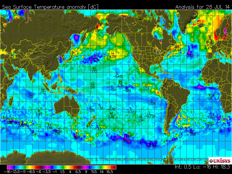
That is pretty unbelievable. Is it by any chance just the legend that is wrong, cycling through the spectrum 3 times, but the range used on the plot is correct? Although it is basically to tell.
It can’t be correct, surely?
The same colours used for a several different temperature ranges?
In reality are the colours re-used?
How common are anomalies of +16c and -16c?
Unfortunately I don’t think you can tell from the map.
Rubs eyes, checks date, not April 1st. Still, this has to be a joke or software problem plus nonexistent quality control, like no on even eyeballed it before they sent it out.
It’s not that difficult to have a more moronic scheme. They could just use 3 shades of red , 1 shade of orange and and 1 shade of yellow for 0.1°C each and cycle them randomly.
I can’t imagine, Paul, having any problem showing where the seas are warmer or cooler from that map. I believe I could even explain it to you! Are you looking at a black and white copy?
That color scheme has only one goal: To confuse the heck out of anyone who looks at it AND allows cooler to be called warmer by the Willing Accomplices like pesce9991.
I asked the question for a particular reason, and at a particular point in time, none of which you were (or are) cognizant of.
Do you want to take this down to the level of the differences in personalities, or keep it on the level ideologies? Your choice.
You would do well to direct your energy and keep you focus on where it can do the most good, rather than engaging in these little, inconsequential dust-ups.
You would also do well to be advised, Gail, to note that more of the male population is afflicted with ‘color perception difficulties’ than the female population; this can lead to differences in posters opinions of fashion, style, and technical interpretation of ‘colorized’ data if the incorrect choices for colors are made.
There is a WHOLE FIELD dedicated to making graphics presentable to ALL persons with color perception difficulties; FEW people are aware of this field, or the recommendations and tools available to generate acceptable graphics that all people can view and perceive correctly.
“I believe I could even explain it to you!” Sure pesce, if you have a brief explanation of why a single standard color spectrum representing anomalies in the range of -16C to +16C was not used, go for it.
Paul, I only stated I could explain where the cooler and warmer sea temps were. For why that color scale was used you’d have to ask a cartographer or a scientist who uses it.
I guess that from the numbers on the map (which I didn’t see before), only a small part of the colour spectrum is being used i.e. approx. +5 to -5 but if the anomalies go outside that range there could be problems with “cold” colours turning into “warm” ones and vice versa.
It’s quite obvious that they need more government (Read: “tax payer”) funding so that they can afford more colors. They’re so poorly funded that they have to recycle all the colors after just a few degrees. Think about Teh Chillllllrun!!!!!!
You know, I like this scale! It is the only scale which can be accurate no matter which form of climate change you believe in (i.e. catastrophic-anthropomorphic or natural or combination)! If you are a CAGW-believer it all looks hot with anomalies of +9 to +16.5degrees! But if you are a natural climate change/global warming believe it looks incredibly cold with anomalies of -6 to -16degrees! And if you are a combo-CAGW/naturalist then it looks nice and with anomalies from somewhere like -5 to +5degrees. Everybody wins!!!
1) Above average
2) Well above average
3) Extremely above average
4) Hot enough to cook raw meat
5) Boiling point of water
6) Boiling point of lead
7) Same temperature as the surface of the Sun
They only disagree on what color to use for each range….
I’ve looked at Unisys SST maps off and on over the years. They’ve used this scheme ‘forever’ as far as I know. Confusing as all get out if you’re not familiar with it,
I want to say that I started looking at them when tracking tropical systems that used Unisys as a data source. Hmm, it is approaching 10 years now for me.
I am still at a loss to locate the position of the indicated _low_ of -16 or the _high_ of +18.3 as the notation in the lower right hand corner indicates exists somewhere on the plot. Even given the sappy color scheme used and expecting transitions through the color scale, one cannot still find those the locations of those indicted high and low values.
_Jim I can find nothing close to those numbers. About the only spread I can find is a +6.43 off the coast of Maine and a -3.21 between Australia and Antarctica.
I think the scale was made to allow any and all possible results and does not indicate what is on any individual map.
You would also do well to be advised, Gail, to note that more of the male population is afflicted with ‘color perception difficulties’ than the female population; this can lead to differences in posters opinions…
>>>>>>>>>>>>>>>>>>>>
Jim, That darn scale has the same color repeat THREE TIMES so for example “rose” could be -16 and -3.5 and +9. That is enough to confuse anyone especially when the numbers on the map are hard to read. If you want to pick nits you can also say the tiny numbers are discriminating against old folks.
In a word the map sucks for more than one reason.
And considering my boss was so color blind he had to zero everything to get a black and white image he could see, I am well aware of that problem. Had a FEMALE friend who was blue/green color blind too. She was an artist and painted the weirdest landscapes you have ever seen!


Please! It looks like my sister and wife got together and decided to paint one of our rooms! it is pretty (they told me to say that).
That is pretty unbelievable. Is it by any chance just the legend that is wrong, cycling through the spectrum 3 times, but the range used on the plot is correct? Although it is basically to tell.
Maybe they consulted Feng Shui designers? Those colors are very soothing and make me feel at one with map.
Looks like a truck from the Crayola factor had a head on collision with a truck load of Skittles…
It can’t be correct, surely?
The same colours used for a several different temperature ranges?
In reality are the colours re-used?
How common are anomalies of +16c and -16c?
Unfortunately I don’t think you can tell from the map.
I think they will change that. Impossible to make sense of – as you said.
Rubs eyes, checks date, not April 1st. Still, this has to be a joke or software problem plus nonexistent quality control, like no on even eyeballed it before they sent it out.
?
It’s not that difficult to have a more moronic scheme. They could just use 3 shades of red , 1 shade of orange and and 1 shade of yellow for 0.1°C each and cycle them randomly.
Like everything else, probably done by a fairly large committee, lots of time, several layers of approvals.
The scale is more confusing than the map. Just looking at the map it is easy to tell where the cool/cold areas and the warm/hot areas are on the seas.
I agree. Looking at that map the seas are clearly -6 to -16degrees below average! Oh-my-lord! IT FREEZING!
I know a GIS professor that would have a cow if a beginning student would do something as bad as that.
Climate ‘science’…
I can’t imagine, Paul, having any problem showing where the seas are warmer or cooler from that map. I believe I could even explain it to you! Are you looking at a black and white copy?
Female – right? No ‘guy’ would carry on like this …
Don’t insult females.
That color scheme has only one goal: To confuse the heck out of anyone who looks at it AND allows cooler to be called warmer by the Willing Accomplices like pesce9991.
That color chart has been discontinued. Good! Now move on.
Evidence? Links? Source?
Or is that your clairvoyance again?
Here is the link I saw. This was about 3 years ago. Not sure if they changed it yet or not.
http://bobtisdale.wordpress.com/2011/09/04/unisys-is-changing-their-color-scaling-on-sea-surface-temperature-anomaly-maps/
Apparently Bob’s article was premature since they have not done so yet.
Let us be equanimous – Hermaphrodite.
From their web site yesterday
I asked the question for a particular reason, and at a particular point in time, none of which you were (or are) cognizant of.
Do you want to take this down to the level of the differences in personalities, or keep it on the level ideologies? Your choice.
You would do well to direct your energy and keep you focus on where it can do the most good, rather than engaging in these little, inconsequential dust-ups.
.
And that is? I have yet to see any good coming from the carbon unit.
You would also do well to be advised, Gail, to note that more of the male population is afflicted with ‘color perception difficulties’ than the female population; this can lead to differences in posters opinions of fashion, style, and technical interpretation of ‘colorized’ data if the incorrect choices for colors are made.
There is a WHOLE FIELD dedicated to making graphics presentable to ALL persons with color perception difficulties; FEW people are aware of this field, or the recommendations and tools available to generate acceptable graphics that all people can view and perceive correctly.
E.g. http://webdesign.tutsplus.com/articles/designing-for-and-as-a-color-blind-person–webdesign-3408
.
“I believe I could even explain it to you!” Sure pesce, if you have a brief explanation of why a single standard color spectrum representing anomalies in the range of -16C to +16C was not used, go for it.
Paul, I only stated I could explain where the cooler and warmer sea temps were. For why that color scale was used you’d have to ask a cartographer or a scientist who uses it.
You could “explain”??? Why? Who was asking for an explanation? Or were you trying to say you could “identify” where they were?
English speakers with inquiring minds want to know.
You are a pink panty wearer. No explanation required.
LOL Scratch a troll and you get ad hominems. No substance, just abuse.
You are so predictable.
… the map looks ‘anomalous’ alright …
Their latest El Nino scare has completely fallen apart.
I guess that from the numbers on the map (which I didn’t see before), only a small part of the colour spectrum is being used i.e. approx. +5 to -5 but if the anomalies go outside that range there could be problems with “cold” colours turning into “warm” ones and vice versa.
It’s quite obvious that they need more government (Read: “tax payer”) funding so that they can afford more colors. They’re so poorly funded that they have to recycle all the colors after just a few degrees. Think about Teh Chillllllrun!!!!!!
Pesce,is that little magenta spot in the middle of the Atlantic -16, -4, or +8?? Might make a difference. Just sayin’.
You know, I like this scale! It is the only scale which can be accurate no matter which form of climate change you believe in (i.e. catastrophic-anthropomorphic or natural or combination)! If you are a CAGW-believer it all looks hot with anomalies of +9 to +16.5degrees! But if you are a natural climate change/global warming believe it looks incredibly cold with anomalies of -6 to -16degrees! And if you are a combo-CAGW/naturalist then it looks nice and with anomalies from somewhere like -5 to +5degrees. Everybody wins!!!
Warmists only want 7 ranges of temperature:
1) Above average
2) Well above average
3) Extremely above average
4) Hot enough to cook raw meat
5) Boiling point of water
6) Boiling point of lead
7) Same temperature as the surface of the Sun
They only disagree on what color to use for each range….
+1
I’ve looked at Unisys SST maps off and on over the years. They’ve used this scheme ‘forever’ as far as I know. Confusing as all get out if you’re not familiar with it,
I want to say that I started looking at them when tracking tropical systems that used Unisys as a data source. Hmm, it is approaching 10 years now for me.
I just read they have discontinued color scheme. I had a feeling it wasn’t meant for the casual observer. Thanks.
Again, link, source? Why is so hard for you to post them?
I agree, I find that really annoying.
I am still at a loss to locate the position of the indicated _low_ of -16 or the _high_ of +18.3 as the notation in the lower right hand corner indicates exists somewhere on the plot. Even given the sappy color scheme used and expecting transitions through the color scale, one cannot still find those the locations of those indicted high and low values.
Anybody have an idea where those points might be?
.
_Jim I can find nothing close to those numbers. About the only spread I can find is a +6.43 off the coast of Maine and a -3.21 between Australia and Antarctica.
I think the scale was made to allow any and all possible results and does not indicate what is on any individual map.
Makes it rather misleading doesn’t it?
_Jim says: @ July 30, 2014 at 4:27 pm
You would also do well to be advised, Gail, to note that more of the male population is afflicted with ‘color perception difficulties’ than the female population; this can lead to differences in posters opinions…
>>>>>>>>>>>>>>>>>>>>
Jim, That darn scale has the same color repeat THREE TIMES so for example “rose” could be -16 and -3.5 and +9. That is enough to confuse anyone especially when the numbers on the map are hard to read. If you want to pick nits you can also say the tiny numbers are discriminating against old folks.
In a word the map sucks for more than one reason.
And considering my boss was so color blind he had to zero everything to get a black and white image he could see, I am well aware of that problem. Had a FEMALE friend who was blue/green color blind too. She was an artist and painted the weirdest landscapes you have ever seen!