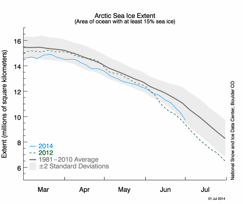
Early July every summer, alarmists start their annual “the Arctic is going to break the record minimum” voodoo chant.
What is actually going on is that the ice in the Baffin and Hudson Bays, and the Barents Sea is melting a little early. They have no impact on the summer minimum, because they always they have little or no ice at the end of the summer.
The interesting thing to note is that ice extent in the Arctic Basin is right at the 1981-2010 mean, which means that it will soon take a sharp turn towards the median, and break little alarmist hearts once again.


don’t forget they changed it again…..now they are counting all the little ins and outs around the coast….and what melts first?……all the little ins and outs around the coast
To make it more fair, it would be much appreciated if you would tie half your brain behind your back before responding to your detractors or bringing up information such as this.
Does it look like the wind will push the Arctic basin ice toward the Canadian archipelago again this summer, rather than out to the North Atlantic, as it did in the years with the lowest September ice extent? (If so, I’m waiting for complaints that the far Northern Atlantic will be unusually warm because it didn’t cool by melting the ice.)
I think this chart has been getting the same kind of help the temp chart has been getting…to tell the approved story.
How can you say the ice is melting a little early when compared to 2012, the year with the lowest summer minima, the rate of ice loss has been a lot lower until the end of June when the rate increased?
A more accurate statement would be to say the current position of the ice extent gives no indication of the final value at minima.
Andy
A more accurate statement is that you never have any clue about what is being discussed.
It’s worse than we thought!
The sea ice extent chart clearly shows that there are 4 million square kilometres of missing sea ice (chopped off the bottom of the scale).
If the link works here’s one with the missing ice restored. It leaves much more room for making pretty doodles of Arctic Sea Ice Death Spirals on.
Oops, here’s the link.
http://i62.tinypic.com/23jkhh0.jpg
It’s even worse than I thought.
It’s 5 million square kilometres of missing sea ice chopped of the chart.
Last year, July saw this weather pattern with low pressure dominating the eastern basin, and high pressure over the western basin.
http://www.esrl.noaa.gov/psd/tmp/composites/compday.SXM_tWrrUj.gif
The current pattern has high pressure dominating the basin, but GFS runs have been showing a breakdown of that pattern to one similar to last July.
http://mag.ncep.noaa.gov/data/gfs/06/gfs_arctic_168_10m_wnd_precip.gif
http://mag.ncep.noaa.gov/data/gfs/06/gfs_arctic_192_10m_wnd_precip.gif