
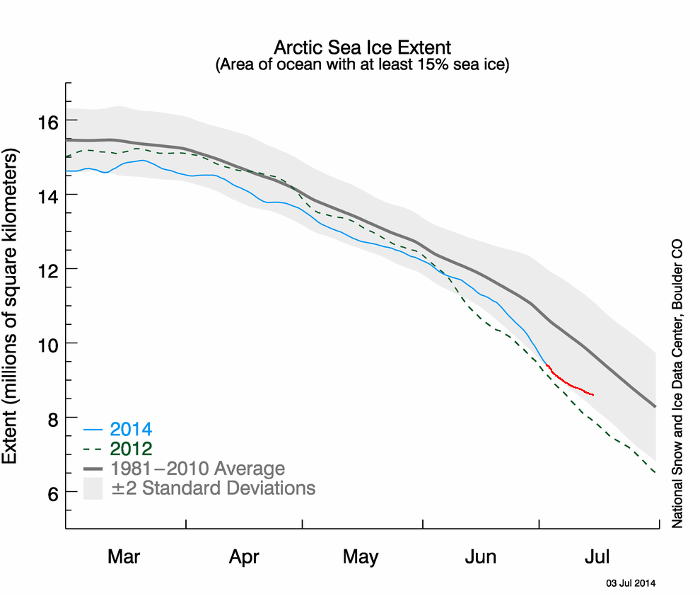
I added my forecast for the next two weeks in red, on to the NSIDC Arctic ice extent map. The ice should take a turn towards the median in a few days, because the Hudson and Baffin Bays will finish melting out, and there will be little change in extent in the Arctic Basin, Beaufort Sea, Chukchi Sea or Barents Sea.

Reblogged this on wwlee4411 and commented:
Looks normal to me.
For the same reasons you mention I believe it will continue to dive for 2 weeks… Then a real sharp turn to average, and average by August 7th [the cross quarter]
Tony I was reading on WUWT recently and a poster comment that the adjustment for water on the sea ice is now not made about this time of year but is tinkered with throughout the year. I always wondered about this since in the past early July ice graphs always showed a plateauing about now but in recent years the plateau has been noticeably missing. Given the tendency to adjust data in anyway possible to get reality back on the program I have always assumed the sea ice was likely fudged also.
That’s also why MASIE is a useful alternative check on the microwave-based indices. As you may know, NIC produces ice charts for navigation purposes relying on various data source, including satellite imagery and ship observations along with the microwave sensing. MASIE is the ice extent estimate from the charts.
For comparison, MASIE shows about 700,000 Km2 more ice extent than NOAA both at maximum and minimum. This is usually explained by microwave sensors seeing melt water on top of ice the same as open water.
For the years 2007 to 2013 inclusive, each year MASIE shows higher maximums than NOAA, on average 5% higher. In each of those same years MASIE shows higher minimums than NOAA, on average 15% higher. The melt extent is more comparable: NOAA shows an average annual loss of 70.5 %, while MASIE shows an average loss of 67.5%.
You say: “a turn toward the media”. Probably you meant “Median”, since a slower melt will be ignored by the media.
The ice charts are just another progtard projection of their non-world. They’re tweaking that graph to say whatever they want. When levels exceed what was seen in the 70s, they’ll likely still have it showing low.
It’s already turning now.
And I think it will continue tracking year 2007 and 2012. And no it is not turning yet.
http://meteomodel.pl/klimat/arcticice_nsidc.png
So you are thinking the Hudson Bay is going to go negative area? Perhaps anti-ice?
Now two week have gone. It hasn’t make a turn towards the median.
http://nsidc.org/data/seaice_index/images/daily_images/N_stddev_timeseries.png
“anti-ice”–hilarious!
“Anti-ice” sounds much more scientific than “the heat is hiding in the deep oceans”.
They probably wanted to use the phrase “anti-ice”, but Tony preempted them.
LMAO