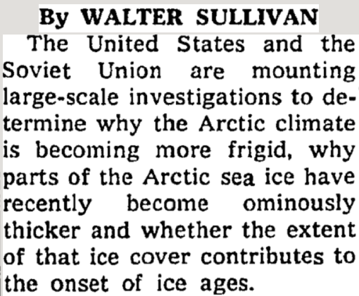
Our friends at the Ministry of Truth have been working overtime to erase the 1970’s global cooling and the ice age scare, but Al Gore’s Internet invention has made that very difficult for them.
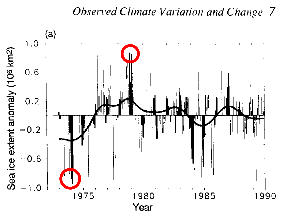
If you have ever wondered why Arctic sea ice graphs now begin in 1979, the 1990 IPCC report makes it clear. 1979 was the maximum ice extent of of the satellite era, and the data from before 1979 wrecks their global warming story.


I harpooned an alarmist with that fact. I am book marking this in case he comes back. Thanks.
Do not forget the 1974 CIA report, Tony has also mentioned this in the past.
“A Study of Climatological Research as it Pertains to Intelligence Problems”
http://www.climatemonitor.it/wp-content/uploads/2009/12/1974.pdf
Thank you! Another gem!
Great reading. I forgot to use it in a recent discussion with an intelligent and well-meaning but uninformed neighbor. Thanks for the reminder.
Just to clarify, this post references the Arctic but the graph says only “Sea ice extent anomaly”. Am I correct that it is graphing Arctic sea ice, not global sea ice?
And yes, the “Coming Ice Age” scare really did happen. I was there. I remember reading the articles and listening to the various experts declaim on the possibility.
Arctic only. Antarctic ice was declining from 1974-1979
Thanks, Tony! Looks like Arctic ice anomaly is back to about the same as forty years ago. Where’s the catastrophe in that?
Even if it were lower, it’s just an observation, like many other climate-related figures; there’s no absolute proof of how much influence humans have had on it.
I have asked so many scientists why, why, why, studies are not done on an entire earth scale. There is extensive evidence of oscillations in quantities of sea ice with the hemispheres being in opposite phases of the oscillation. Someone like Mark Serreze (sp)? simply will not get his head out of the arctic sand.