
Remarkable cooling events are happening on the planet, which the team is not only ignoring, but are attempting to hide.
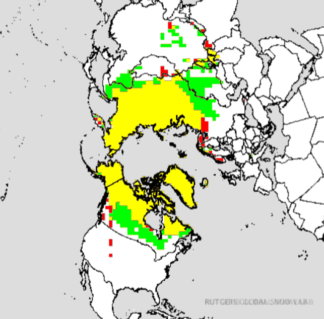
There is a huge excess of snow in the Northern Hemisphere, shown in green below
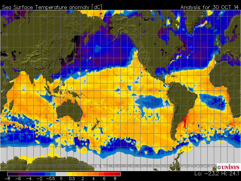
Sea surface temperatures have plummeted in the Northern Hemisphere.
Ice in the Barents and Kara Seas has grown to its highest level in many years, destroying the basic premise of a well publicized paper published this week.


This scam is dead. Look for “climate scientists” to continue to lie about it and tamper with data – because their jobs and short term reputations depend on doing that. Any climate scientist who strays is immediately ripped to shreds by the defenders of the orthodoxy, like Rhode Island Senator Whitehouse.

“Look for “climate scientists” to continue to lie about it and tamper with data –”
Looks like that’s what’s going on in OZ:
http://www.dailymail.co.uk/news/article-2813394/Heat-Weather-Bureau-MP-accuses-wiping-118-year-old-temperature-records-justify-claims-climate-change.html
They’ll either stay quiet, or attribute it to “climate change”.. Meanwhile, the public at large are noticing the rat-like smell even more..
The dumping has arrived.
Now see, all these facts and pointing out of reality are not going to help our case! Have to use “feelings” to “reach” these f**king idiots. And I ain’t good with “feelings”, so we be in trouble!!!!
It’s just weather.
Oh! Don’t say that to them, then their heads will ‘splode and you got to get the shopvac out clean up the mess!
Oh, and here in western PA we are freezing our a$$es off on this Nov 1.
When election day is past, James O’Keefe should run a Project Veritas special on these people. Emails apparently weren’t enough, but video…
Tony or BobT,
I am having trouble reconciling the current Unisys and NOAA SST anomaly charts–specifically in the Gulf of Alaska from Kodiak Island (where Unisys shows a very cold pool) around to the AK panhandle and BC. NOAA shows the Gulf to be significantly warmer. If they’re operating from the same current data, I can only conclude their baselines are different–significantly so.
Although the Unisys color scale is complicated, it provides better fidelity and demonstrates the significant range (to the negative/cold) of the anomalies you point out.
The NOAA chart seems to me to have some discontinuities that don’t make sense: The Sea of Okhotsk has a HUGE gradient from west to east; Hudson Bay’s gradient N to S, etc.
Unisys:
http://weather.unisys.com/archive/sst/sst_anom-141026.gif
NOAA:
http://polar.ncep.noaa.gov/sst/rtg_high_res/color_newdisp_anomaly_global_lat_lon_ophi0.png
Thanks in advance for the mentoring.
Unisys has a problem with their color bar. They’re using that NOAA site for their data and verified that their numbers match NOAA. http://weather.unisys.com/news/?p=391
I told ‘goddard’ about this yesterday. Doesn’t stop him from pretending that Unisys claims cold waters.
P-Spam,
My point is that Unisys and NOAA provide very different and contradicting products. The 30 Oct 2014 one TH posted above and the 26 Oct 2014 one I posted BOTH disagree with the NOAA one.
Your assertion that Unisys is not demonstrating cold NH SSTs is incorrect. Both Unisys products posted in this thread show anomalously cold NH SSTs. The 30 Oct 2014 one is their “new” one which unwraps the color scale and stops at -8. The data is the same; it’s just easier for most to read than the 26 Oct 2014 one I posted. I find the “wrapped” one useful, because it really shows the magnitude of the anomalies.
NOAA and NASA have a long history of manipulating or adjusting data (e.g. Hansen et al, 2001, to cite just one relatively old example). Have they done that here with their SST product? Or is there a scientifically/statistically meaningful (honest) explanation of the disparity?
Unisys says that the numbers they’re working with (which come from that NOAA site) are represented accurately by the NOAA site and that they’ve got a problem. You choose to ignore them. It’s not NOAA’s fault that you won’t listen to Unisys about their graphics problem. Nor is it NOAA’s fault that you won’t listen to Unisys when they say that they’ve got the same numbers as NOAA.
Instead, you have to have a conspiracy and fraud. Go for it.
P-Spam,
Please explain in scientific, statistical, and graphics terms the specific problem Unisys experienced (identified in their 22 October 2014 post you cited) and how that problem was not corrected as shown in their new anomaly product posted above dated 30 Oct 2014.
Additionally, please explain how this “new” anomaly image dated 30 Oct 2014 does not show NH SST cooling. I want to hear your interpretation of the 30 Oct 2014 image that Unisys describes as their “SST Anom-New.” I am sure Unisys (and most folks on this thread) would appreciate your constructive feedback on how their new graphic is misleading me and others into seeing “cold” where there is actually “warm.”
Thank you in advance for your kind reply.
Warmer waters – more ice. Brilliant!
plutarchtroll doesn’t understand
“…and this has caused some users to misinterpret the maps… ”
You must be one of the “some” that also, at best, misinterpret what they say.
There are two SST anomaly maps available at Unisys. The one you show above is the old product with the ridiculously confusing scale. The one Tony is using is labeled Unisys New and is using a scale that is easier to read. Unisys says those maps are based on data from NOAA. If I had to choose I am immediately skeptical of any NOAA map, chart, or graph derived from the same data with good reason. Their willingness to play with real data is becoming legendary.
You have a link to the ‘new’ product. I have found the old one with the repeating color scale to be unreadable.
Never mind… I found it…
The blue / purple anomalous map stands alone.
http://i.imgur.com/VmXWeOj.png
I find it interesting that UNYSIS and NOAA’s maps agree reasonably on the SH, and profoundly disagree on the NH!
Another point that I was able to check was the evolution of the UNYSIS maps, since August, and noted that there there was a clear, coherent evolution of the temperatures both in the NH and SH, showing that as the NH got much colder, it “pushed” / forced the warmer anomalies towards the SH, producing even a slight “bounce back” of the (weak) positive El Nino, and warming of the northern part of the Indian ocean.
I’d like to point out that a similar effect happened at the end of 2013, during the strong N. Polar vortex that ended at the first days of January. The evolution of the NH/SH temperatures was very similar to what we’re seeing now in the UNYSIS maps, but it ended very fast– in a couple of days, in January, the anomalies were back to normal– it lasted for nearly 20 days, but this new “wave” of colder anomalies is already going on for nearly a month.
I believe the “phenomenon” shown in the UNYSIS graphs could be real, but in this case it would necessarily have important effects on the continental temperatures too.
As Steve has been pointing out in the last few days, the recent record autumn snowfall in the NH and fast increase of the Arctic ice, specially at the N. of Asia, seems to corroborate the anomalies of the UNYSIS graph.
I guess we cannot have a clear comparison though, because all these “analyses” are based on models of one kind or another, and, if “by the fruits we can know the tree”, I’d bet the UNYSIS “models” are less distorted by the AGW agenda than the NOAA’s ones and should be presenting a more realistic “analysis” of what is really going on.
I believe the truth of this story we’ll only know in a few weeks when the effects of possible abnormal cold, or not, become more evident over the continental areas, where the actual thermometers and *people* are.
As for the cause of the abnormal cold– if it is actually happening (as indicated by the snowfall and Arctic ice)– I think the most probable suspect would be the flip of the AMO, happening ahead of its normal ~ 30 years period.
typo: … UNISYS …
Its dead Jim….
More ice means higher temps. Wow. Just wow.
I have been checking the Sea Ice Extent image several times a week for 3 years. “news” reports in this time period have consistently told us that sea ice in the Arctic has been shrinking and has practically disappeared here in 2014. Yet the images show the opposite. Whats the old saw about pictures and words?!?!
Each time I run into someone believing the “humans are destroying the environment” crapola I give then a few links, here, Anthony’s place and the Sea Ice Extent image page with a warning to be very skeptical of what is written there. Then nature takes its course.
Information, or the free flow of, is something the political left absolutely despise. That is why I so enjoy spreading it as far as possible.
I try as well… but folks say “Who are you going to believe, NASA or some guy’s blog??” That’s what we’re up against… either there has to be a lawsuit, or some high profile person needs to stand up…
Many folks think it’s exaggerated. .. yet many others really think this .00004 mole CO2 will lead to the Apocalypse. ..
Scary thing is lots of people want apocalyptic events to happen. Right up until they do, at which point they suddenly figure out it is NOT what they want. Bit late, then. Once the genie is out of the tube you can’t put the toothpaste back in the lamp.
Remember that the way they’re explaining all of the known scientific facts is by claiming that there is a roving blob of Missing Heat that emerges from the deep ocean where it cannot be measured, wreaks havoc (with “weather weirding”) on everyone due to the “sins” of their conservative enemies, and then finally calms down and settles back into the depths for a while (where we can’t measure it), content to watch for a time and see if the “filthy mortals” have learned.
In other words, they are saying that the blob of Missing Heat displays traits of not only consciousness, but also vindictiveness. In other words, they are recycling a number of pagan myths. Their ideas are nothing more than mythology. We should point out this fact to them as often as possible. If they dispute the characterization, show them a temperature map and ask them to point out where exactly the Missing Heat can be found on it.
RTF
To which they respond”Duh, its missing, like totally, dood!”. It definitely gives one that bashing head against brick wall feeling.
And you come right back and say, it can’t both exist and not exist at the surface. If it is causing weather weirding, it must at the surface right now. Show me where it is, otherwise you’re admitting that there is no “weather weirding” right now.
I like to take facts and roll them up like a giant newspaper and whack the crap out of them. Does not bring them to reality, just makes me feel better. 😉
You can not waste time on the willfully blind and ignorant. Smack’em once and move on to more fertile ground.
We have to be willing to get a few head bumps in the process of waking people up.
Why did your comment get shunted to moderation?
I don’t know. Perhaps we are not allowed to ride the family dog like a pony in this establishment! Never mind, I will continue to roll facts up like a news paper and beat the f**k out of leftards with them. It just makes me feel better.
Oh C’mon Steven… we’re trying to save the planet here and stop evil fossil fuel burning!!…. to quote Hillary Clinton “What does it matter” if we alter data a little for the cause… get with the (political) consensus Mr Goddard!!!
I think Kyle K map above is more representative it does shows cooling but not like the Unisys map. Its impossible for such a great change in such a short time sorry! I think ther is a problem with the UNISYS color bar.
Is this REAL or NOT???? http://weather.unisys.com/surface/sst_anom.gif
Please check everybody. If it is…. its MAJOR, If its not, its just a glitch. In any case UNISYS has NOT changed it for 7-10 days now so it may be real and would be a real worry re ice age. I am still very skeptical I think the color bar below is not correct.
How do you know all the previous ones that showed higher temps were accurate? Maybe they were the wrong ones.
RTF
On September 15 the UNYSIS map was
https://dmhscratch.files.wordpress.com/2014/11/sst_anom000-14-09-16-la-nina-still-possible-similar-to-1-year-ago-tg.gif
which was similar to NOAA’s.
During the first weeks of this month UNYSIS map “evolved” to it’s present form, while NOAA’s map kept showing basically the same anomalies as in September.
Do we have any reasons to believe one more than the other?
I think that’s is the real question.
I agree!
I don’t know why I keep writing “UNYSIS” instead of “UNISYS” … 🙁
All of these companies and agencies may use the same data but do they all process it exactly the same?
Even a few days of averaging, in the analysis of the raw data, could make an important difference if the rate of cooling is really fast.
E. g., Cryosphere is still showing the anomalies below 1 million negative,
http://arctic.atmos.uiuc.edu/cryosphere/IMAGES/seaice.anomaly.arctic.png
but NOAA’s satellite image shows the ice almost covering the entire area delimited by the average line,
http://nsidc.org/data/seaice_index/images/daily_images/N_daily_extent_hires.png
If you consider that Greenland’s area is ~ 2.2 million km2, I believe the blue area in this map is in fact close to 500 k km2, and it’s decreasing every day.
Above may be all correct.The rate of increase is possibly one of the fastest on record?
https://www.youtube.com/watch?v=HiQ2sff-N0k
The narrative is changing:
https://curryja.files.wordpress.com/2014/11/cartoon-cooling-and-warming.png?w=500
Anyone who wants to continue this discussion with Bob Tisdale look at his article and comments over at WUWT. The problem may be the baseline for the anomalies is different between NOAA and Unisys. I’m going with Tony with this thing.